Showing posts with label Nick Bantock Ink. Show all posts

Tuesday, September 27, 2022

Small Gifts - Oil Diffusers - One of a Kind

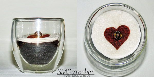
Martini - I created this unique essential oil diffuser with a small martini glass.

I dyed a felted wool ball with a couple of shade of ink.  A few drops of each Nick Bantock Sap Moss and Chartreuse Leaf was added to water to cover the ball. The ball was wet with clear water then immersed into the dye.  It was left there for a half hour.  I squished some of the dye out so it would dry more easily.

The first one I dyed were left overnight and still had to be put in the microwave so this one just went directly there.  With about 15 seconds bursts and cooling down in between it took a few minutes to dry it.

I then put a long round toothpick through the "olive". I then punched a small circle of red felt. To attach the pimento to the olive I put a small green ebead on the bottom end of a green thread and pushed it through the olive with a sharp needle. I just caught the red piece and brought the thread back down to the bottom.  I made sure I went passed the toothpick on one side going up and other side going down.  The thread was knotted just above the ebead then the thread was run through the olive and cut to the surface to hide the end. The glass protects the surface from oil drops.

Mickey Mouse - I found this authentic vintage Disney Mickey Mouse candle holder at the thrift store. I cleaned up the old wax and removed the paint on the outside.

I cut a piece of black felt for the bottom of the holder having the ears and face now black. I put 2 black felt balls in the ear spaces.  

For the nose I put an aqua felt ball to which I sewed on a black wooden bead to finish off the nose.  The nose was threaded to the base felt shape when I attached the nose bead.

I imagine that the nose is where I put the drops of essential oil but it is all felt so it could be placed anywhere.  The glass holder protects the surface from oil drips.

Christmas Tree - I chose this clear glass tea light holder in the shape of a Christmas tree.

I created a felt stack of 1.5 inch circles to fill the tealight space. It took 7 layers to make it high enough and alternated red and green circles.

I added a silver metal flower which could represent a poinsettia in the center top of the stack then added a red polka dot glass bead in the middle.  These accents were stitched to the stack with a red thread which runs the full depth of the stack.  The thread was well knotted on the bottom and tied off

The diffuser can stand as shown or lie flat on a surface.


I've called this one Caffe Latte. I made this oil diffuser with a 2.5 oz Bodum Praveena double wall glass.  I cut many layers of brown felt from 1" at the bottom to 2" at the top to represent the coffee.  Just making the next layer just a bit bigger than the last one. A lot of cutting by hand. Then I added the the cream layer again going a bit bigger.  I added the cinnamon heart on the top with an amber sparkly glass bead on top.  The stack was stitched together with brown thread. It looks pretty sharp. It would fit right in for scents in the kitchen.

Aqua Bouquet - This oil diffuser features felt flowers in a fine art glass Ulpukka bud vase made by Iittala in Finland.

The felt flowers are aqua with silver glass e beads as stamens and threaded onto twisted silver wire. Each flower also has a silver bead at the end of the wire to ensure no rough spots. 

The wood spiral in the vase helps to provide structure to the composition. 

Place your favorite essential oil on the felt flowers and enjoy the scent in your space whether that is the office, the living room, or the bedroom.  This vase will fit in almost any place.

Super happy with these one of a kinds.

Wednesday, October 27, 2021

I Love You Card

I made a card for my Dad who is in hospital and not doing well.

He is too sick to have the surgery he needs to fix his arm which was broken in a fall very early morning Friday.

I just wanted to let him know that I love him and whatever happens all will be well.

We have started the process of him moving from the apartment to a place with more care.

He is in his early 90s and has survived many health issues.

I pray that God blesses him today and that he knows how much we all love him.

I watercolored the heart, ran a line of gold metallic ink around it and spattered it with the 3 colors I used - Nick Bantock - Vermilion, Rose Madder and Plum.  Added a gold ribbon wrapped around the card front and tape to the inside. Mounted the heart to a brown card A7 base with 3D foam tape. 

Thursday, March 4, 2021

Christmas Card Challenge - March - Large Greetings

I decided to make Christmas cards with large greetings for my March cards.

It was easy to find some greetings on some of my Cricut cartridges.  They are easily sized and cut.  I chose the Winter Frolic cartridge.  It's hard to tell how large they will be on the first cut so I ended up with some larger die cuts than I planned so I used 5x7 cards (A7). 

The large greeting was cut from white pearl card stock at 3.5" T.  

Of course, the fun part was making acrylic ink background with photo paper.  These are 4x6 sheets and I used my Nick Bantock liquid acrylic colors for these. The colors were: Deep Turquoise, Cerulean Azure, Prussian Blue, Chrome Yellow, Chartreuse Leaf, Vermillion Lacquer, and Sapmoss Green.

I added colored sequins to the card fronts adhered with Bling Zots. For the first one the sequins were Christmas green, the red one was gold,  and the other was red and green.

I used a bit of color watered down to spatter the card fronts once I was done which helps to marry all the elements.

For the 5x7 cards I needed a clean pull of color across the 4x6 as I could not trim it.  Sometimes I end up with white edges or finger prints in the corners as I turn them over.

I see that I ended up with some pink sequins as well as red on this card. Not my intention but that's how it goes.

I have documented these in my Cricut manual so I can get smaller die cuts next time.

Always nice to have a few larger cards in my Christmas card box.

Super happy with these.

Tuesday, November 17, 2020

How To: Photographing Bottled Light

My aunt shared with me a You Tube video a while back by one of her favorite photographers - Harold Davis.  It was how to Photographing Bottle Light.  I just loved it!  Check out his videos if you are interested.

I am offering my experience with the process.

Materials needed: Colored bottles, color for water in clear bottles, sunshine, a camera with a macro lens or at least a good macro setting and a very clean white surface.  I will cover some options in each area.

Colored Bottles or containers - wine bottles, vinegar bottles, olive oil bottles, condiment bottles, etc.  Check the kitchen and cleaning supplies.  I found the dark green olive oil bottle did not light a lot of light through so great job for oil maybe less effective for this process. But use whatever you find and see what happens. Think of colored vases as well.

Clear Glass - bottles or vases of clear glass can be used with colored water.  

Glass texture and pattern - some texture or pattern in the glass adds to the refraction of the light.  I had a small etched vase where the etched areas became almost black.  Not what I wanted.

Color for Water - I have lots of liquid acrylic so that is what I used. Harold used food coloring.  It needs to concentrated and transparent.

White surface - It must be CLEAN and smooth.  The material should not absorb the light.  I used foam core board which worked well.   It needs to large enough for the light to be refracted beside the containers. 

Light - I found bright sunshine the best.  Any artificial light I used did not produce results I was happy with.

My experience with stemware was not very successful.   

Setup is entirely up to you.  Does the light go through one bottle to the next creating new color? Do you want the shape of the glass to play a part? Compose your art as you wish based on light, shape and color.

Very Important - You are photographing the light on the white not the light through the containers. 


Here are some examples of the photos I took over 2 photo sessions.

Post Processing: I had to trim all of my images because I could not isolate the light from the container.  All of these have been brighten and had some adjustment in the color saturation.  Rotate the image as you may see something you could see from the other direction.

Now, I don't have the imagination that Harold has to see objects within the abstract shapes.  Maybe that will come in time.

How about photographing the light through the glass?  Anything goes really.

This one has the large blue bottle in front of the olive bottle with an artificial light behind the olive bottle.  The bottles are overlapping creating the bright green color in the center.  It was nice to have the 2 small dots in the bottom right hand corner to provide a git of a focal element.

I would encourage you to experiment!  All you have to lose is a bit of time and colored water.

I am so glad I tried this technique!


Friday, August 14, 2020

Exchange Cards - Spatter Cardstock

I made a couple of cards with the the great spattered card stock I made a while ago.  I loved how I was able to get ink splotches!  The original 12x12 card stock is by Teresa Collins - Giving Thanks.

I started with card bases in Stampin Up Bermuda Bay. 

I used Nick Bantock's Cerlean Blue and Chrome Yellow liquid acrylic as well as white pearl Gleams acrylic paint on this card stock. 

I found some large die cut flowers in aqua.They needed a bit of a texture so I used the same colors again on the large handmade paper flowers.  Then I added a pearl white flower die cut made with the Stampin Up Flower Fair thin-let set.  I layered a deep teal flower then a smaller deep yellow one held in place a deep teal mini brad.  This was assembled into an accent.

I cut the spattered card stock to 4.00 x 5.25 inches and adhered it to the card front.  I added  a ripped strip of silver metallic card stock.  I then adhered the flower accent with 3D foam tape. I added a quarter sheet insert.


This card as very similar pieces. 

The ripped strip is pearl white cardstock. It was adhered to the card from then trimmed it to the card edges.

The flower accent has a deep yellow mini brad in its' center.

I love the swirls of grey in this card stock.   I chose their layout to determine where I was going to place the flowers.

These are headed out to the mail box.


Friday, August 30, 2013

Blah Paper - Bonus

Here are the sheets of paper I "printed" from the ink I applied to my blah paper.  I used 32lb bond paper I had on hand.  Once the was the ink applied and I felt I could do no more, I just laid this 8.5x11 sheet onto the12x12 sheet then pulled it up. It was interesting that not all the colors reacted the same way.  I think to the blue really spread nicely but the others beaded to varying degrees and would not spread smoothly.  You can see the stripes and the brush strokes really well in the top left.  I cleaned my brush on the others so I ended up with a more funky pattern. 

How To: Blah Paper - New Life


This was a dollar store find so I was not going to lose a lot to take the package home. It was really nice heavy paper.  Here's another set of blah paper which I have given new life.  The original paper is cream with matte and shiny stripes - the sample on the right.   I applied a few drops Nick Bantock ink to it with a bit of water and a paint brush.  Mostly it repelled the mixture. Once I had printed another sheet of paper (see that later) from it, I wiped it down to reveal what was left behind.  Despite feeling like not much had happened I did have color. Yeah!
I was expecting it to take the color much more and I would have dramatic contrast.  I'm going to use the brown and the red for fall cards for my Card Club in September.  

Saturday, March 23, 2013

How To: More Blah Paper

I found more colors to use on this blah glitter paper.  Here's the ones I did earlier.  This is Nick Bantock Prussian Blue and Vermillion Lacquer.  Keep an eye here to see the cards I will make with these papers!

Sunday, March 3, 2013

How To: Re-purpose Blah Paper

Do you have paper in your stash that does not inspire or speak to you?  The top left corner of the picture here is the original glitter paper.  I bought it on sale and thought I should be able to do SOMETHING with it.  Well I decided to paint it with diluted Nick Bantock ink.  The colors I chose were Turquoise, Lamp black and Sap Moss Green.  That stuff goes a long way because it just took a drop or two to get this color.  I just watered it down then applied it with a foam brush.  I pressed it down as it dried. I'm so much happier with it now.  Keep an eye out here for how I will use it.
Think about what technique you could use on blah paper.  Paint it, print on it, stamp on it, distress it, think outside the box.  You are not inclined to use it the way it is so what have you got to lose? I way nothing so go for it. Let me know what you do and how it turns out.