I created this card with a color print of a watercolor I painted years ago. I added a periwinkle layer then adhered it to a navy card.
I added a french birthday greeting color printed on white card stock and punched with the Stampin Up Modern Label. I added an offset label in the navy card color. This greeting was mounted with 3D foam tape.
This card features a piece of my bubble paper in a lavender color. I printed the french greeting onto the decorative paper then trimmed it to leave a small border.
I cut the candle with a QuicKutz die from silver card stock. Unfortunately, the scan does not do it justice. It shines in real life.
I took the stars cut from the candle and adhered them around the card front.
I mounted the bubble paper layer to the front of a lavender card.
This card features one of my 4x4 photos from my
Beauty photo calendar. This is a great blue flower taken on a morning walk when the dew was still on the flower.
It was cut to 3.75 x 3.75 inches with Sizzix Square Thinlits.
I printed the french birthday greeting layer onto white card stock. The sentiment was done in Smoky Slate and the graphic in a coordinating Brilliant Blue. The graphic is from
The Graphics Fairy. It was adhered to the card front of a true blue card.
I then adhered the photo in the frame printed on the greeting layer.
Another 4x4 photo from one of my photo calendars. This one is a green fern. No sentiment on this one so it can be used for any occasion. The graphic is the same as the previous card printed in a coordinating color Garden Green. I glued it to a dark green card.
Another 4x4 photo from one of my photo calendars.
This one is a purple daisy. No
sentiment on this one so it can be used for any occasion. The graphic
is the same as the previous card printed in a coordinating color
Handsome Hunter. I glued it to a very dark green card.
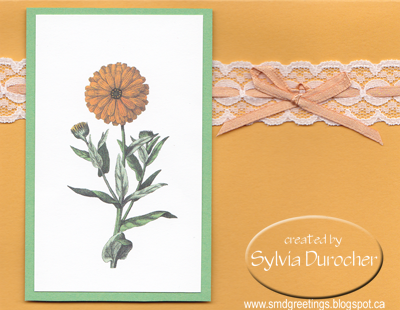
I started with my daisy drawing which I printed onto an orange quarter sheet.
I punched a large daisy from decorative paper made with Rich Razzleberry, Melon Mambo and Crushed Curry. I added an orange center to the flower.
It was then layered onto a bright pink card.
These cards were delivered to the Art Gallery gift shop today. I brought back 6 with English greetings.