Tuesday, October 24, 2017

Cards to Gallery - Photo Cards

This is a Tree Swallow photo which I took when I visited the Ellis Bird Farm this summer.  They were all over the place and overall cooperated with those of us with cameras.

As you can see he had his eye on me but I got a great photo.


I am happier with my photos coming back from the developer since I had a conversation with the tech in the print room.

It means I have to maintain 2 sets of photos; one in the 4x6 and another in the 3.5x5 inches.  For these photo cards I have printed 3.5 and trimmed a bit off the length.

The photos are adhered to great heavy card stock which produces a great end product.

I caught this wonderful yellow tulip at the Legislative Grounds.


This is a Greater Scaup which is medium sized diving duck.  This is a male with the great shiny head and striking yellow eye.

This was taken on my trip the Elk Island Park this summer.

Would be a great card for a guy into the outdoors.

Card to the Gallery - Decorative Paper

Using a kit from Card Club I just replaced the polka dot layer with a piece of my decorative paper layer in shades of blue. 

The decorative paper was cut to leave a small border then adhered to the card front.  I tacked down the silver glitter star in place then used a push pin to create a hole in the card front.

I remove one of the strands on the fiber just leaving the shiny one. It was wrapped onto the red star brad. The brad was inserted into the hole and the prongs pressed apart in the inside of the card. I like the lighter feel to the fiber on this card.

One of the ladies last night mentioned it could be a Christmas card. That would be great.


Another Card Club kit.  I replaced the Japanese handmade paper with my own decorative paper in greens and browns. 

I chose a dark brown card and adhered the gold square.

I wrapped the ribbon across the card front and tape the ends to the inside.  I adhered the 3.75 inch square of decorative paper over the ribbon.

I added 3 fall leaves brads onto the decorative paper.


Another Card Club kit.  I replaced the bird layer with a piece of my own alcohol ink background papers in blues and greens. 

I used the navy card with the warm gray layer adhered to the front. The background paper was adhere to the front.

I added a punched card stock flower in the Bermuda Bay behind the silk flowers and chose a brad that matched the card stock.

I added a strip of the Bermuda Bay card stock across the bottom third of the card. 

The greeting was color printed, punched with the SU Artisan Label punch then adhered over the strip with 3D foam tape.


Cards to the Gallery

I chose a nice red poppy for a this card.  The phot was trimmed to 3.75x3.75.

The white layer was color printed with a smoky slate frame and flourish.  This was adhered to the front of a green card.

The photo was adhered to card front aligned in the frame.


I chose a brown owl photo trimmed handled the same way as the poppy and placed onto a turquoise card.

The last owl sold last week so it was time to add another.

Monday, October 23, 2017

Card Club - October - Glitter Star

I started with the polka dot decorative card stock which was trimmed to leave a large border and adhered to the front of a red card.

I cut the stars with the Sizzix Star #2 die which cuts one large star.  I used POW glitter card stock in silver and gold for the stars. The star was adhered to the polka dot layer.

I decided placement of the red star and used a push pin to create a hole in the card front. I then cut a length of white glitzy fiber. I wrapped onto the prongs of the red star brad and press those through the hole and pushed the prongs apart inside the card. Trimmed the ends of the fiber to length with scissors.

Card Club - October - Elegant Thank You

I love the elegance of this card.  I recycled a commercial thank you card  in gold and ivory for the greeting.

I wrapped a length of coordinating fiber around the greeting and tied a knot. I then adhered it to the light blue card front.

I added 2 gold flower sequins on the right and left of the greeting held in place with tiny blue brads which coordinate with the card color.

This kit has blue and pink cards.

Card Club - October - Blue Bird

I chose the decorative layer first. I then chose a navy blue card with a coordinating blue grey layer which was cut to leave a small border.

I wrapped a piece of blue trim across the front of the bird decorative layer and taped the ends to the back.  This layer was then adhered to the card front.

I placed the white silk flower in the top right hand corner.  Using a push pin I created a hole through the card front for the brad. I placed the blue flower then the white flower onto the blue brad then the prongs were inserted through and pressed apart on the inside of the card.

The greeting was color printed in navy onto white card stock then punched with the Stampin Up Decorative Label punch. I placed 3D foam tape behind the greeting lengthwise as to not interfere with the trim.  The greeting was adhered over the trim in the center of the card.

Card Club - October - Gold Handmade Paper

I started with the handmade paper which was painted and highlighted with gold. I cut it into 3" squares.  I then cut 4" squares from gold card stock.
I chose a rust card onto which I glued the gold square on the left side of a landscape card.  I then wrapped a piece of gold metallic ribbon across the front and taped the ends to the inside of the card.
I adhered the gold handmade paper on top of the ribbon.


I chose the grey in the paper for the greeting.  I printed small tags which I trimmed along the edge by hand with scissors.  I repeated the gold one more by choosing a gold paper clip to hold the greeting to the card.

I chose terra cotta, rust and burgundy card bases for these kits.  The greeting can be excluded with no detriment to the final card.

Saturday, October 21, 2017

Cards to the Gallery

My reception at the Gallery last night went really well. Several friends dropped by to check out the art.

With brisk sales I was in need of more cards to keep my display full.

I have added a title to the card front as many people asked me the names of the birds and flowers.

Here is my Black Capped Chickadee on heavy white card stock.


I love the various colors in Cosmos flowers.  I captured this one at the Legislative Grounds this summer.  It's great to have another in the background that repeats the punch of pink.


Here's that cute little Barn Swallow with his great colors.  This was taken at the John Poole Wetlands at the Lois Hole Provincial Park near St. Albert.


I sold the wedding card I delivered on Tuesday so I whipped up another based on this lovely image of a wedding couple available at EDigg Clipart.

Printed in black on vellum and clear embossed.  I chose a piece of bubble decorative paper.  I love how his side is more a masculine color and hers is lovely blue lavender.  The paper was cut to leave a small border of the warm blue card.  The vellum was trimmed a bit more and is held in place with 4 tiny white brads.

These are off to the gallery this morning.

I am bringing 2 Nature Photo Calendars and 1 Teddy Bear Calendar as well. 

Thursday, October 19, 2017

Share Your Cup - Recent Pics

When I bought my cute glass lemon a while back, my aunt the other two that were being offered.  I lent me her two so I could take some interesting photos. 

I placed them onto a navy blue blue plate.  I was not fussy of the shiny navy empty space on the corners so I sprinkled some cornmeal to reduce the glare.

I added some direct light onto the front one with a small flashlight.

I'm happy with this photo.


I hosted Welcome to my Kitchen this morning.  This is our fellowship group where we take turns hosting. 

With my new kitchen I was excited to host but with 16 expected I was concerned about having space for everyone to be comfortable.  I am very happy with the layout created with my dining room table and my craft table.  I chose yellow table cloths as it was the only color I have one big enough to cover the large table.

With 10 able to sit at the tables I set up TV tables along the sofa.  There was a table in the far corner with a stool.  The large chair in the foreground had a space of plate and cup on the trunk next to it.  I also had a small stool to serve as a table along with cushions on my wooden bench. 

As it turned out we were 12 and it was very comfortable.  As you can see the sun was shining!

Isn't Tupperware the best!  Tupperware parties were the rage when I graduated from high school. I have attended 100s of parties and spent a good dollar in my 20s stocking my kitchen. Money back guarantee!  I think the younger generation is not appreciating this product. Many pieces are between 30-40 years old. No,  I am not a demonstrator or have any vested interest.  I just love their product.

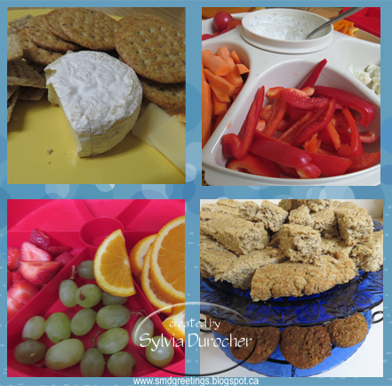
I put together a cheese and cracker tray which was served on a large yellow platter.  I served Camembert, mozzarella and marble sheet with great whole grain crackers.

I prepared a veggie tray with dill dip served in the Tupperware Large Serving Center.  I put in carrot sticks, pepper slices, cauliflower, and cherry tomatoes.

A fruit tray served in the Tupperware Red Six Section Snack Tray.  Green grapes, oranges slices, and strawberries.

I made some Carrot Bran Muffins which features pineapple.  The other baking was Scottish Oat Scones.  Served on my plate stand with French Cobalt blue glass plates.

Here's my plate on a TV tray.

A friend helped me with the coffee making in a coffee maker I won as a prize at one of those famous Tupperware parties years ago. It gets used 1-2 times a year. I bought Nabob 1896 Tradition grounds which was a good choice I am told.   As most of you know, tea is my drink of choice.  I used my IKEA Cobalt Blue tea pot and made Red Rose black tea.  Both was well enjoyed.

I am working on my cobalt blue pieces in hopes of putting together a still life photo sometime next year.


The tall glass bottle is a recent purchase.  There was a different style at the same store so I going to get that one as well.

My inspiration is this painting by Mickie Acierno. 


During the update to my place mostly in the kitchen I put new art for the bathroom on the shop list. Ihave not found anything so far.  As you may remember I lightened the bathroom with a white shower curtain. This wee,  I combined 2 items I have owned for years.  I had an empty white wooden frame in 16x20 and the print in my bathroom was the same size.  I thought these should work.  They do!

Sharing with

Jann at Daily Cup with Mrs. Olson who hosts  Share Your Cup #268.

Mersad who hosts Through My Lens #116 every week.

Tuesday, October 17, 2017

R2Go Christmas Stack - Bethlehem

I tweaked this card and put together a stack card kit.

I chose a graphic I downloaded from the internet when I did some research.  I was not able to find it again to find the credits. I will update when I do.

I printed the Bethlehem graphic onto vellum in black and clear embossed it.  It is trimmed to 3.75x5 inches.

I designed the color shaded layer to have the most color behind the central building fading out to white toward the outside edges.  This layer is cut to leave a small border of card base. 

I selected two colors for the card bases in this this kit. Lavender and a medium blue.

The color layer is adhered to the card front.  When the vellum is aligned, use a push pin to create holes in the four corners for the black brads.  I put star brads in the top holes and round ones in the bottom.  

It has been added to the Stack Class Kit page.

Bethlehem Vellum - needs tweaking

This is a card I was going to turn into a kit but it was not quite right. It needed to be tweaked so I put this one together and will work on a kit version.

I love the Bethlehem graphic I downloaded from the internet. I could not find credit today when I went back looking.

I printed it black on vellum and clear embossed it.  On the card stock layer I designed the shadow for the town in a light blue green.  The words are on the card stock layer. I adhered the card stock layer to a turquoise card then I placed some vellum adhesive on the words to the vellum would stick.  I added a tiny black star brad over one of the stars in the sky.

Tweaks:
The words need to be on the vellum layer.
I need a star higher up on the vellum so that the star brad is higher.  The bottom needs a brad as well but I don't know how that will work out yet. The shading needs to be more general so alignment of the vellum does not need to be so specific.

Photo Cards to the Gallery

I made a few photo cards for the gallery as well.  This is a wonderful Alberta Rose which makes a great card to send to far away places.

The card is white heavy card stock in the A2 5.5x4.25 inches. 

The photo has been trimmed to 3.5 x 4.75 inches and adhered to the card front leaving a generous border.

Getting started on Christmas cards for the gallery.

Loved this sitting deer decoration all decked out with a Christmas wreath around it's neck featuring red berries and pine cones. 

The card is white heavy card stock in the A2 5.5x4.25 inches. 

The photo has been trimmed to 3.5 x 4.75 inches and adhered to the card front leaving a generous border.

I am not really sure what type of fruit is featured in this photo. It was taken at the conservatory last year.

I cropped the image to have the red nicely framed with leaves.

The card is white heavy card stock in the A2 5.5x4.25 inches. 

The photo has been trimmed to 3.5 x 4.75 inches and adhered to the card front leaving a generous border.


Decorative Paper Cards to the Gallery

I love the colors on this decorative paper too.  It's so much fun to make and each piece is unique so not easily replicated when it turns out so well.

I trimmed the decorative paper to leave a large border on the royal blue card base.

I die cut a yellow butterfly with the Sizzix Winged Beauties framelit set.  I used a navy marker to color in his body.  It was adhered to the card front with 3D foam tape.  I turned up it's wings a big to add more dimension.

I chose a french greeting for this one the same yellow.  It was printed and punched with the Stampin Up Modern Label punch.  I punched another from the same card stock as the butterfly. I cut it in half crosswise and glued each half offset to the right and left sides.  It was adhered with 3D foam tape as well.

Another card which would do nicely for a male recipient.  I chose a pea green card.

I cut the decorative paper to leave a small border on the card.

I adhered with quick dry adhesive the 3 gears. The are layered with the largest first and the others over the first.  It nice to have them related to each other.  These were cut with the Tim Holtz Gadget Gears die in 3 colors - rust, pea green and true blue.

I added 3 gold square brads in the bottom right hand corner to add some dimension.


My wedding cards sell well at the gallery so I chose to make another.

I selected a white card and adhered to the front a piece of bubble paper featuring teal, purple and green.

I punched a white heart with the Stampin Up Sweetheart punch and embossed it with a Cuttlebug Juli's Garden.  It was adhered to the card front with a white brad to which I added an iridescent flower sequin.

I punched birds with the Stampin Up Bird Builder punch. One teal one purple. I added white wings embossed with the Cuttlebug Swiss Dots folder. The birds were adhered with 3D foam tape. I added white branches to ground the birds.

The card has 2 "Congratulations" greetings included one in each French and English. They were punched with the Modern Label punch and will fit nicely between the ends of the branches below the birds.

Photo 4x4 Cards to Gallery


Another set of card for the gallery.

These are 4x4 photos from my photo calendar from several years ago. You can check out this years set here.

I chose the tiger to create a card which would work for a man. 

I chose a rust card base and coordinated the frame on the layer in the same color. I added a green flourish below the frame and printed it onto white card stock.  I trimmed it to leave a small border on the A2 card.

I trimmed the 4x4 inch photo down to 3.75 inches square and adhered it into the center of the printed frame.


I love the shades of purple and blue in this flower.   

I printed the white layer with the purple frame and navy flourish and trimmed it to leave a small border. 

It was adhered to the front of a purple card.

I cut the photo down to 3.75 square.  It was then adhered into the center of the frame.


Decorative Paper Cards to Gallery

I am bringing cards into the gallery today to replenish my supply in preparation for my show on Friday.

I loved making this decorative paper and the colors are great. 

I diecut Memory Box Perky Poppies from black card stock to coordinate with the black card.  I glued the decorative paper then the poppies. 

The die does not cut the bottom so you can have as much space at the bottom as you need. I chose to trim it to leave a small border of the blue green paper.

I added a small strip of the decorative paper over the black base.


I love sunflowers. 

This one was cut with the Spellbinder Shapeabilites Dies - Sunflower 2.  I chose 2 shades of yellow and placed the darker one behind the light one.  I added the leaf in the bottom right hand corner which was cut from dark green card stock. The die embosses the texture onto the die cuts. I added a green then yellow center.

I chose a bright green and yellow decorative paper which was cut to leave a small border. 

This was adhered to a warm green card base.

Saturday, October 14, 2017

Monochromatic Nativity

I spent a few hours this afternoon photographing this small nativity to achieve a nice bokeh background.

The photo was printed on white card stock and fussy cut to the edge of the printing.  I rubbed the edges with a black ink pad to get rid of the white cut edge and soften the corners. 

I cut the Tim Holtz Cameo Frame from taupe grey card stock.  I adhered it to the front of a black card. I adhered the nativity element to the center of the die cut with 3D foam tape. Skipped the brads on this one.

Monochromatic Madonna

I have been working on more Christmas Card Stack kits. These cards are samples that I decided not to pursue as kits.

This card features Mary and Jesus in lovely soft tones.  The original photo I downloaded from Pixabay.  It did not have the right ratio for the space I wanted it to cover so I widened the image.  I am happy with the way it turned out.  I printed it onto white card stock then fussy cut it to the printed edge.  The image is 3 3/4"T x 3 5/8"W.

I cut the Tim Holtz Cameo Frame in a taupe grey card stock.  It was mounted to a black card.  I rubbed the edges of the central image with a black ink pad to get rid of the white edges and soften the edges of the image. The Madonna image was adhered to the center of the frame with 3D foam tape.

I added 2 tiny black brads in the center of the top and bottom curves. 

R2Go Christmas Card Kit - White Felt Ornaments

Another Christmas Stack kit ready to go.

This is the same layout as yesterday's but in cool blue colors.


I started with the felt ornaments.  I selected the snowflake and the reindeer.

I then selected cool designer paper with white in the pattern.  Then a coordinating card base cardstock which is duplex paper with excellent colors was selected. I adhered the designer paper to the card front leaving a small border.

I added some 1/8" silver metallic ribbon in the ornament hanger. A silver star brad holds the ornament to the card front. I cut some silver foil paper with the 2.75 inch Spellbinder Nestabilities in smooth circles. Then I aligned that silver layer between the white ornament and the designer paper then glued it down.

I designed a greeting for the Stampin Up Artisan Label punch.  The greetings are coordinated with the card base color.  Adhered with 3D foam tape.

The card above details are as follows:

  • Snowflake White Felt Ornament
  • Echo Park Paper Co. - Winter Park by Lori Whitlock - Gondola  (Four 6x6 patterns)
  • Warm dark blue card base
  • Greeting in Not Quite Navy and Baja Breeze

The card to the right details are as follows:
  • Reindeer White Felt Ornament
  • Echo Park Paper Co. - Winter Park by Lori Whitlock - Gondola  (Four 6x6 patterns)
  • Warm light blue card base
  • Greeting in Not Quite Navy and Real Red

Friday, October 13, 2017

R2Go Christmas Card Kit - Red Felt Ornaments

I created a Ready2Go Christmas Stack kit today.  I started with the felt ornaments.  I selected the snowflake, the reindeer and the tree. 

I then selected warm designer paper with red in the pattern.  Then coordinating card base was selected. I adhered the designer paper to the card front leaving a small border.

I added some 1/8" gold metallic ribbon in the ornament hanger. A glitter star brad holds the ornament to the card front. I cut some gold moire paper with the 2.75 inch Spellbinder Nestabilities in smooth circles. Then I aligned that gold layer between the red ornament and the designer paper then glued it down.

I designed a greeting for the Stampin Up Artisan Label punch.  The greetings are coordinated with the card base color.  Adhered with 3D foam tape.


The card above details are as follows:
  • Snowflake Red Felt Ornament
  • Blue Fern Studios - Paisley & Vine - Bohemian Designer Paper
  • Warm blue card base
  • Greeting in Marina Mist

The card on the right as follows:
  • Reindeer Red Felt Ornament
  • Authentique - Tradition - Customary Designer Paper
  • Bright warm green card base
  • Greeting in Kiwi Kiss 
The card on the right as follows:
  • Tree Red Felt Ornament
  • Designer Paper by Anna Griffin
  • Pinecone cardstock by Bazzill
  • Greeting in Early Espresso

The kit has been added to the R2Go Stack Kit page.

I have several stack card classes coming up so that will provide the participants with a choice of kits.

Thursday, October 12, 2017

Art Gallery Invite - Oct 20th

I will be launching my 2018 photo calendars at this art show.  I would be delighted to see you there.
Friday, October 20th CAVA Gallery - 7pm - 9103 - 95 Avenue.
Click the photo to see the bigger version.


Check out my Calendar page and my Ready2Give Card page for photo cards.

Wednesday, October 11, 2017

Exchange Cards - October

I took this card kit from Card Club and adjusted it.

My sister made a similar card here which is my inspiration.

I embossed white rectangles with the Cuttlebug Swiss Dots and the Devine Swirl embossing folders. I glued them in opposite corners onto the bright green card.

I glued the postage to a piece of vellum then this accent was adhered to the card front with 3D foam tape.


Another card kit from Card Club.

I ripped the vellum to separate the vellum greetings.

I attached the vellum to the black card front.  I then adhered the gold foil stickers to a teal card stock then punched them out. 

These were adhered over the edges of the vellum strips.

These cards are headed to my card exchange partners.