I used left overs from my recent Ready 2 Go Cmas Stack kit to create some thank you cards.
I chose a black card base.
I used the cut pine cone square element and added a layer of white card stock.
I then cut a strip of left over from the back of a black and red plaid card stock. I cut it to 4.25 inches and adhered it across the card.
I punched a Stampin Up Modern Label punchie from the plaid leftover and ensured red on both ends. I added a SU Word Window punch in the center. That was adhered in the top left hand corner.
I adhered the square pinecone element with 3D foam tape to the card front leave even borders on the left bottom and right hand sides.
I started with a black card.
I added the strip of snowflake designer paper by Terese Collins on the left hand side.
I added a 1 inch strip of gold moire paper in the center of the card overlapping the snowflake layer.
I created an accent with a square of black card stock, a 1 inch circle of gold paper, a white dove brad and a SU word window punchie. This was adhered to the card front with 3D foam tape.
Added these to the Thank You box.
Saturday, October 27, 2018
Thank You cards
R2Go Christmas Stack kit - Pinecones & Reindeer
I cut the pine cone element with a Sizzix Squares Thinlits at about 3 inches square. I then cut with the paper cutter a white layer at 3.25 inches. These are adhered together.
I cut black and white snowflake designer card stock into pieces 4.25 inches by 2.5 inches. The paper is by Teresa Collins - Christmas Home - Cmas Damask. This is the reverse side. I adhered the piece on the left side aligned to the edge of a black card.
I then cut a length of 6.5 inch red crimped ribbon and placed in the center of the wide card and taped the ends to the inside.
I added 3D foam tape to the four corners of the pinecone accent and adhered it to the right side leaving even border on the top, right and bottom edges.
This is the same sketch but in the portrait orientation.
The Reindeer element was cut to 3 inches and an ivory layer was cut to 3.25 inches. These are adhered together. I chose ivory to coordinate with the striped ribbon.
The striped light and dark green designer paper is by Graphics 45 from the Twas the Night Before Christmas collection. It was cut to 2.5 inches tall and 4.25 inches wide and adhered to the bottom of the green card.
The striped ribbon was cut to 6.5 inches, placed in the center of the card and the ends were taped to the inside of the card.
The reindeer element was adhered with 3D foam tape placed in the 4 corners. It was aligned to leave an even border on left top and right hand sides.
I cut black and white snowflake designer card stock into pieces 4.25 inches by 2.5 inches. The paper is by Teresa Collins - Christmas Home - Cmas Damask. This is the reverse side. I adhered the piece on the left side aligned to the edge of a black card.
I then cut a length of 6.5 inch red crimped ribbon and placed in the center of the wide card and taped the ends to the inside.
I added 3D foam tape to the four corners of the pinecone accent and adhered it to the right side leaving even border on the top, right and bottom edges.
This is the same sketch but in the portrait orientation.
The Reindeer element was cut to 3 inches and an ivory layer was cut to 3.25 inches. These are adhered together. I chose ivory to coordinate with the striped ribbon.
The striped light and dark green designer paper is by Graphics 45 from the Twas the Night Before Christmas collection. It was cut to 2.5 inches tall and 4.25 inches wide and adhered to the bottom of the green card.
The striped ribbon was cut to 6.5 inches, placed in the center of the card and the ends were taped to the inside of the card.
The reindeer element was adhered with 3D foam tape placed in the 4 corners. It was aligned to leave an even border on left top and right hand sides.
Friday, October 26, 2018
Thank You Cards - Donation
I have another set of thank you cards ready to drop off to Compassion House today.
I worked up some single card kits I had in stock and decided to make them useful.
Pink and feminine always comes to mind for me for this organization but I expect they have folks of the male persuasion who they need to thank as well so I included some cards which would be appropriate. The jalopy and geometric designs work well for male recipients.
I have my class samples ready for the next class. Yeah!
I worked up some single card kits I had in stock and decided to make them useful.
Pink and feminine always comes to mind for me for this organization but I expect they have folks of the male persuasion who they need to thank as well so I included some cards which would be appropriate. The jalopy and geometric designs work well for male recipients.I have my class samples ready for the next class. Yeah!
Wednesday, October 24, 2018
Apron - Gathered Half Reversible - Soft Leaf
Another gathered half apron featuring soft leaf print 100% cotton fabric with a moss green textured cotton fabric.I placed two 6 inch patch pockets on the print side.
This is a reversible apron.
It has a 24 inch waistband with 26 inch ties.
The ties easily create a knot or bow in the back.
Reinforced stress points.
I love the solid textured side of this apron.
I need to move onto other art for my sale on November 2 & 3rd.
Labels:
100% cotton,
Always Artichoke,
apron,
gathered half,
patch pocket,
soft leaf
Tuesday, October 23, 2018
Apron - Reversible Gathered Half Apron
This time it is a reversible gathered half apron. I chose a colorful print I bought at the SEESA Sale on Saturday and an aqua solid100% cotton to make this half apron.
I placed a 6 inch patch pocket on the print side in the aqua fabric. I`m still have problems with my right and left reversed so the pocket is on the left hand side. I hope it works for the new owner.
Thirty inch ties are great to knot this apron in the back. Long enough to accommodate various sized middles.
The edge has been top stitched on the sides and bottom.
The waist band is 24 inches wide by 2 inches tall. The ties are 2 in tall by 30 inches long. They fit into the ends of the waist band then the skirt is inserted into it and the inside this tacked down with the top stitching.The skirt is 29 inches wide by 17 inches tall plus the 2 inch waistband for an overall height of 19 inches. This provides 5 inches of easement which I think is quite adequate and easily accommodated with the double front design.
All the edges are finished in this apron.
I love this one.
Labels:
apron,
aqua,
blue,
gathered half,
patch pocket,
purple,
reversible,
ties
Grey Flannel Cover Up
All this sewing has been a learning experience for me.This is a beautiful soft flannel garment. It was a Wosley XL short sleeved men`s shirt.
The result of a solid color and short sleeve is a toned down look and no ties. The sleeves went into the pockets.
I chose black bias tape.
I was out to quilting group today and I brought my earlier apron to show the leader of the group. She tried it on.
I have a challenge of needing someone try them on and see how it fits and adjusts.
Someone there who has worked with seniors suggested that these could be used as cover ups while eating. This maybe more accepted by some than an adult bib. I never even thought of that.
I am loving my progress!
Labels:
apron,
bias tape,
black,
eating cover up,
flannel,
grey,
men`s shirt apron,
smock apron,
very large
Monday, October 22, 2018
Grey Pinstripe Smock Apron with Red accents
I started with a Ralph Lauren grey pinstripe 16.5/36 L men`s shirt.
I decided on red bias tape around the neckline and the arm holes.
I used one of the long sleeves for the patch pockets onto which I added red bias tape on the slant edge.
I used the other long sleeve for the waist ties. I cut the stripe 2 1/4 inches wide and 80 inches long. I ironed the sides into the center then ironed it in half. I top stitched the ties with red thread and created square ends. This fabric would have been too heavy to turn a tied inside out.

It includes my standard features of a hanging loop at the back, tacked tied to allow them to adjust as needed, reinforced stress points on the patch pockets and the ties long enough to tie in front.
I decided on red bias tape around the neckline and the arm holes.
I used one of the long sleeves for the patch pockets onto which I added red bias tape on the slant edge.
I used the other long sleeve for the waist ties. I cut the stripe 2 1/4 inches wide and 80 inches long. I ironed the sides into the center then ironed it in half. I top stitched the ties with red thread and created square ends. This fabric would have been too heavy to turn a tied inside out.

It includes my standard features of a hanging loop at the back, tacked tied to allow them to adjust as needed, reinforced stress points on the patch pockets and the ties long enough to tie in front.
Labels:
apron,
bias tape,
grey,
men`s shirt,
men`s shirt apron,
patch pocket,
pinstripe,
red,
smock apron
Red Denim Snug Half Apron
I started with an extra large red denim men`s shirt. I paired it with a small amount of red and white small print 100% cotton fabric.
I cut the shirt straight across under the arm holes.
I measured 6.5 inches from the side seam and trimmed the buttonhole and button pieces off the shirt. I hemmed the sides of the apron with a wide hem.
I created a waist band from the denim and sewed that onto the top edge of the apron leaving about .5 inch beyond the side seam.

I created a pocket which was 9 inches tall and 10 inches wide. With a snug apron the pocket needs to have some fullness in order for one to get their hand inside. I hemmed the top edge and created 2 small pleats in the bottom edge of the pocket making it a square pocket. I sewed it onto the right hand side of the apron with top stitch.

From the print fabric I cut three stripes 3 inches wide and 35 inches long. These when sewn together created a strip 105 inches long. I wanted them long so they could wrap around and tie in front. I pointed the ends and sewed the strip closed leaving a space in order to turn it inside out.
I sewed the ties by aligning the center of the ties with the center of the apron. I stitched it to the waist band of the apron top and bottom. This closed the space left to turn it over and adhered it securely to the apron.
This apron will work well for a slim person.
I cut the shirt straight across under the arm holes.
I measured 6.5 inches from the side seam and trimmed the buttonhole and button pieces off the shirt. I hemmed the sides of the apron with a wide hem.
I created a waist band from the denim and sewed that onto the top edge of the apron leaving about .5 inch beyond the side seam.

I created a pocket which was 9 inches tall and 10 inches wide. With a snug apron the pocket needs to have some fullness in order for one to get their hand inside. I hemmed the top edge and created 2 small pleats in the bottom edge of the pocket making it a square pocket. I sewed it onto the right hand side of the apron with top stitch.

From the print fabric I cut three stripes 3 inches wide and 35 inches long. These when sewn together created a strip 105 inches long. I wanted them long so they could wrap around and tie in front. I pointed the ends and sewed the strip closed leaving a space in order to turn it inside out.
I sewed the ties by aligning the center of the ties with the center of the apron. I stitched it to the waist band of the apron top and bottom. This closed the space left to turn it over and adhered it securely to the apron.
This apron will work well for a slim person.
Labels:
apron,
half apron,
men's shirt,
patch pocket,
red denim,
snug half apron,
square pocket
Sunday, October 21, 2018
Burgundy with Floral Accents Apron
This apron started with a Joseph & Fiess 100% cotton (17.5/33) men`s shirt. I had not really thought about how it being a solid color would affect my process but the price was good so I brought it home.
Well it did. I just could not put solid bias tape on this one. I hit the SEESA Rummage Sale today and found the exact fabric I needed to finish this apron.
It is a floral with a grey background, white, dusty pink and burgundy flowers with gold accents. The down side is I had to make my own bias tape so there was not savings on time with this apron but it was worth it.
I used the handmade bias tape for the round neck and arm holes. I used the same fabric for the patch pockets. I just hemmed the open edge of the pocket. The ties were created on the straight edge of the fabric. They were just tacked to the back of the apron so they can adjust as needed to the wearer.
The ties started out at 3 inches wide then iron flat with the seam in the center. I put a line of stitching in the center which offers a bit of structure to the ties.
Reinforced stress points on the pockets and hanging loop.
This is an XL large apron in my opinion.
Well it did. I just could not put solid bias tape on this one. I hit the SEESA Rummage Sale today and found the exact fabric I needed to finish this apron.
It is a floral with a grey background, white, dusty pink and burgundy flowers with gold accents. The down side is I had to make my own bias tape so there was not savings on time with this apron but it was worth it.
I used the handmade bias tape for the round neck and arm holes. I used the same fabric for the patch pockets. I just hemmed the open edge of the pocket. The ties were created on the straight edge of the fabric. They were just tacked to the back of the apron so they can adjust as needed to the wearer.
The ties started out at 3 inches wide then iron flat with the seam in the center. I put a line of stitching in the center which offers a bit of structure to the ties.
Reinforced stress points on the pockets and hanging loop.
This is an XL large apron in my opinion.
Labels:
apron,
burgundy,
fabric,
floral fabric,
men's shirt,
men`s shirt apron,
patch pocket,
shirt apron,
smock apron
Friday, October 19, 2018
Apron - Purple Plaid
Another apron for my sale in November. This one is made from a large ENYCE men`s 100 cotton shirt in purple plaid.
I added purple bias tape around the neck opening, arm holes and the slant on the patch pockets.
As always I have reinforced the stress points on the pockets.
The ties have been tacked to the middle back of the apron which allows them to adjust as needed when tied in front.
I added a hanging loop at the back.
I added purple bias tape around the neck opening, arm holes and the slant on the patch pockets.
As always I have reinforced the stress points on the pockets.
The ties have been tacked to the middle back of the apron which allows them to adjust as needed when tied in front.I added a hanging loop at the back.
Labels:
apron,
bias tape,
men`s shirt apron,
patch pocket,
plaid,
purple,
purple plaid,
shirt apron,
smock apron
Thursday, October 18, 2018
Recent Photos
We had our fellowship group meeting today. Our hostess was a recent retiree. I was on snack so I prepared Orange Bran Muffins with my sisters recipe. It made 24 muffins and we were expecting 14 ladies. They must have been good because I only brought 4 home.
I put together a Tupperware fruit tray including strawberries, cantaloupe, oranges and pomegranate.
Rounded out the selection with a variety of yogurt.
We collected yarn for a couple who does knitting for our Christmas Mitten Tree.
We had such a good time.


These books by Grace Livingston Hill have been on my bedside table recently.
Nice light romances in the early 1900s. I enjoyed the novels by Hill but the one by her aunt Aldon was not as great for me.
We have had an injection of new books for the WtomyKitchen library so I will clear some of these at our Mission Possible Sale at the beginning of November.
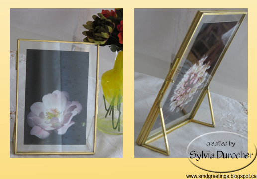
I found this float frame at the ReUse Center on the weekend as my niece visited.
I think there are wonderful photography possibilities for this object.
I have placed a couple of my 4x6 photos in for now.
Love the angles of the stand on the back side.
I picked up this puzzle at the same center. My niece spent an hour trying to solve it. She came really close.
I picked it up because of the clear pieces which will surely be nice for photography.
I did find a solution on-line so I could assemble it and it would be awesome in photos.
The sunset was wonderful tonight. I headed out a little late but I am happy with this shot.
Share Your Cup #311 hosted by Jann at Daily Cup with Mrs Olson.
I put together a Tupperware fruit tray including strawberries, cantaloupe, oranges and pomegranate.
Rounded out the selection with a variety of yogurt.
We collected yarn for a couple who does knitting for our Christmas Mitten Tree.
We had such a good time.


These books by Grace Livingston Hill have been on my bedside table recently.
Nice light romances in the early 1900s. I enjoyed the novels by Hill but the one by her aunt Aldon was not as great for me.
We have had an injection of new books for the WtomyKitchen library so I will clear some of these at our Mission Possible Sale at the beginning of November.
I found this float frame at the ReUse Center on the weekend as my niece visited.
I think there are wonderful photography possibilities for this object.
I have placed a couple of my 4x6 photos in for now.
Love the angles of the stand on the back side.
I picked up this puzzle at the same center. My niece spent an hour trying to solve it. She came really close.
I picked it up because of the clear pieces which will surely be nice for photography.
I did find a solution on-line so I could assemble it and it would be awesome in photos.The sunset was wonderful tonight. I headed out a little late but I am happy with this shot.
Share Your Cup #311 hosted by Jann at Daily Cup with Mrs Olson.
Labels:
0,
book,
cancelled,
float frame,
muffin,
puzzle,
sunset,
SYC,
WTMKitchen
Son in Law Card Order
I recycled a landscape element from a commercial card. I trimmed it close to the border.
I printed a custom greeting layer on a piece of textured card stock. I chose a green color to match the textured card base.
These were layered then adhered to the card front.
I added a gold star sequin in the bottom left hand corner held in place with a gold tiny brad.
Labels:
color printed,
gold star sequin,
green,
HB,
JD,
landscape,
recycled cards,
tiny brad
Wednesday, October 17, 2018
Christmas Card Gift Set
I have prepared a set of Christmas Cards for a friend who moved away and loves to give handmade cards.
I recycled a note card front into this card.
I added a blue green layer behind the tree image.
I punched a couple of holes in the top and ran a length of gold metallic ribbon through and knotted it in the front.

The Rejoice is a digital image I designed years ago. It was color printed onto white card stock. I added a gold sparkle star brad above the `j`. The image was spattered with silver ink. It was mounted onto a green card base.

A recycled card front mounted onto a purple card to pick up on the holographic image. Love the silver frame.
I was able to keep the greeting which was great.
This card features my Bethlehem digital. I printed it in dark brown onto a white card.
The star was printed on vellum and embossed with silver powder.
The edges were ripped and then it was folded over the edges of the card then adhered to the inside.

Another recycle card front with a white dove placed on a red card base. The greeting was printed in the top left hand corner.
I recycled a note card front into this card.
I added a blue green layer behind the tree image.
I punched a couple of holes in the top and ran a length of gold metallic ribbon through and knotted it in the front.

The Rejoice is a digital image I designed years ago. It was color printed onto white card stock. I added a gold sparkle star brad above the `j`. The image was spattered with silver ink. It was mounted onto a green card base.

A recycled card front mounted onto a purple card to pick up on the holographic image. Love the silver frame.
I was able to keep the greeting which was great.
This card features my Bethlehem digital. I printed it in dark brown onto a white card.
The star was printed on vellum and embossed with silver powder.
The edges were ripped and then it was folded over the edges of the card then adhered to the inside.

Another recycle card front with a white dove placed on a red card base. The greeting was printed in the top left hand corner.
Labels:
Bethlehem,
birch trees,
green,
Greeting Card Gift Set,
KVS,
purple,
recycled christmas cards,
red,
Rejoice
Monday, October 15, 2018
All Occasion Stack Class
I held my All Occasion Stack Class tonight.
I made a set of cards while the other 3 participants made their cards.
This card came from a full of Thank You cards. The gold scallop is sticker paper. The gold foil greeting was trimmed and holes were placed on the left and right with the Stampin Up slot punch. I ran the gold organza ribbon through the holes and knotted on the right hand side.
We had a great time and then a cup of tea and a bit of cake.
I made a set of cards while the other 3 participants made their cards.
This card came from a full of Thank You cards. The gold scallop is sticker paper. The gold foil greeting was trimmed and holes were placed on the left and right with the Stampin Up slot punch. I ran the gold organza ribbon through the holes and knotted on the right hand side.
We had a great time and then a cup of tea and a bit of cake.
Sympathy Cards
A wonderful man passed away quietly in his sleep last week. I spent many Christmas Eves with my sister and her husband`s family. His father was a great support to this kids and grandkids. The funeral is today.
This card is a 5x7 inch card on heavy card stock. It features a beautiful chokecherry tree leaf which was adhered to the card front in portrait orientation.
I added a blue greeting color printed and punched with the Artisan Label punch by Stampin Up. I used 3D foam tape to adhered it in the bottom right hand corner.

This card is for my brother - in - law`s sister which I have gotten to know over the years.
It features a pink rose photo which was cut to 3.5 x 4.75 inches and adhered to the front of a heavy card stock card.
I added a greeting in the bottom left hand corner created with a Word Window punchie glued to a green Modern Label punchie. It was adhered to the card front with 3D foam tape. The punchies were created with Stampin Up punches.
This card is a 5x7 inch card on heavy card stock. It features a beautiful chokecherry tree leaf which was adhered to the card front in portrait orientation.
I added a blue greeting color printed and punched with the Artisan Label punch by Stampin Up. I used 3D foam tape to adhered it in the bottom right hand corner.

This card is for my brother - in - law`s sister which I have gotten to know over the years.
It features a pink rose photo which was cut to 3.5 x 4.75 inches and adhered to the front of a heavy card stock card.
I added a greeting in the bottom left hand corner created with a Word Window punchie glued to a green Modern Label punchie. It was adhered to the card front with 3D foam tape. The punchies were created with Stampin Up punches.
Saturday, October 13, 2018
Decorative Paper Workshop
Earlier this year I developed a workshop on decorative paper for the gallery. I decided to provide the participants several techniques and papers to allow them a good variety of end result papers.
Work Surface
You need an impermeable surface onto which you will place your color. For the class I created pieces of heavy chipboard covered with freezer paper. I have used an acrylic plate. I recently acquired a piece of glass which I will us from now on. It is about 16x16 inches which allow me to make larger prints.
Color
I used liquid acrylic ink but any liquid color would work. My sister and I have used watercolor in the past. A pipette or eye dropper is used to drop ink onto your work surface. Consider the opaqueness of the color which will affect your end result.
Watercolor Paper
The ink on watercolor paper is the first one my sister taught me years ago. You lay color onto a non permeable surface then lay your watercolor onto it to produce a monotype print. The ways to enhance this technique is to add coarse salt which repels the color and creates these star type patterns in the color. The other is to cover the print with plastic wrap and allow it to dry. It creates more subtle patterns in the color.
Photo Paper
I done a lot of this type of decorative paper for the cards at the gallery. This is again a monotype print which is done with glossy photo paper. I use the 4x6 sheets which are often provided for free with printers. Each sheet is unique.
Card Stock
This sample was created with wax as the resist. The easiest way to apply wax to paper is with wax crayons. I have collected several white crayons which will allow you to have white space on your paper once color is applies. My sister created several clear paraffin wax crayons. Of course colored crayons will create a different look and the color options are endless. Consider the color combo when choosing your ink color. The sample above used a silver metallic crayon. It is again a monotype print with color on your work surface.
Wednesday, October 10, 2018
Card Exchange
I love this color combination. Yellow and black with silver which is not easy to see in the scan.
This is a sketch I have used before. I chose a black card base. I cut the yellow decorative floral card stock to 3.75 x 5.00 inches.
I cut a hole in it with the Stampin Up Decorative Label thinlits.
I tied a short length of black 1/8 inch satin ribbon on the right hand side then adhered it to the card front.
The greeting is color printed in black to match the card and punched out with the 1.25 inch circle punch. I added a 1 3/8 inch circle in yellow to coordinate with the color in the paper. I adhered the greeting layer in the center of the label hole. Added a quarter sheet insert.
The red card is the same sketch with a bold red and black checkered plaid. The red circle coordinates with the plaid.
These card are off to my card exchange friends.
This is a sketch I have used before. I chose a black card base. I cut the yellow decorative floral card stock to 3.75 x 5.00 inches.
I cut a hole in it with the Stampin Up Decorative Label thinlits.
I tied a short length of black 1/8 inch satin ribbon on the right hand side then adhered it to the card front.
The greeting is color printed in black to match the card and punched out with the 1.25 inch circle punch. I added a 1 3/8 inch circle in yellow to coordinate with the color in the paper. I adhered the greeting layer in the center of the label hole. Added a quarter sheet insert.The red card is the same sketch with a bold red and black checkered plaid. The red circle coordinates with the plaid.
These card are off to my card exchange friends.
Labels:
black,
bold plaid,
CCE,
circle greeting,
CST,
decorative paper,
floral,
plaid,
red,
satin ribbon,
SU Deco Label Framelit die,
yellow
Tuesday, October 9, 2018
Cardmaking - CH - Class 2
Style 3 - Square - The designer paper chosen is Stampin Up Autumn
Spice. The card color selected is Old Olive. The designer paper was
cut to 4 inches square. The edges were rubbed with an Early Espresso
ink pad. It was adhered to the card in a portrait orientation.
The buttons are from Stampin Up and matches the card color. I tied a length of Early Espresso thread through the button which was knotted and trimmed.
The greeting was color printed in Cajun Craze and clear embossed. They were cut apart to 1" tall. I ripped the top and bottom edge. It is held in place with Zots. Once placed the button was adhered with a large Zot to the left of the words of the greeting.
Style 2 - DSP Split - I chose cool colored designer papers. The 4 inch x 5.25 inch piece is cut at 3.5 inches then the 2 pieces are taped back together.
I added a piece of white grosgrain ribbon across the join and tape the ends to the back of the layer. I created an accent of silk flowers starting with a tiny pink handmade paper one on the white brad, then the aqua one, a raspberry colored one, then the final large white one. A hole was made through the designer paper layer with a push pin, the prongs were pushed through and the prongs spread apart on the back.
The layer was then adhered to the front of a deep burgundy card.
The greeting was printed on white card stock, punched and it was adhered to the
card front with 3D foam tape. The card works without a greeting as
well.
Style 1 - Ripped 4 inch - The designer paper is cut to 4 x 5.25 inches. It is ripped and the pieces are positioned to the edges leaving the orange card showing in between.
I chose a butterfly accent color printed and punched with the Stampin Up Decorative Label. The colors on this one is Tango Tangerine and So Saffron. This label is adhere to the card front with 3D foam tape.
I had 7 ladies in the class tonight. They had a good time. A couple of the girls had experience which was very nice.
Perfect as all kits are used and I can move onto another sketch for the next class.
The buttons are from Stampin Up and matches the card color. I tied a length of Early Espresso thread through the button which was knotted and trimmed.
The greeting was color printed in Cajun Craze and clear embossed. They were cut apart to 1" tall. I ripped the top and bottom edge. It is held in place with Zots. Once placed the button was adhered with a large Zot to the left of the words of the greeting.
Style 2 - DSP Split - I chose cool colored designer papers. The 4 inch x 5.25 inch piece is cut at 3.5 inches then the 2 pieces are taped back together.
I added a piece of white grosgrain ribbon across the join and tape the ends to the back of the layer. I created an accent of silk flowers starting with a tiny pink handmade paper one on the white brad, then the aqua one, a raspberry colored one, then the final large white one. A hole was made through the designer paper layer with a push pin, the prongs were pushed through and the prongs spread apart on the back.
The layer was then adhered to the front of a deep burgundy card.
The greeting was printed on white card stock, punched and it was adhered to the
card front with 3D foam tape. The card works without a greeting as
well.Style 1 - Ripped 4 inch - The designer paper is cut to 4 x 5.25 inches. It is ripped and the pieces are positioned to the edges leaving the orange card showing in between.
I chose a butterfly accent color printed and punched with the Stampin Up Decorative Label. The colors on this one is Tango Tangerine and So Saffron. This label is adhere to the card front with 3D foam tape.
I had 7 ladies in the class tonight. They had a good time. A couple of the girls had experience which was very nice.
Perfect as all kits are used and I can move onto another sketch for the next class.
Thursday, October 4, 2018
Harvesting - High Bush Cranberry Syrup
I was out to visit my sister yesterday which was a much nicer day than Monday. One of the tasks was to pick up the High Bush Cranberry Syrup she made on Monday. She picked 2 pails of them in the snow with gloves to keep her hands warm! We generally process them together but the berries were wet and she decided to just do it!
We have decided standardized our jars for preserving. She is using pint sized Mason Jars with Gem Lids which you see in the photo that hold 1.5 cups. I brought her 2 flats of them which I unearthed from my corner kitchen cabinet that have been sitting there since I moved years ago. I will be using the 1 cup tapered Mason Jar with Standard Lids. Those are the ones you see in the background of this photo.
I brought a few of the 1 cup jars back with me so I can make Chutney nearer to Christmas time.
Tuesday, October 2, 2018
Christmas Card Challenge - October - White Dove
I chose designer paper from a 12x12 glitter pad by My Mind`s Eye - Sweet Dreams - Holiday Avenue. I cut it to 4 inches tall and 5.25 inches wide and ripped the bottom edge.
I printed the greeting on white and ripped the bottom edge.
These were layered then adhered to the front of a deep warm blue card.
The dove was cut with the Dee's Distinctively - Dies - Dove Right. The extra wing was glued to the back of the dove. Then adhered to the card front on the designer paper. I added a few sequins to finish off the card.
Subscribe to:
Posts (Atom)