
#9

I decided to participate in the Inktober 2023 challenge. They published a daily prompt list which I did not have time to follow.
I have been inclined to try this medium for a while and when the I was made aware that there was a Flickr Group I could join, I did.
I have some permanent fine tip markers. I used 90lb watercolor paper for my first few pieces because that is what I had on hand. I pulled out what supplies I had and got started.
#1
.jpg)
I was always inclined to want to paint afterwards which why I used watercolor paper.
I laid out my wavy river lines then marked up the vertical and horizontal lines on either side.
I added dimension with the color.
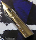
I knew I had tools I had used in the 1980s for calligraphy so I pulled those out. Turns out I had Speedball holders and quite a few calligraphy nibs most of which had a reservoir. I had picked up a small metal box of dip nibs recently so I pulled those out and cleaned them. There were a couple of straight dip nibs so I put one in a holder and tried it out. I did have several bottles of Daley Rowney FW Acrylic Inks in my stash as well.
#2

This is my next piece which was a straight steel dip pen nib and DR FW Purple Lake acrylic ink.
I was able to achieve quite fine lines, tiny dots and marks. Filling in the darker spaces was a bit challenging and the paper was not smooth enough.
The watercolor paper tended to lose bits of paper fiber that would get stuck in the nib.
Composition quickly becomes a challenge and I was just making marks at this point. I had check out a few videos on line.
#3

I used smooth 110lb white card stock I use for card making for this piece. That worked better with next to no issues with the paper surface.
Still using the Macleans Best Ever No.2 steel dip nib and a black dip pen holder.
It was not a very good composition. I chose just a small corner that I thought worked out pretty well.

#4

This is a dark green in the same brand as before and the red is a calligraphy ink.
The grasses I managed to make some very thin and other a bit thicker.
The composition when drawing something actual instead of abstract worked out better.
#5

More new colors was kind of fun.
I was wanting to fill a shape with patterns - not realistic but artsy.
Other than the wing I am happy with this one.

The Zebra G nib was recommended on line so I purchased one of those at under $3. I was looking for a black ink which I could then watercolor on top.
The Daler Rowney FW Acrylic ink was recommended on sale about $7. I had to leave it dry completely before watercoloring over it.
Now, I wanted a paper I could use. After considering that I am a beginner and a $70 pad of paper was out of the question I settled on a Canson pad for fluid mixed media. The pad was also on sale for just about $9. I went home with supplies for about twenty dollars which I hoped would help advance my art pursuits.

I also found on line a video that recommended a container of alcohol to clean your nib as you were drawing. I chose an old film container as it seals tight. I use put in enough to the depth of my nib.

That is the Zebra G Nib installed ready to go.
#6

I divided the page into 4 pieces with score lines which would make a manageable amount of space to fill.
I looked at several owl line drawings on line and composed one of my own using aspects of the ones I had found.
I am happy with this drawing.

I painted a light wash over the whole piece then added color to the owl.
I love the yellow eyes and dark wings. Of course, the color is just out of my head.
I mixed all my colors mostly and used some black gouache to darken some of my colors.
#7

Here's my next composition. I drew a meadow with a tree, flowers and a little mushroom. The original was rectangular but with more flowers on the right hand side so I just cropped it to square. I had to lose a bit of the tree to keep the mushroom which of course was necessary.
It was then painted. Again an overall light wash so I don't have a white background. Blue to the top and green to the bottom.
#8

I found this one quite dark as all the patterns are quite heavy.
It has been fun to work on these projects, learn something new, be inspired to draw and get the right tools and supplies to have some success at it.
I will make more projects and look forward to Inktober in 2024.
You will find number 9 at the top of the post. This is a smaller version of the owl for the Macro Monday challenge I do every week. The theme was spooky but the limitations are that the piece photographed can only be 3 inches. I scaled down my first one which was about 4 inches tall down to 3 inches. I did not capture the ink drawing before I painted it. I was on a deadline and missed a step. That is how it goes. Then photographed the painting with dramatic light and I think it did Spooky really well.
No comments:
Post a Comment
Thanks for visiting. I love to read your comments.