Showing posts with label Brilliant Blue. Show all posts

Wednesday, June 5, 2024

Cards - Christmas Snowflakes

This background paper is wrapping paper.  I liked the color scheme so I brought it home from ReUse despite having too much designer paper already.

I cut it to leave a border on the A2 card of SU Ballet Blue card stock. 

I cut the snowflakes with the Stampin Up Snow Flurry Bigz die from white and Tempting Turquoise card stock. 

The solid circle is punched with the 1.75 inch punch.  These were layered and aligned along the left hand side of the card.  All held in place with a white mini brad.

Full half sheet blank insert with a white envelope.

This card features a SU Lovely Lilac textured A2 card base.

A background of lovely mosaic purple toned wrapping paper.

I cut the snowflakes with the Snow Flurry Bigz Die.  Punched a circle of 1" from the same card stock as the card base.

All held in place with a mini brad in a warm purple color.

I added a banner along the bottom edge from the card base card stock.

I may add a greeting later.

Full white insert to cover the brad tabs showing on the inside of the card.  White envelope to finish.

This was very versatile paper because I made 4 cards with 4 different colored card bases.

This card base is Orchid Opulence in an A2 size with landscape orientation.

I cut the snowflakes with SU Snow Flurry Bigz die.  The middle snowflake was cut from Pacific Point card stock.

These are all held in place with a purple mini brad.

I complete forgot that I would use silver on some of these cards. It is what it is.  

Full half sheet insert and white envelope.

The card base on this card is Bashful Blue in an A2 size.

I cut the snowflakes with the Stampin Up Snow Flurry Bigz die.

The smaller snowflake is Brilliant Blue and the stack of die cuts are held in place to the card front with a snowflake specialty brad.

I added a strip of the card color under the snowflake stack.

Full half sheet insert and white envelope.

Glad to have a few Christmas cards in my box as it is nearly half way through the year.

Happy with these.

Tuesday, May 7, 2024

Cards - All Occasion - Watercolor

Another set of cards while I wait for the drywall mud to dry.

I chose to make some watercolor background paper early this morning. I used liquid mixed media paper.

Once it was dry and flattened I cut it into pieces. This is 4.00 x 5.25 inches. I chose to loosely trace some flowers. I then painted them with watercolor. These are blue.  Once dry again, I outlined in black permanent marker.

I chose a SU Brilliant Blue A2 card base.  I adhered the watercolor with double sided tape, added a white insert and a white envelope.

Ready to press under books overnight.

I drew a meadow and tree with a 4H pencil then watercolored the image. 

The blue horizon line was on the background paper so I had to work with it.

I painted the stems then added the flowers a bit later.

Once all was dry, I outlined a few things with the black permanent maker and added the birds in the sky.

I mounted the watercolor to a SU Groovy Guava A2 card base.  Glued a white quarter sheet insert and pulled a white envelope.


This was the left over piece from the watercolor background I made this morning.

I started by adding a light blue wash across the whole piece to cut down the white spaces.

I then used a plastic doily to create some marks but I was not as successful as I had hoped. My brush was too wet in places.

I then used a bottle cap dipped in the dark blue watercolor to add some circles keeping it to odd numbers. 

Once I added yellow to 2 of the circles then I cut a length of yellow grosgrain ribbon and mounted diagonally across the piece.  Still need something so i went to my brad stash and found this yellow postage stamp brad.  

That was what it needed.  I chose a SU Summer Sun A2 card base, added an insert and an envelope and it will join the others under books overnight.  

Sunday, November 5, 2023

Simple Sentiments - Photo - Set 4

I chose a Stampin Up Chocolate Chip A2 card base.

I cut a piece of Summer Sun with the Tim Holtz Cabinet die.  I used the Stampin Up Slot punch to make two slots in the round end of the die. 

I adhered the photo to the die cut then pulled the ribbon through then around the card front and back to the front.  This is a Pumpkin Pie colored ribbon.  

I then adhered the die cut layer to the card front. I pulled the ribbon taut making sure it was not twisted on the inside of the card. I knotted the ribbon and trimmed the ends. An insert and an envelope.

These photos are from my Gentle Glow Calendar. Love the bokeh backgrounds.

Here is a House Finch in the late fall with no leaves on the trees.  I chose Sahara Sand for the Cabinet diecut.  

The card base is Cajun Craze and the ribbon matched so well. It is a beautiful soft ribbon. I just had a short length so I don't know where it came from.  I am down to my last couple sheets of this great color.

Again, slots punched, ribbon threaded through, knots made and the diecut layer adhered to the front.  Quarter sheet insert and envelope.

This is a photo of the top of a metal bistro table taken at the Muttart Conservatory.  Turned out wonderful.  I love the texture and the highlighted edges of by being used over and over by customers.

I used a Brilliant Blue card base and a piece of Smoky Slate card stock for the Cabinet die cut. The ribbon is Night of Navy seam binding.

A quarter sheet insert and white A2 envelope.


Some sweet Common Conecap mushrooms taken at the park down the street.

I chose a Creamy Caramel card stock for the card base.  A Garden Green piece for the Cabinet die cut.  A piece of beige seam binding found in my box.

The assembly as previously described and it was done.  These were fiddly to assemble but I think it was worth it.

A quarter sheet insert and a white envelope.

Saturday, November 4, 2023

Simple Sentiments - Photo Set 3

Another set.

This card features a Barn Swallow taken at the Lois Hole Provincial Park. Check out those ruffled feathers.

I started with a Stampin Up True Thyme card base. I added 3 .75 inch wide card stock strips in Very Vanilla, Not Quite Navy, and Really Rust.  They were adhered then I cut flag ends on them.

The photo was adhered on top of them.  Just love these warm tones.

This features Grape Hyacinth taken at the St. Albert Botanic Park. 

Brilliant Blue textured card stock with three color coordinated strips of card stock with flagged ends.  

Soft Suede, Lavender Lace and Gable Green.  These were adhered to the card front, trimmed then the photo was adhered over top.

White quarter sheet insert and a white A2 envelope.


These are Grey Partridges which I found at Patricia Lake. My one and only time seeing these birds.

I chose a True Thyme card base with strips of Chocolate Chip, Dill and Dusty Durango.  The strips were adhered to the card front then cut with flag ends.

The photo was adhered over top.

A white quarter sheet insert with a white A2 envelope.


A  light pink rose softly tinted rose with hints of a darker shade. This is likely taken at the St. Albert Botanic Park.

I chose a Pixie Pink card base and card stock strips in Chocolate Chip, Lavender Lace and Gable Green.  The strip ends were given flag ends and then the photo was adhered over top.

These made great all occasion cards. Birthday, Thinking of You, Thank You or any other reason for expressing ourselves to others in a tangible way.

Quarter sheet insert and envelope.

Wednesday, August 24, 2022

Watercolor - Blue and Yellow

A belated birthday card for my friend.

I was away last week taking care of Mom when the date went by.

I created a soft blue and yellow background wash which I allowed to dry completely. 

I chose tulips and daisy like flowers for this watercolor.  I placed my blue flowers a little too far to the edges for a perfect composition but I am still happy with it.  Mixed a warm green for the foliage. Added a bit of blue spatter.

I trimmed the watercolor once it was dry.  I chose a Brilliant Blue card base. I added the blue ribbon along the bottom half of the watercolor over the stems and leaves.  I added a blue greeting punched with the SU Modern Label punch, adhered with 3D foam tape.

I will get it to her shortly.

Tuesday, August 16, 2022

Watercolor Cards - Butterflies

I worked on more watercolor cards this week.

I needed a sympathy card and I have found that butterflies are a great symbol for that occasion.

I drew a basic butterfly outline that I will be able to use then adjust the shapes of the wings as I choose.

I again cut a long strip of 140lb water color paper and taped it to my desk.  I applied a light coat of color across the whole piece and let it dry.

Once dry, I cut it to 4" wide pieces then added my elements.

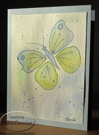
Here I have put the butterfly on the right and filled the wings with mostly lines.  I used a blue, yellow & green color scheme.  I added some color below the butterfly to make the bottom a bit darker which helps to ground the composition.

Once, dry I spattered a bit of blue and let that dry again. Trim the piece to it's final size and adhered it to a card base of Bordering Blue.

I created this butterfly with just lines in the wings put down with a Faber-Castell Ecco Pigment Black pen in size.4.

Painted with some pink, purples and blues.

Again, I added some additional color in the bottom left hand corner to ground the composition.  

A bit of purple spatter.

I believe the card base is Brilliant Blue.

Really loving the subtle colors in these cards.

I used my Lowe-Cornell watercolor palette.

The blue one will be mailed out today for a friend who lost her husband last week.  They have been married for over 70 years.


On this bulrush card I just lightly drew a rough composition with a pencil.  Started with my horizon line, added the sun, then the bulrushes.

I have a brown in this palette so I did not have to mix it but just darken it a bit.

I mixed a warm green for the bulrush leaves.

A warm golden yellow for the sun and some blue for the water.

I had to make decision about whether the bulrush stems were in front or behind the leaves.

Once dry I added a bit of yellow above and below the sun to have the sun glow.  This worked out very well this time.

Once trimmed I mounted it on a card base of Crushed Curry.

Each will get a blank quarter sheet insert and a white envelope.

Sunday, May 1, 2022

Christmas Card Challenge - Watercolor - Bethlehem

I was going to use salt to create the stars in the sky but when I looked for the coarse salt it was no where to be found.  I had to settle for Pearl White Acrylic paint.

This is the first one which I used Silver Sharpie for the star which did not do what I wanted.  I did the others in a fine tip Black Sharpie.

I added a tiny silver star brad in the center of the star to adhere to the card stock and repeat the star shape.

I used several colors of watercolor - a deep blue and a blue red so I achieved some purple backgrounds as well. I taped down the watercolor paper to the board to ensure they would dry flat.

Once dry, I placed them on the light table and traced my Bethlehem drawing in black marker.   They were spattered with the white paint and allowed to dry overnight.

I had cut the water color paper with extra so I could  could trim them to the 4.00 x 5.25 inches I needed. 

I chose card stock color to coordinate with the background.  I adhered them to the card front with double sided tape and the brad and pressed them over night.  I then added a seasonal insert and white envelopes.

I used 
Brilliant Blue,
Night of Navy,
Rich Razzleberry and 
another purple which was not Stampin Up for the card bases.

I still would like to try the salt technique so I will pursue the supplies for that.

Happy with cards.

Wednesday, September 1, 2021

Exchange Cards - Blue Wash

I am using up supplies from old kits.  I had the blue card base, the white silk flower, the metal flower, the brad and silver ribbon.  

I needed a new background and some sort of greeting.

I found a couple of pieces of the Blue Wash designer paper which matched the Brilliant Blue card base so that was trimmed to leave a small border.

I taped the ribbon to the back and across the front and again to the back. I found the greeting in my Stampin Up box.  I aligned the flowers to the left of the greeting and adhered these layers together.  I then adhered this layer to the card front.   I then trimmed the greeting to the card edges with scissors.


I used similar supplies for this card. 

I needed a flower diecut which had 6 petals. After perusing my stash of dies, I used largest flower from the Sizzix Flower Layers and Leaves die and some heavy card stock.   I colored it with a bit of Brilliant Blue reinker in watered down and brushed on.

I added the ribbon across the designer paper and then adhered the three flowers with the tiny brad over the ribbon. 

I stamped the greeting on the same heavy card stock, ripped the top edge and soften it with a bit of water. Adhered with double sided tape.

These are headed out to my exchange partners.


Wednesday, March 18, 2020

Exchange Cards

I decided on hexagons for this month's exchange cards.

They are cut with the Spellbinder Nestabilities set.   I chose a true blue card base in the landscape orientation.

I added a length of red grosgrain ribbon wrapped toward the top of the card.

I added 3 blue hexagons adhered along the ribbon.  I chose one red hexagon and a greeting.  The greeting is color printed and punched with the Stampin Up Modern Label.

I chose a kraft gate fold card base and included an ivory insert.


I used the Stampin Up Wonder Watercolor crayons to add some texture to the card front.  I used Riding Hood Red, Always Artichoke and More Mustard.  The color was applied with a natural sea sponge.

I mounted 3 hexagons with the adhesive on the left hand side so the card will still open.  They were cut from warm tones card stock.

These are off to my card exchange partners.

Friday, April 29, 2016

Note Cards - Wonderful Wings

This is a stash busting opportunity.  Pulling 4" wide remnants of designer paper are pulled from the stash.

I cut the piece of designer paper from Fancy Pants - Summer Soiree - Beach House by Michelle Coleman with wavy decorative scissors.  It was placed in a wide landscape orientation on a yellow card. I produced the butterfly accent with Stampin Up Wonderful Wings stamp set in Blue Bayou on Whisper White card stock. It was then punched out with the Decorative Label punch. The accent is adhered over the split in the designer paper with 3D foam tape.

On this card, the same layout and butterfly on a decorative label punchie.  The designer paper is warm in tone with flowers and circles.  I selected white card for this paper.


On this card, the same layout and butterfly on a decorative label punchie.  The designer paper is warm in tone in soft watercolor pattern.  I selected warm blue card for this paper.  The butterfly accent has no frame.


On this card I chose Stampin Up Brillant Blue for the butterfly accent.  The card is white, the designer paper is ripped and the orientation is tall portrait.


Wednesday, October 29, 2014

R2G Card Kit - Prince of Peace

I worked are card kits for my up coming classes today.  These are SU Style cards.  I used the Prince of Peace stamp which was sold as a single stamp. It fits into the Deco Label Framelits.

I decided to make some cards in cool colors and other in warm colors.

For the cool set I chose Brilliant Blue for the card base and Whisper White for the embossed layer as well as the stamped die cut.  The stamping was done in the same color as the card. I traced the edges of the die cut with a matching marker. I added an aida ribbon in red as well as a silver metallic ribbon which had the bottom end flagged.  I used the Pretty Print embossing folder.  The die cut was adhered to the card with 3D foam tape.

For the warm set I chose Ruby Red for the card base and Very Vanilla for the embossed layer as well as the stamped die cut. The aida ribbon was green and the metallic ribbon gold.