Showing posts with label More Mustard. Show all posts

Thursday, September 11, 2025

Watercolor Card - Landscape

I whipped up some waterolor paper this morning.  I used 140lb cold press paper measuring 11x15 inches.  Fortunately, I unpacked my glass shelf and a couple of plastic craft work sheet and taped the paper down.

I decided to use some Stampin Up reinker in water based dye ink which works the same as watercolor but will match the card stock I have.  I chose Always Artichoke, Only Orange, Baroque Burgundy. 

I used regular salt on one sheet, coarse salt on another and cling wrap on other.

I trimmed the watercolor paper after I decided what my bottom layers were going to be. I chose deep green card stock, deep red card stock and More Mustard card stock.  Ripped the top edges and layered them front to back and then taped the back with clear tape. I trimmed the watercolor paper to fit just below the top edge of the accent. I adhered it to a More Mustard card base in the A7 size. I adhered the ripped paper accent to the bottom of the card. With the scrap of green I cut a Sizzix Pine Small which I inked the edges with Always Artichoke ink pad. I then glued it in place ont the right hand side. I punched a 1 inch circle from Summer Sun card stock and adhered it on the left hand side. I then used the watercolor I had used this morning and painted with like colors to help it blend in the sky. I added 3 birds with my black Micron marker.

I put it to press for several hours. I gave it a white insert and a warm yellow envelope. I will see her tomorrow! Yeah!

Sunday, March 30, 2025

Cards - A7 - Die Cuts

Another few cards today.  Again, A7 (5.25x7.25 inch) envelopes.

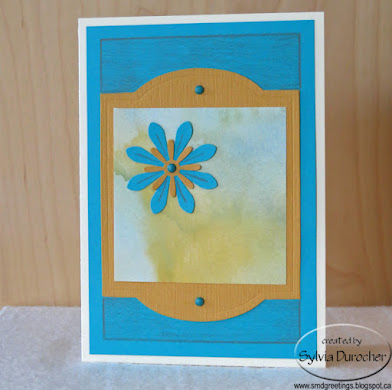
I started with an ivory card base.  I cut a piece of textured turquoise card stock to leave a small border.  

I cut a Tim Holtz Cameo Frame die cut from left over Stampin Up More Mustard card stock from yesterday's session. Trimmed a piece of watercolor designer paper to fit the middle of the die cut. 

The floral accent is a large daisy punchie in turquoise, topped with a small More Mustard one held in place with a turquoise mini brad. 

The cabinet die cut was then adhered to the turquoise layer with 2 more blue mini brads top and bottom.

I added the finishing border with a warm grey colored pencil and also added lines on the large daisy die cut.  A white insert and an ivory envelope to finish it off.

For this card the base is SU Tempting Turquoise card stock in 12x12. 

I used the negative piece from the Cameo Frame die cut to layer onto the card front leaving a tiny border. 

I placed a piece of the watercolor designer paper behind the More Mustard layer. 

I cut a Sizzix Leaf Stem die cut from warm green card stock then embellished it would pencil crayons. I cut a couple more leaves and added them below the opening.

I added a pencil crayon line along the inside of the die cut in a warm grey.

A white insert and an ivory envelope were added.

For this card, I chose a warm green card base. 

I ripped left over card stock in the More Mustard and the Tempting Turquoise and layered them with a piece of the watercolor designer paper.

I cut a flower with the Sizzix Flower Daisy #4 die from turquoise card stock.  I glued it to the front of the card with Scotch Quick Dry adhesive.

I added some texture to the flower with colored pencils. 

I mounted a tiny button in the center of the flower with a Bling Zot.

A white insert and an ivory envelope completes the card.

Saturday, March 29, 2025

Cards - A7 - Florals

I needed a distraction today so I put my hands to making some cards for my stash.

I found some A7 (5.25 x 7.25 inches) envelopes which were free when received so nice to destash.

The floral designer paper I chose is by Anna Griffin in this grey brown color cut to about 4 inches. 

The dark layer is some Early Espresso in Co-ordinations style which means it has a colored core and folding the card stock reveals that color so I used it for the layer and band instead.

The script paper at the bottom designed by Blue Fern Studios - Paisley & Vine - Bohemian. 

The card base is Stampin Up Sahara Sand.  A white sheet insert and ivory envelope.

This card has the same components.

I cut the floral paper to leave a large board all the way around then cut a Early Espresso layer leaving a narrower border.

SU Sahara Sand is the A7 card base used in the landscape orientation.

I cut a band of the dark brown card stock and flagged the end. Using 3 ivory mini brads I adhered it to the 2 other layers.

This full layer was then adhered to the card base with double sided tape.

A white insert and an ivory envelope.

For this card I chose a Stampin Up More Mustard card base to fit in an A7 envelope.

I cut the floral designer paper by Anna Griffin in the mustard color to leave a wide border all the way around.

I layered a piece of Early Espresso card stock behind leave a narrow strip on the left and right sides. These were adhered to each other with double sided tape.

I cut a strip of the dark brown card stock and then added 2 Stampin Up Five Petal punchies in the dark brown and the More Mustard colors with a tiny flower punch in the center all adhered to the layers with a More Mustard mini brad. 

A white insert with an ivory envelope.

A Stampin Up More Mustard base to fit in an A7 envelope.

The Early Espresso but to leave a small border all the way around and the mustard floral by Anna Griffin cut a bit smaller to provide an even brown border on all sides.

I added a band running top to bottom on the left hand side of the floral piece.

I punched a Martha Stewart butterfly punchie in More Mustard and adhered it to the 2 previous layers with a yellow mini brad.

This was all adhered to the card front in the landscape orientation.  White insert and an ivory envelope. 

Saturday, December 2, 2023

Christmas Cards - Watercolor - Siblings

I made some special watercolor ornaments to put on my siblings Christmas cards this year.  This is the first year that Mom and Dad are both gone. We are getting together early December for a get together which is close to what would be Dad's birthday. 

This is an ornament I designed myself.  You can read more about the process here.  The ornaments were cut out by hand.

All the designs were hand drawn then I used a permanent black marker for all the outlining.  

I used my Stampin Up Watercolor Wonder Crayons for all the painting. The background is watercolor paper with a mixture of Always Artichoke and Garden Green.  I painted a wash on a couple of 9x12 sheets of wc paper.  I made it a bit darker at the top and lighter at the bottom. I did put salt on but it was not wet enough to produce much of an effect. When dry I added a spatter of Always Artichoke.  Once cut to the 4.00 x 5.25 inches I pained the branch and I spattered the pieces with Always Artichoke. 


The ornament has a Bethlehem Star in the night sky colored with More Mustard.  Some Elegant Eggplant and Night of Navy for the sky. On the snow banks in the foreground I used Marina Mist for the wash and Night of Navy for the contours.  Always Artichoke for the tree.

The card base is Elegant Eggplant.


A full moon in the night sky.  The moon is colored with Daffodil Delight with a light wash of Night of Navy for the sky.  I drew a house on the hills with was colored with Ruby Red and More Mustard for the windows.  Elegant Eggplant for the hills.  

The card base is Ruby Red.


This one features a sunrise which I had experience drawing when I did my glass art piece for the window a couple of years ago.

The sky is a light wash of Tempting Turquoise with the sunrise rays being first wash of Daffodil Delight, then More Mustard closer to the center then Tango Tangerine at the center. The hills are a combination of Garden Green, Always Artichoke. 

The card base is More Mustard.


I decided on a water theme for this one and drew a light house.  The sky is a light wash of Tempting Turquoise.  The lighthouse and rocks are done with a light wash of black gouache. The sea is Night of Navy.

The card base is Basic Grey.


This one here is a Christmas flower but I would not go so far as saying a poinsettia.  It turned out like a sunflower in the shape.  The ornament is Tango Tangerine wash.  The flower is a mix of Ruby Red, Bravo Burgundy and Cherry Cobbler.

The card base is Ruby Red.


This one features another Bethlehem Star in the night sky.  The star is More Mustard with a light wash of Marina Mist for the sky.  The mountains are 3 gradient washes of Elegant Eggplant.  Tiny black marker dots in the sky with a touch of More Mustard.

The card base is Elegant Eggplant.


This one features a large star in the center of the ornament.  I did trace the shape from the Stampin Up Star thinlit set, using the smallest one.

The star was washed in Daffodil Delight all over then one half of the points was painted with More Mustard. The ornament is a dark wash of Night of Navy.

The card base is Night of Navy. 

Tuesday, September 12, 2023

Card - Watercolor - Yellow Cosmos

I painted this yellow cosmos for my niece's birthday card.   

I found an image on line just to give me an idea about their foliage.  I did a bit of a pencil drawing to start.

I used my Stampin Up Watercolor Wonder Crayons. I did a light wash of blue with Tempting Turquoise and a light wash on the bottom half with Old Olive. Once I had my first light color on the flower and the stem then I erased about 50% to leave just a very light line.

I used Daffodil Delight for my first light layer on the flower and Pear Pizzaz on the stem. I then added definition on the cosmos with More Mustard and Always Artichoke on the stem.

I added some very light stems on the bottom just so the flower was more grounded. 

I mounted the watercolor with double sided tape to a 5x7 card of Hello Honey.  I was a little short on the bottom so I added a length of  Washi Tape in More Mustard.  It rips very easily so I need to use this up so that its gone!

Thursday, July 6, 2023

Cards - July Birthdays

 This is a birthday card for my sister who celebrates a birthday this month.

I chose a piece of watercolor paper I colored up a while back with playing with my Stampin Up Watercolor Wonder Crayons.  It was 9x12 inches.  I chose to cut it with the Tim Holtz Vintage Cabinet Card.  I mounted a layer of silk flowers filling in the top half circle of the die cut. I chose a large oen with warm toned ends, then a pink organza one and then a small ivory one all held in place with a gold mini brad.

I added a pink Modern Label punchie topped with a Word Window punchie with the greeting.  This was adhered below the flower on the diecut with 3D foam tape.

The diecut was adhered to the Lucky Limeade green A2 card base.

A white quarter sheet insert was added to the inside.

With the other half of the watercolor sheet I cut a Tim Holtz Cameo Frame. 

I chose to highlight the bit of yellow towards the bottom of the diecut and so cut big H and B with the Stampin Up Typeset Alphebet dies in Crushed Curry.

I traced the rest of the words with a More Mustard marker.

I added 2 gold glitter star brads to the left of the B.  The diecut was then adhered to the Lucky Limeade card front of with 3D foam tape.

A white quarter sheet insert was added.

This is for my nephew whose birthday has already passed but that's okay I was in touch by email.

Friday, June 16, 2023

Card - Watercolor Pansies

This is a card for my sister.  She celebrates her birthday soon and I wanted it in the mail so it arrives on time.

I found a coloring book page on line to help me with the line drawing of these flowers.

I used Stampin Up Wonder Watercolor Crayons so it would match with the card stock I selected.

The colors are Night of Navy, Elegant Eggplant, Daffodil Delight, More Mustard, and Always Artichoke. Once painted and dry I outlined the image with a fine Micron permanent black marker.  It pressed overnight under several heavy books.

The back petals are a mix of Navy and Eggplant, the center ones are EE and the front one is Daffodil with darker marks with More Mustard. Put a pale background with Night of Navy on the top and Always Artichoke on the bottom.

I chose to trim the watercolor piece to 3.75 x 5 inches. I taped a couple of lengths of grosgrain ribbon in the AA and EE to the back of the watercolor. Brought them forward and held in place with double sided tape and trimmed the ends on an angle. This was adhered to an Eggplant layer leave a small border.  Then that was adhered to the Always Artichoke A2 card base.

Monday, April 24, 2023

Card - Retirement and Moving


I made a card for my friend who is moving away to be close to her daughter. She has had health challenges in the last few years.  Her husband has now retired and they are looking forward to a new life in this new chapter.  

I found a landscape graphic on line and a drew this composition from it.  I wanted to have a road into the distance with a prairie landscape as they move one province to the east.  They will be close to grandchildren and family. 

I drafted the composition with pencil and I used my Stampin Up Watercolor Wonder Crayons.  I started with a light wash of light blue all over the piece of paper. I then painted the horizon line of trees. I laid a light layer of Always Artichoke. Of course, I needed it to have a yellow field which can be wheat, canola, barley, etc. I created a brown color for the road and painted it.  I had to be patient and used my heat gun to dry the layers before I moved to add dark elements to the sky, trees, road and yellow field. I love the pink flowers along the edge of the field.  Here in Alberta they would be roses but they don't bloom when the fields are yellow but it's my picture so I put them in.  It needed to have a gorgeous sun and a blue sky. 

Once I had my painting I scored a sheet of Baja Breeze card stock into a half sheet card.  I trimmed the edges to make sure it fit into my envelope.  It needed an anchor so I chose a length of Taken with Teal velvet ribbon and a wrapped on the inside of the card and brought the ends to the card front and taped them down.  I adhered the painting with 3D foam tape to allow space for the ribbon.  I pressed the card under heavy books for a few hours.  I added a white half sheet insert onto which I wished them both a happy new chapter in their lives.

Sunday, April 23, 2023

Card - Thank You with Bees

I made a card for my niece who passed along a great deal on a Janome Serger earlier this year. After a servicing it has been working really well. 

I wanted a card with warm tones. I found a bee graphic on line that I liked then transferred some of the elements to watercolor paper.

I watercolored the background in a light shade of Daffodil Delight. The image was painted with Daffodil Delight and More Mustard. Outlined the elements with dark grey watercolor and a fine brush.  I then created a few shadow hexagons around the outlined ones which I think worked out really well.

Once dry, I mounted the painting onto a Summer Sun card in the A6 size (just a bit smaller than half sheet size).  I placed a piece of narrow stitched grosgrain ribbon in Basic Grey around the inside of the card and taped the ends to be under the watercolor layer.  I added a Modern Label punchie greeting with a yellow offset with a grey greeting on white.  I watercolored the white punchie to be just a little less stark.

Sunday, September 11, 2022

Fall Leaves Birthday Card

Another watercolor card.  This lady is a warm colors lovers so I decided on fall leaves for the image on the card.

I found several fall leaves line drawings on line then created an image which I drew in pencil.

I then used my Stampin Up Watercolor Wonder Crayons to produce some colors for these leaves. Bravo Burgundy, More Mustard, Cajun Craze, Always Artichoke featured in the colors.

I placed a wash of color from the reds to greens to yellows on the 140lb watercolor paper.

The leaves are red with a mixture of some of the other colors.

I mixed some Payne's Gray and some left over color to do the lines in the leaves and tracing the outline of the leaves.

Once the watercolor was dry, I chose a Soft Suede card base in A7 size (5x7) and adhered it to the card front with 3D foam tape.

The greeting is SU Artisan Label punchie color printed and backed with a More Mustard punchie cut in half and glued offset on the back.  It was then adhered to the card front with 3D foam tape.

Sunday, May 8, 2022

Mom's Day Card

I painted a blue daisy flower for my Mom's mother's day card.

Her favorite color is blue.

I used a piece of 140lb rough water color paper measuring approximately 4.25 x 5.5 inches.  I sketched it lightly with a pencil and then painted it with my Stampin Up Wonder Watercolor  Crayons.  Using Marina Mist as the main color with some Night of Navy and some Not Quite Navy.   The leaf colors were Always Artichoke and More Mustard.  The center is More Mustard.

Once completely dry I traced around the flower and leaves with a black permanent marker. 

I mounted the flower onto a half sheet card of Marina Mist card stock.   I added white and medium blue seam binding below the flower by punching a slit in the fold then wrapping them around the card front and knotting in the front.

A white insert was added to the inside.


Saturday, July 31, 2021

Birthday Cards - Big Cards for Big Birthdays

This is a half sheet card meaning it measures 5.5 x 8.5 inches.

I started with a Very Vanilla card base.

I chose a sheet of designer paper from Springtime Vintage Series.  A lovely blue and ivory small floral print.  I cut it to leave a small border.

I added a piece of Baja Breeze Stitched Grosgrain ribbon to the top third of the card and taped the ends to the back.  It was then adhered to the card front.

I color printed a greeting on Very Vanilla card stock and cut it with one of the the Deco Label Framelits.  I then cut a textured Baja Breeze one as well.  I cut that in half and adhered them to the back of the greeting offset for the color to show.  It was adhered with 3D foam tape.

I added 3 pearl buttons in the bottom right hand corner adhered with small Zots.  A nod to the seamstress that my Mom is.


I started with felt finish printed card stock from Authentique - Remberance Collection - Remberance One.

It is printed in burgundy on warm white so I decided to just watercolor the flowers on the piece I had cut leaving a small border.  I chose More Mustard for the flowers and Always Artichoke for the leaves. This was great fun!

I added a twill ribbon of Bravo Burgundy topped with a grosgrain ribbon in More Mustard.  These were adhered to the back of the layer then adhered to the Bravo Burgundy card front.   I printed the greeting on Very Vanilla card stock and ripped the top and bottom.  I adhered it with 2 More Mustard mini brads.  This one is for my Aunt who celebrates a special birthday later this summer.

Sunday, July 18, 2021

Balloon Cards

I painted some balloons with watercolor.  I chose my Watercolor Wonder Crayons from Stampin Up to match the card stock I am using. 

I did draw a slight image to follow in pencil on heavy white card stock.  

I chose Always Artichoke green, More Mustard yellow and Bravo Burgundy with Cherry Cobbler red for the balloons.  

I added strings with a black permanent marker once the piece was completely dry and pressed flat.  I signed the art as well. 

I added a length of Bravo Burgundy grosgrain ribbon across the bottom o the card with ends taped to the back.  

I added a Modern Label punchie color printed greeting with a More Mustard offset to match the card base in the same color.  This was adhered with 3D foam tape.


Another balloon card.  I chose Old Olive, More Mustard, Not Quite Navy and Real Red card stock for the balloons.  

I cut them out of scraps of cardstock with my Create Cricut electronic cutting machine using the Create a Critter cartridge.   I cut them at 3", 2.75" and 2.5" inches.  I tied black thread onto them for strings.  I added white highlight spots on each of them with a white opaque marker.

Added a piece of sky designer paper which I warmed up with some warm yellow chalk pastel applied with a stipple brush and adhered to the front of an Old Olive 5x7 card base.  I then assembled the balloon bouquet with the ones farther back adhered to the sky paper, then the next ones with 1 layer of 3D foam tape then the small red one in front with 2 layers of 3D foam tape.   This adds depth to the composition.

I taped all the string to a central spot.

I added a ripped color printed greeting over the strings with 3D foam tape.

Tuesday, September 18, 2018

Card Making - 3 Styles

When designing cards for this class at Compassion House I chose versatile designs where different paper, card stock and accent would create a different card.

Style 1 - Ripped 4 inch - The designer paper is cut to 4 inches square.  It is ripped and the pieces are positioned to the edges leaving the yellow card showing in between.  I chose a butterfly accent color printed and punched with the Stampin Up Decorative Label.  The colors on this one is Old Olive and So Saffron.  This label is adhere with 3D foam tape.


 Style 2 - DSP Split - I chose warm colored designer for fall cards.  The 4 inch x 5.25 inch piece is cut at 3.5 inches then the 2 pieces are taped back together.

I added a piece of ivory grosgrain ribbon across the join and tape the ends to the back of the layer.  I created an accent of silk flowers starting with a tiny yellow handmade paper one on the gold brad, then the orange one, another yellow, a deep rust one then the final large yellow one.  A hole was made through the designer paper layer then the prongs spread apart on the back.

The layer was then adhered to the front of a deep brown card.

The greeting was printed on tan card stock and it was adhered to the card front with 3D foam tape.  The card works without a greeting as well.


Style 3 -  Square - The designer paper chosen is Stampin Up Autumn Spice.  The card color selected is More Mustard. The designer paper was cut to 4 inches square.  The edges were rubbed with an Early Espresso ink pad.

The buttons are from Stampin Up and matches the card color. I tied a length of Early Espresso thread, knotted and trimmed.

The greeting was color printed in Cajun Craze and clear embossed.  They were cut apart to 1" tall.  The end was flagged with scissors.  It held in place with Zots. Once placed the button was adhered with a large Zot to the left of the words of the greeting.

Monday, November 9, 2015

Ready2Go Card Kit - SU - Bright & Beautiful


Here's another kit for my class tonight.  This is a Stampin Up kit using Bravo Burgundy and More Mustard and the Bright and Beautiful Stamp Set. I printed the star on vellum in BB and clear embossed it.  I cut a star from MM and the vellum star with the Sizzix Star #2 die and layered them. I chose BB for the first card base onto which I printed Wonderfully Worn background in BB. The stars are held in place with a tiny gold star brad in the center on a BB card.  I slipped a length of MM grosgrain ribbon behind the stars on the bottom third of the card front and taped the ends to the inside.  The greeting is printed on Very Vanilla card stock, punched with the Artisan punch and mounted to the card front over the ribbon with 3D foam tape.


The next card again has a
Bravo Burgundy card base.  I created a designer layer with the Bright and Beautiful stamp set on Very Vanilla.  This layer was trimmed to 4.00 x 3.5 inches and adhered to the card front aligned to the bottom. I ran a length of More Mustard grosgrain ribbon at the top of the stamp layer by putting a slit in the fold of the portrait card and taping the ends to the inside.  I created the large JOY greeting with the stamp set and layered it with MM and adhered to the card front over the ribbon with 3D foam tape.   The other card is based on the same layout but using More Mustard as the card base and NOEL as the greeting.


Wednesday, July 29, 2015

Banner Thank You

I made this card for color challenge.  I started with the thank banner as I need a card for a friend who hosted me at her cottage a while ago. 
I stamped the Thank You from the Stampin Up Noteworthy stamp set in Night of Navy 3 times on a piece of white about 1.75" wide.  In my recent order the Banner Triple punch arrived as well.  I punched the bottom of the white layer then cut a NofNavy layer and punched that one too.  I then adhered the white to the blue and trimmed the top to match. I love that I can make my banner as long as I want. I tied a Calypso Coral ribbon around the banner above the words.  I added a small flower button in NofN with a Zot. I printed a
section of a Decorative Overlay in NofN onto the front of the More Mustard card.  I adhered the banner to the right of center.

Submitting the card to the following challenge(s):
Color Q #301

Washi Tape Cross Section

I made the card based on a challenge sketch.  I chose Stampin Up Washi Tape for the elements.  I used Hello Honey from at Happiness Is Project Life Accessory Pack, Bermuda Bay from the Everyday Adventure and the other is Crushed Curry from the Cherry on Top set. I placed them 90 degree angles to each other in the bottom left hand corner on a white card. I cut a couple of them down to half the width to add interest. Once the tape was applied a spattered the piece with Bermuda Bay ink. I chose a More Mustard card and a button to match. I stamped the greeting from the Noteworthy stamp set in black and then added a layer of black between the card and the washi tape layer.  I knotted some black string into the button then adhered it to the card front with a Zot. 
Submitting this card to the following challenges:
Stampin Celebration Sketch 109