Showing posts with label Summer Sun. Show all posts

Thursday, September 11, 2025

Watercolor Card - Landscape

I whipped up some waterolor paper this morning.  I used 140lb cold press paper measuring 11x15 inches.  Fortunately, I unpacked my glass shelf and a couple of plastic craft work sheet and taped the paper down.

I decided to use some Stampin Up reinker in water based dye ink which works the same as watercolor but will match the card stock I have.  I chose Always Artichoke, Only Orange, Baroque Burgundy. 

I used regular salt on one sheet, coarse salt on another and cling wrap on other.

I trimmed the watercolor paper after I decided what my bottom layers were going to be. I chose deep green card stock, deep red card stock and More Mustard card stock.  Ripped the top edges and layered them front to back and then taped the back with clear tape. I trimmed the watercolor paper to fit just below the top edge of the accent. I adhered it to a More Mustard card base in the A7 size. I adhered the ripped paper accent to the bottom of the card. With the scrap of green I cut a Sizzix Pine Small which I inked the edges with Always Artichoke ink pad. I then glued it in place ont the right hand side. I punched a 1 inch circle from Summer Sun card stock and adhered it on the left hand side. I then used the watercolor I had used this morning and painted with like colors to help it blend in the sky. I added 3 birds with my black Micron marker.

I put it to press for several hours. I gave it a white insert and a warm yellow envelope. I will see her tomorrow! Yeah!

Wednesday, April 30, 2025

Cards - Butterflies - Charity

Another few cards for I Win charity.

These are the last of the clear butterfly stickers I bought yesterday.

I chose Stampin Up Glorious Grape cardbase in A2 size and added a layer of watercolor background cardstock.  Not sure when I created this but it works well.

Added a strip of gold non shed glitter card stock across the top third.  Mounted the sticker onto the glitter.

I added a SU Small Oval greeting in coordinating colors and added a bit of purple around the edge to tone down the white.  Mounted with 3D foam tape.

Blank white quarter sheet insert.

I used the left over scrap of the watercolor background card stock on this Glorious Grape card base set in the wide or landscape orientation.

I added a non shed gold glitter corner on the right hand side of the watercolor layer adhered with double sided tape.

I mounted the butterfly sticker in the opposite corner.

The banner greeting was perfect for the space left by the shorter background layer.  It is mounted with 3D foam tape.

A white quarter sheet insert was added.

The final butterflies were warm toned so I turned to my favorite Stampin Up color - Summer Sun.

I dug in the origami paper envelope and found a burnt orange piece, cut it to size and mounted it to the card front.

I chose a scrap of paste paper in blue and cut to 2.5 inch square and mounted the butterfly to it. I added a strip of gold glitter to the bottom.

A SU Modern Label punchie in the same blue paste paper with a Word Window greeting in orange glued to the front.

A white quarter sheet insert was added.

I chose Summer Sun card base again with a bit brighter orange origami paper for this card.

I added a Pacific Point strip of card stock then mounted the butterfly onto it.  I like that the tips of the wings show off their bright colors.

I added a bit of non shed gold glitter card stock on the blue strip.

The greeting is the same blue card stock punched with the SU Modern Label punchie  with an orange Word Window greeting.  Mounted with 3D foam tape.

A white quarter sheet insert.

Another 4 cards for this charity.

Friday, April 18, 2025

Cards - Donation - Teacher Appreciation

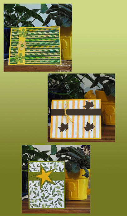
This set of cards feature more decorative paper.

The top card has a layer of Japanese origami paper mounted onto a Stampin Up Summer Sun card base. 

I added daisy punchies in green and gold with round sequins in the center and held in place with green mini brads.


This card is again the gorgeous Summer Sun card base.

I mounted a layer of SU designer paper in strips. 

I added a strip of Early Espresso cardstock across the top onto which I knotted some yellow cotton thread.

I added 3 maple leaf punchies mounted with Bling Zots.

The bottom card is an Old Olive card base with watercolor leaf designer pape from Stampin Up.

I added a length of the same green card stock across the top.

I then cut 2 stars with the Sizzix Stars#2 die with sharp points. Layered these and then mounted them onto the bar.

Again quarter sheet inserts and envelopes.


Monday, February 24, 2025

Cards - Charity

Three more cards for IWin.

The designer paper is Stampin Up Painted Blooms. Nice watercolor design.

I chose SU Lucky Limeade A2 card base for this card.  I added a piece of DSP trimmed to leave a small border.

I adhered the glitter butterfly to 100lb card stock then cut the oval with the Creative Memories cutter.  I added a border of Thalo Blue watercolor pencil then brushed it with water brush.

I created a greeting accent with a Modern Label in blue and taped a Word Window greeting to it.  

I adhered the oval accent to the card front then added the greeting with 3D foam tape.

This card base is SU Summer Sun in the A2 size.

A layer of floral designer paper adhered to the card front.

I adhered the silver glitter butterfly sticker to a piece of vellum trimmed to leave a large border.

I added a Not Quite Navy card stock strip along the top attached with 3 silver brads. 

I added the round greeting in the top right hand corner with 3D foam tape.


On this card the A2 card base is Always Artichoke.

Trimmed another piece of designer paper to leave a small border.

I adhered the butterfly sticker to a piece of Regal Rose card stock then trimmed it with the CM oval cutter.

I added an Always Artichoke mini brad to the head of the butterfly.

The greeting is a combination of a Modern Label Punchie and a Wordl Window greeting.


Wednesday, February 19, 2025

Cards - Charity

I set out this morning to make cards for IWin which is a charity which helps vulnerable women.  When they finish their program they get a card in their backpack to remind them that someone is thinking of them.

Each card needs a Thinking of you greeting and a butterfly.

I found a bag of wooden butterflies at the thrift shop the other day and brought them home.

I have been at a disadvantage to making cards for this project because of my home situation.  Back home and feeling like crafting again.  Not all is unpacked but I move forward.

I chose this designer paper with flowers printed in green. I trimmed it to leave a small border and adhered it to the front of a A2 card in SU Summer Sun.

I punched a Stampin Up Artisan punchie in Always Artichoke and adhered the butterfly with a Zot. I placed the short length of SU chevron ribbon under it and followed the pattern to trim it.  I added the greeting in the bottom right hand with a shadow of a green oval punchie.

For this yellow card base I trimmed a piece of floral designer paper to leave a small border. Wrapped the red ribbon along the bottom edge and taped the ends to the back.  It was adhered to the card front with DS tape. 

I added the yellow SU Decorative Label punchie, topped with the SU Small Oval greeting then topped with the wood butterfly accent held in place with a Zot.

Love the bright colors in this card.


Carrying on with the green floral designer paper I added it to an SU Always Artichoke card base.

I added a card stock strip on the left hand side and adhered with double sided tape.

I made the wood butterfly and the SU Small Oval greeting punchie touch and attached with a Zot and tape.


This card features a water colored piece of the green floral designer paper.  It was not very thick so I had to be really careful with the amount of water. I adhered it to the card front.

I combined the wood butterfly and the greeting in the bottom right hand corner.  

A Zot for the butterfly and DS tape for the SU Small Oval greeting punchie.


Tuesday, June 18, 2024

Cards - All Occasion

I wanted to finish a few more cards before cleaning up my space for company as well as use up the rest of this gold speckled paper. 

An Island Indigo card base with a piece of the gold decorative paper adhered with ds tape and glue stick.  

I added a gold fabric ribbon along the left hand edge knotted to the top of the card.

A flower element with leftover flowers from the earlier set. Cut with the Tim Holtz Tattered Flowers die.

Rust, golden yellow and blue to match the card all held in place with a copper mini brad.

White quarter sheet insert and envelope.

A masculine themed card with Not Quite Navy card base with a piece of the gold speckled decorative paper. 

A length of gold fabric ribbon tied along the top edge and knotted.

I cut a Tim Holtz mover and shaper Jalopy truck from same card stock as card and adhered with 3D tape.

A white quarter sheet insert with a white envelope.


For this card I used a SU Handsome Hunter A2 card base.

Adhered a piece of gold speckled decorative paper and trimmed the left hand side to the card edge with scissors.

Added a length of gold fabric ribbon along the fold edge of the card and knotted.

There was a star shaped hole where I had cut a shape earlier.  I cut a yellow star with the same cutter (SU Star Thinlits). It was adhered over the hold with 3D foam tape.

A white quarter sheet insert and white envelope and it is ready to give.


A bit of change of pace in color for this card.

The star was a leftover from earlier cardmaking so I mounted it to a piece of Tempting Turquoise card stock trimmed to leave a border.

I chose a bright green card base - Glorious Green I think.

I tacked the large star in Summer Sun then the small star in the same color as the blue layer. 

Made a hole in these layers and added a yellow star brad.

This layer was then adhered to the green card front.

White quarter sheet insert and envelope.

Thursday, June 13, 2024

Card & Basket - Thanks

I made a large card for a group of guys who worked on my place in recent days.

I started with a half sheet card so an 8.5x11 inch piece of card stock folded in half. 

This Island Indigo - a rich deep blue. I chose to use this holey gold decorative paper and was thrilled to see the blue show through like small bits of water.

I had some satin ribbon to match. I punched 3 holes at the top and did an inny outy knot in which I captured the length of ribbon that held the star.

The yellow star is cut with the Sizzix Star Primitive #2 from Summer Sun card stock. Then embossed with the Cuttlebug Thanks Words folder trying to align the "Thank You" to be visible.  I punched a hole in the top and strung the ribbon through. It is also held in place with 3D foam tape. This was a last minute card but it worked out so well. Full insert helped to cover all the names and a white envelope.

I delivered a basket of healthy food for the guys.  

Crackers and cheese, snap peas, tomatoes and carrots. 

I did throw in a box of hot chocolate for dessert.

I lined the basket with lime green tissue paper.

The basket was a nice sturdy one with metal accents which suited the situation.


Tuesday, May 7, 2024

Cards - All Occasion - Watercolor

Another set of cards while I wait for the drywall mud to dry.

I chose to make some watercolor background paper early this morning. I used liquid mixed media paper.

Once it was dry and flattened I cut it into pieces. This is 4.00 x 5.25 inches. I chose to loosely trace some flowers. I then painted them with watercolor. These are blue.  Once dry again, I outlined in black permanent marker.

I chose a SU Brilliant Blue A2 card base.  I adhered the watercolor with double sided tape, added a white insert and a white envelope.

Ready to press under books overnight.

I drew a meadow and tree with a 4H pencil then watercolored the image. 

The blue horizon line was on the background paper so I had to work with it.

I painted the stems then added the flowers a bit later.

Once all was dry, I outlined a few things with the black permanent maker and added the birds in the sky.

I mounted the watercolor to a SU Groovy Guava A2 card base.  Glued a white quarter sheet insert and pulled a white envelope.


This was the left over piece from the watercolor background I made this morning.

I started by adding a light blue wash across the whole piece to cut down the white spaces.

I then used a plastic doily to create some marks but I was not as successful as I had hoped. My brush was too wet in places.

I then used a bottle cap dipped in the dark blue watercolor to add some circles keeping it to odd numbers. 

Once I added yellow to 2 of the circles then I cut a length of yellow grosgrain ribbon and mounted diagonally across the piece.  Still need something so i went to my brad stash and found this yellow postage stamp brad.  

That was what it needed.  I chose a SU Summer Sun A2 card base, added an insert and an envelope and it will join the others under books overnight.  

Wednesday, December 27, 2023

Watercolor - Tree Line


I brought home a small watercolor palette from the ReUse Center last week. I saw a video in the last month that the artist makes the practice of doing this tree line with a new palette so she has documented the colors in the palette.  I thought I would give it a try.  Wet on the bottom and dry on top.  Just go along the colors and this is the result.  

I wanted to do something with the art.

I have a set stitched squares dies which makes a nice frame. The large one which I have used on cards was too large for the small strip of 3" tall watercolor paper I had.  I used the middle one. The easiest was to make the watercolor this size of the cut out.  This gives less of a look of framed art.

I debated what color the frame should be.  I used a grey here. Could it be black?

The next challenge was that the card seemed too plain so adding some embossing worked really well. 

On this card I used Stampin Up Summer Sun card base,  a Cuttlebug folder with a diamond pattern for the back ground. Diamond in the Rough folder.


On this card I used SU Daffodil Delight card base with again a grey frame.  I think it works a little better on this card.

The embossing folder is Sizzix Softly Falling.  


I remembered that I had an instant camera die so I dug that out. Sure glad it made the cut during the destashing.  

On this card the white card seemed to white so I brushed it with Very Vanilla chalk.  Forgot to emboss this one.

A dark green die cut works.

With this die I could cut my watercolor strip just under 2.75 inches wide and it fit behind the frame.  I like this better.


On this card, I chose SU Baja Breeze as the card base.

The cool grey for the frame die cut.

I used Quick Dry glue along the back of the die cut and just layed the watercolor on to it.  Hold it down for half a minute and it is well adhered.

Again, I think the card front could have used some texture.


I finally remembered to emboss the card front.

I think this SU Gable Green card base with a Sizzix Tim Holtz Alterations Star embossing folder.

I like the contrast of these colors.


Sunday, November 5, 2023

Simple Sentiments - Photo - Set 4

I chose a Stampin Up Chocolate Chip A2 card base.

I cut a piece of Summer Sun with the Tim Holtz Cabinet die.  I used the Stampin Up Slot punch to make two slots in the round end of the die. 

I adhered the photo to the die cut then pulled the ribbon through then around the card front and back to the front.  This is a Pumpkin Pie colored ribbon.  

I then adhered the die cut layer to the card front. I pulled the ribbon taut making sure it was not twisted on the inside of the card. I knotted the ribbon and trimmed the ends. An insert and an envelope.

These photos are from my Gentle Glow Calendar. Love the bokeh backgrounds.

Here is a House Finch in the late fall with no leaves on the trees.  I chose Sahara Sand for the Cabinet diecut.  

The card base is Cajun Craze and the ribbon matched so well. It is a beautiful soft ribbon. I just had a short length so I don't know where it came from.  I am down to my last couple sheets of this great color.

Again, slots punched, ribbon threaded through, knots made and the diecut layer adhered to the front.  Quarter sheet insert and envelope.

This is a photo of the top of a metal bistro table taken at the Muttart Conservatory.  Turned out wonderful.  I love the texture and the highlighted edges of by being used over and over by customers.

I used a Brilliant Blue card base and a piece of Smoky Slate card stock for the Cabinet die cut. The ribbon is Night of Navy seam binding.

A quarter sheet insert and white A2 envelope.


Some sweet Common Conecap mushrooms taken at the park down the street.

I chose a Creamy Caramel card stock for the card base.  A Garden Green piece for the Cabinet die cut.  A piece of beige seam binding found in my box.

The assembly as previously described and it was done.  These were fiddly to assemble but I think it was worth it.

A quarter sheet insert and a white envelope.

Friday, November 3, 2023

Simple Sentiments - Photo - Set 1

I made some cards with my 4x4 photos.

These are Aspen Leaves taken at Elk Island Park in the fall.

I chose a Stampin Up Summer Sun A2 card base, scored in half and folded.

I then cut a 1/4 sheet of Brocade Blue with the Tim Holtz Cameo Frame die.

I had to trim the photo to 3.5 W x 3.75 T to fit within the score line on the die cut.  I adhered the photo with double sided tape.

I added caplets in warm gold yellow at the top and bottom. This layer was then adhered to the card front.

I added a quarter sheet insert and a white envelope.


This card features a Dandelion Seedhead with tiny water droplets from a misty morning.

I chose Winter Wisteria as the card base and Lovely Lilac as the frame layer.

I added iridescent snowflakes embellishments held in place with purple mini brads on the right and left hand side.

A quarter sheet insert and white envelope.


This card is a photo of a Palm Leaf I took at the Muttart Conservatory.  The sunshine through the lace curtains when I photographed this card makes it extra cool.

The A2 card base is SU Garden Green.

The frame layer is Gable Green.

I added leaf green star brads on either side of the frame diecut and adhered it to the card base.

A quarter sheet insert and a white envelope.


This is the very textural center of an orange Dahlia taken at the St. Albert Botanic Park.  Love the water drop in the right hand corner.

The card base is SU Ruby Red and the frame layer is Dusty Durango.

I added red caplets on the top and bottom of the frame layer.  These are easily installed with my Crop-a-dile.  The layer was adhered to the card front.

I quarter sheet insert and an ivory envelope and it is ready to go.

Note: I had to replace the photo on the card because it end up with double side tape on it.  I replaced the photo with tulips which works just fine.

Saturday, September 30, 2023

Exchange Cards - September - Yellow Flowers

My Exchange Cards for September feature autumn colored flowers.

This first one is a sunflower.  The 4x4 inch photograph is from one of my annual photo calendars.  Trimmed the numbers off and it was ready to go.

I chose a Stampin Up Summer Sun card base.  I cut a 2" strip of black card stock which I punched with the SU Banner Triple Punch.  

It is very versatile as it easily centers the V on several widths of banners. Allow allows you to make any length.

Once that was adhered I installed 3 golden yellow caplets by making holes with the Crop-a-dile and then inserting the caps and choosing the right settings to press these into place.

A full half sheet white insert make this a card which can be used for any fall occasion.

This card features the same Summer Sun card base. This time I chose a Chocolate Chip piece of card stock which I aligned closer to the top of the landscape oriented card.

I adhered the 4x4 inch photo of a dahlia aligned on the left.  

Then, I chose a metal postage stamp brad in a golden yellow color.  I marked the spot for the prongs on the back and used a push pin to create a hole for them.  Press the prongs apart on the inside.

A full half sheet insert and this card is ready to be mailed on Monday.

Sunday, April 23, 2023

Card - Thank You with Bees

I made a card for my niece who passed along a great deal on a Janome Serger earlier this year. After a servicing it has been working really well. 

I wanted a card with warm tones. I found a bee graphic on line that I liked then transferred some of the elements to watercolor paper.

I watercolored the background in a light shade of Daffodil Delight. The image was painted with Daffodil Delight and More Mustard. Outlined the elements with dark grey watercolor and a fine brush.  I then created a few shadow hexagons around the outlined ones which I think worked out really well.

Once dry, I mounted the painting onto a Summer Sun card in the A6 size (just a bit smaller than half sheet size).  I placed a piece of narrow stitched grosgrain ribbon in Basic Grey around the inside of the card and taped the ends to be under the watercolor layer.  I added a Modern Label punchie greeting with a yellow offset with a grey greeting on white.  I watercolored the white punchie to be just a little less stark.

Monday, August 1, 2022

Exchange Card - August - Watercolor

I decided to make watercolor cards for my exchange cards for August.

I drew a few flowers with a pencil, traced the shapes with the black Micron marker then watercolored them in bright colors.

Once they were dry I went back and added the green wash to the bottom of the card.  

Once that was dry then I added spatter with blue water color.

The flowers are just designer shapes with no attempt to represent flowers realistically.

The stems and leaves were done in warm and cool greens.

The water color accent as adhered to to a Pool Party card base with 3D foam tape.

Great all occasion card.

I created some funky flowers on this piece of 140lb rough watercolor paper which measures about 3.5 inches square.

I drew the flowers with pencil, traced the shapes with a Micron permanent black marker, erased the pencil marks and applied watercolor.

I flooded the large center with yellows, oranges and a touch of red. The petals were left white. The leaves were painted green.

Once the flowers were dry a light green wash was applied to the background.

The Summer Sun card base had a length of satin stitched Gumball Green ribbon wrapped with ends taped under the focal element.  The watercolor square was adhered with 3D foam tape.

These are off to my partners this week.

Thursday, January 13, 2022

Christmas Card Challenge - Watercolor - January


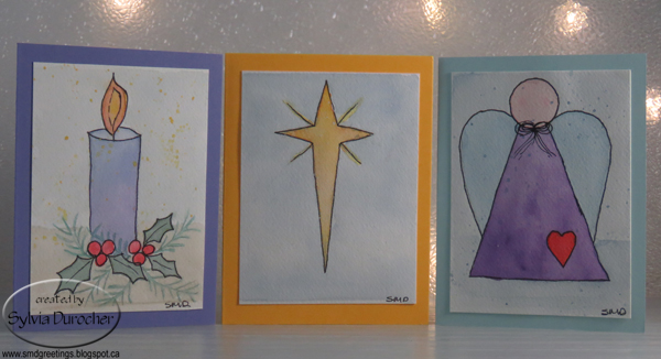
I made these three watercolor cards for my Christmas Card Challenge - Watercolor for January.  I chose 140lb cold press watercolor paper.  I cut a piece of paper and taped to a piece of glass.  I drew my images by hand then painted them.  I traced the images with a black permanent marker after they were dry.  I them spattered them with watercolor.  I trimmed the images and I had cut it too short so on some of them you can see the line from the tape.  Live and learn.

The first is a candle and I used a gradient wash from blue to purple on the body of the candle. I added holly leaves and berries then added some different foliage. I added yellow, orange and red to the flame.  I left the foliage not touched by the black marker. I added a background to the bottom and the top.

The  middle is just a Bethlehem Star.  I tried to add spatter with bleach thinking it would remove the color but it did not.  Maybe I should have added yellow. 

The angel is a design I create years ago for a custom ornament.  A background was added to this one also with a spatter of blue.  I think I made the bow too small.  Still happy with it.

Wednesday, August 18, 2021

Watercolor on Handmade Paper

More reusing supplies from old card kits.  I just loved these small white handmade paper sheets and could not just give them away.  I have painted daisies on these in the past but I wanted to create new art on these.

I am using my Stampin Up Watercolor Wonder crayons in rich regals and brights color families.

This one is an abstract flower in the blue green color family.

I had to trim the handmade paper because the other flowers were not great.  This required an additional layer so i chose some Old Olive on some Not Quite Navy card base.

I always adhere handmade paper to cards with hot glue.  It works the best but you have to be fast before it cools.

This card features a multitude of pinky orange abstract flowers again.  Regal Rose and Old Olive are the colors used.

I did try to put a background of subtle color which did not really work great.

Mounted on a Regal Rose card base.

Each card gets a white blank insert on the inside.

I signed each one as well.


I started with abstract shapes on this piece of handmade paper.  

The colors used are Tango Tangerine and Marina Mist.

I dug through my bling box and found these butterfly confetti sequins which were the right blue color.  I then added them to the handmade paper sheet with orange tiny brads.

I like the fact that there are 2 different designs of butterfly.

Makes me think Santa Fe coloring.

Mounted to the a Marina Mist card base.


This card features Bravo Burgundy as the color in several shades for the flowers.  I was thinking of roses when I painted but I am not sure I succeeded.

Always Artichoke for the stem and leaves with a bit of mixed brown thrown in for good measure.

A bit of spattering in the main colors to lessen the white background.

Mounted to a Bravo Burgundy card base and a white insert.


I tried following the design of the small deep teal handmade paper flowers I had selected as inspiration.  

I had to remind myself - Stick to the 5 petals and make them rounder than usual.  Always Artichoke for the stem and long open leaves.

I mounted the small pale yellow flower then the bit larger teal one onto the watercolored on with a tiny white brad.

Mounted to a deep teal card base of textured card stock.

A bit of spattering to tone down the white background.


I painted the flower with More Mustard and a bit of Daffodil Delight with a lot of long slender petals. I think I should have overlapped some of them.

I really needed Summer Sun to match the card base but I did not get the yellow mix quite as good as I hoped.

A mix of greens and blues for the closed long leaves.

I mounted a small yellow handmade paepr flower in the center of the watercolored one, held in place with a tiny white brad.

These no greeting cards could go into the cards for seniors box but I am not sure yet.

Love the painting.