Showing posts with label no greeting. Show all posts

Friday, May 31, 2024

Photo Cards - Abstract

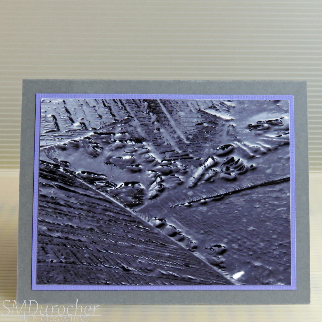
I created these 2 cards with a print I produced for a art show earlier this year which just did not work.

It was a 4x10 photo print of ice broken in a puddle in the spring.

I decided to trim it to a size I could place on cards.  I then layered it with a piece of Lovely Lilac card stock.

Then this was adhered to a black A2 card base.

A white quarter sheet insert and white envelope finished the card.

It is pressing under books overnight.


This is the other half of the print.

I used the same light purple card stock layer.

I mounted this one on a Basic Grey A2 card base.

A white quarter sheet insert and white envelope finished the card.

Glad to have another 2 cards into the card box.


Friday, June 17, 2022

Watercolor Cards - All Occasion

I needed a  few cards for upcoming birthdays so I decided to follow the trend of my Christmas cards and make them with watercolor.

I searched the internet for simple floral images - bouquets so that I could see how the stems interacted, etc.

I trimmed my 140lb water color paper to 3.5 x 3.5 inch squares.  Loosely following the compositions I found on line I drew flowers with a pencil.  Once I was happy with it I traced the pencil lines with black permanent marker again making adjustments if needed.

Once the ink was allowed to dry a bit I erased the pencil lines and was left with the black lines.  I used my Stampin Up Watercolor Wonder Crayons to match my card bases.

I chose flowers which were non specific so I could paint them any color, rather than recognizing the flower and saying that must be pink or whatever.  I also added some spatter of each color to tone down the white of the paper.

For the first card the flowers are a pale version of Rich Razzleberry and Garden Green for the leaves on a Pixie Pink card base.

Card number 2 is Elegant Eggplant card base with Old Olive for the stems.

Card number 3 is Marina Mist card base with Always Artichoke leaves and foliage.

I chose Mellow Moss grosgrain ribbon wrapped around the front of the card with the ends taped under the watercolor accent.

The floral watercolor is adhered to the card front with 3D foam tape. 

I decided to go with no greeting so I can use it for any occasion. 

Quarter sheet insert on the inside with A2 white envelope and 3 more cards ready to give.  One for my aunt, one for my sister and one for Mom.  I still have a couple of sisters who have birthdays this summer.  Another session to follow soon.

Monday, January 22, 2018

Card Club Kit - Set 1 - Card 2

I chose another sheet of Japanese Origami paper for this card.  This time I cut it into four 3 inch squares.  I chose a blue card to coordinate with the paper. I chose a wide or landscape orientation.

I adhered the gold sticker paper across the card and trimmed it to the edges with scissors. I adhered the origami paper over the gold and placed it on the left hand side.

I selected blue and gold star sequins which I placed on the gold paper to the right.  I used a push pin to create holes in the card front, pushed the prongs of the tiny gold star brad through and spread them apart on the inside of the card. 

Tuesday, October 17, 2017

Photo 4x4 Cards to Gallery


Another set of card for the gallery.

These are 4x4 photos from my photo calendar from several years ago. You can check out this years set here.

I chose the tiger to create a card which would work for a man. 

I chose a rust card base and coordinated the frame on the layer in the same color. I added a green flourish below the frame and printed it onto white card stock.  I trimmed it to leave a small border on the A2 card.

I trimmed the 4x4 inch photo down to 3.75 inches square and adhered it into the center of the printed frame.


I love the shades of purple and blue in this flower.   

I printed the white layer with the purple frame and navy flourish and trimmed it to leave a small border. 

It was adhered to the front of a purple card.

I cut the photo down to 3.75 square.  It was then adhered into the center of the frame.


Monday, May 16, 2016

Card Club - May - Daisy

I cut my decorative card stock to 3.75" x 5" and punched the corners with a corner rounder.  I chose several colors of card stock for these card kits.  This one is a warm dark green.  I placed a piece of orange grosgrain ribbon across the bottom 1/3 of the decorative piece.  I taped the ends to the back. This layer was then adhered to the card front. I punched the daisies with a large punch from coordinating aqua card stock. The white is just the back side of the aqua card stock. The daisy accent is adhered over the ribbon.  The white pearl button is adhered to the flower with a Zot. The colors of card in the kits are aqua and orange along with this dark green.

This card has the orange card base with a coordinating orange button in the middle of the flower.  I've decided to use in the tall portrait orientation as well.  Great versatility.

Card Club - May - Prima Flowers

Another card club class today.

This card features 2 Prima handmade paper flowers along with 2 silk flowers in the main element.  The card color matches the largest flower's color.  In this case, pink and the other aqua.  The white card stock layer was cut to 4" x 5.25" and embossed with the Craft Concepts Whisper folder.  I placed the flower embossed border in the bottom 1/3 of the layer. This was then adhered to the card front.  Placing the largest flower onto the top part of the embossed layer I used a push pin to create a hole for the brad in the center of the flower cluster.  Placing the smallest to the largest flowers onto the white brad I then placed the prongs through the hole I just made and spread the prong apart on the inside of the card.  Blue and purple cards are included in the class kits.

Friday, April 29, 2016

Note Cards - Wonderful Wings

This is a stash busting opportunity.  Pulling 4" wide remnants of designer paper are pulled from the stash.

I cut the piece of designer paper from Fancy Pants - Summer Soiree - Beach House by Michelle Coleman with wavy decorative scissors.  It was placed in a wide landscape orientation on a yellow card. I produced the butterfly accent with Stampin Up Wonderful Wings stamp set in Blue Bayou on Whisper White card stock. It was then punched out with the Decorative Label punch. The accent is adhered over the split in the designer paper with 3D foam tape.

On this card, the same layout and butterfly on a decorative label punchie.  The designer paper is warm in tone with flowers and circles.  I selected white card for this paper.


On this card, the same layout and butterfly on a decorative label punchie.  The designer paper is warm in tone in soft watercolor pattern.  I selected warm blue card for this paper.  The butterfly accent has no frame.


On this card I chose Stampin Up Brillant Blue for the butterfly accent.  The card is white, the designer paper is ripped and the orientation is tall portrait.


Note Cards - Canvas Butterfly

I received an order for blank note cards.  I chose to finish my supply of canvas butterflies into these cards.  They are all gone! I'm moving to another method.


Above - I chose a deep taupe card and designer paper by Fancy Pants - Fancy Free collection - Tradition.  I ripped the small piece on the left by pulling towards myself to avoid the wide rip edge. Then I pulled again a narrow strip to remove the white edge. These pieces were then adhered to the card front leaving a space of card showing.  I adhered the canvas butterfly over this space in the top left hand corner with Zots.

Right - On this card I chose a light taupe card which coordinated with one of the colors in the flowers.  I applied the same process and glued my designer paper in the portrait tall orientation.  Zots hold the canvas butterfly in place.  The designer paper is by Little Yellow Bicycle - Acorn Hollow.

Wednesday, April 27, 2016

Sympathy Card & Card Set

I made another set of sympathy cards to have a set in reserve when the need arises.

This designer paper is by Fiskars - Kimberly Poloson - Rose Garden.  The colors are very suitable to a somber occasion. On the sympathy card I chose a 4 inch square of designer paper with a color printed greeting in Early Espresso on a gray granite card.  I added a length of ivory satin ribbon and placed the ivory canvas butterfly along it's length.


I love the old crackle design on the other side of this card stock.  I chose several different colors of card stock to provide some variety. There was a natural parchment card, some grey granite, and a muted blue.  I was consistent with the 1/8" ivory satin ribbon and the canvas butterfly through out the set varying the layout and the orientation of the split in the designer paper.   The canvas butterfly is held in place with Zots.  The DSP split is 3.5 & 1.75 inches.

Saturday, April 23, 2016

All Occasion Cards - Canvas Butterfly


I made a set of cards for the family who are grieving the loss of a husband, father, and grandfather.

The colors in the paper allowed me to use several card colors (kraft, royal blue and sage green) to provide some variety in this set of very simple cards. They can be used as needed at this difficult time.
The designer paper was cut to 4" square then ripped leaving a smaller and a larger piece. The piece with the white paper edge was ripped again to remove the white paper edge.  I adhered the pieces to both ends of the card leaving the card color showing in between.
I adhered the canvas butterfly over this space held in place with Zots. The design is versatile in that it works in the wide or tall orientation.


Monday, April 18, 2016

Mason Jar Sticker Card

Here's a card which was my original design for the lace card for card club.  I did not have enough stickers for the kits I needed and I was having difficulty finding a graphic to match the dimensions of the sticker.  I just moved on to another design.

I chose a pink card to coordinate with the flowes in the vase. The eyelet lace has blue 1/8" satin ribbon pulled through the holes.  The ends are taped to the inside of the card.  I printed the flower vase onto white card layer and then added the clear dimensional mason jar sticker over the printed one.

A very nice feminine card.


Card Club - April - Masculine

We have a masculine card next.

The bird images are from Graphics Fairy.  They were printed onto kraft card stock. A layer of solid card stock was then trimmed to leave a small border.  The piece of caramel seam binding is taped to the back of the colored piece then adhered to the kraft card front.  Then the left hand piece of ribbon is pulled across to the right and the bird layer is adhered over it to the left side of the card with 3D foam tape.  The seam binding is then knotted and the ends trimmed.


The second card has a green layer and greeting.  I did not align my ribbon to allow me to tie a knot so I just cut them at an angle.  I added a small oval greeting in the top right hand corner.

Card Club - April - Eyelet Lace

A great feminine card for this class featuring eyelet lace. I pulled a length of satin 1/8" ribbon through the holes in the lace. Trimmed the ribbon to the length of the lace, saving the small length for later.  I then taped the ends to the inside of the card. I adhered the flower layer to the solid card stock layer. This accent was then adhered to the card front with 6 pieces of 3D foam tape on the left hand side of the card.  I then tied the short piece of ribbon onto the ribbon on the right hand side and trimmed the ends with scissors. 
The second card features a marigold and a golden yellow card with a coordinating satin ribbon into the white lace. 

Tuesday, April 12, 2016

Garden Week - Card

I made this card for the Home Page Card Challenge at CST.  The challenge is to choose a holiday in April and make a card to go with it.  I chose Week 2 which is Garden Week.
I chose one of my 4 inch photos featuring a beautiful pink tulip. I cut it with the Die-namics Stitched Square Frame thin dies which gives me the frame and the inner square. I trimmed the inner square with the paper cutter to make it a bit smaller than the opening of the frame. I chose a pink card which matched the tulips very well.  I adhered the stitched frame to the card front.  The center square is adhered with 3D foam tape to raise it a bit.  Now the border of pink shows through the frame.  I embossed the bottom edge of the card with the Cuttlebug Nathaniel`s Penwork border embossing folder.  I will have to work out how to get it centered on the card but it is the perfect width so I will work it.

Monday, March 21, 2016

Card Club - March - Pick Up Truck

I wanted a card for guys.  I chose this striped designer paper in some great colors.  I chose cards in green as show, royal blue and a deep orange. I adhered the striped paper to the card front. I created the banner with the Stampin Up Triple Banner punch.  The white strip is 1" and the blue one is 1.5 inches.  Once they were adhered together I placed it on the card front and trimmed the top end to the card edge. I then adhered the pick up truck image to the navy blue layer. This was then adhered over the banner. I placed 3 sticky embellishments on the right hand side. 

Sunday, March 13, 2016

Farewell Card

I made this card for a lady from our congregation who is moving.  We will miss her and her family.

I started with a light green parchment card stock which I folded in half.  I applied a piece of Recollections Designer paper to the front cut to leave a small border.  I cut a piece of light green card stock with a picket fence Die-namics thin die.  I cut the piece of card stock to be narrow enough as I did not want the pickets as I was going to use it as a ribbon threader.  I trimmed it to the width of the card.  I taped my orange organza ribbon to the back of the DSP then ran it through the slots in the die cut. I tied the ends in a bow and trimmed the ends.  The orange picks up the orange in the large flower which is the focal point.

I created a couple new Nifty Notes to include in a gift of cards for her in her new job.   These again feature watercolors from Pixabay.


Thursday, March 10, 2016

Spring Gift

I made a bright spring card.  The stamp is Gift by Magenta Stamps (a Canadian Company).  I embossed it with bright pink powder and fussy cut around the image with scissors.  I layered it onto a piece of turquoise cardstock onto which I printed my own background design of stars.  I punched 2 holes near to middle of the bow and pulled through a length of grosgrain ribbon in yellow and tied a bow.  Trimmed the ribbon ends.  This layer was adhered to a yellow layer repeating the yellow color then onto a bright pink card.  It creates a wonderful spring card.

The stamp I have owned for 20 years or so and have not used in forever. The bright pink embossing powder I don't think I have ever used.
Never-Before-Used-Schtuff (Stamps, Dies, EFs, etc.)
The cards are going to the girls on my card exchange group list for March.


Submitting this to:
NBUS Challenge hosted by Darnell at DJKardKreations
CST Home Page Challenge - something from our stash we have not used in a while

Friday, March 4, 2016

Decorative Paper - Card Set 3

This bright bold paper was done with alcohol ink on an acrylic plate and picked it up with 4x6 photo paper.  I printed the large greeting on white then I cut the FRIEND word from it with the Stampin Up Little Letters Thinlits.  I adhered the alcohol background paper to a black card.  I added some black washi tape to the centre of the white.  I then added 3 sets silk flowers onto it held in place with tiny brads. I adhered the white greeting layer with 3D foam tape.

The decorative paper on this card was done with masking areas on white heavy bond paper with every day items.  The diamond shapes were done with a net material.  Other areas were spritzed with colored ink a bottle.  I placed a piece of aqua chevron washi tape on the left. I adhered it to a yellow card.  I placed a teal teapot cut with the Cricut and the Folk Art Festival cartridge.  I added a greeting punched with the Stampin Up Decorative Label punch.  I then placed an green one cut in half and offset on the back.


This card would be nice for a guy.  I used a piece of white heavy bond paper and sponged on acrylic paint in a variety of colors such as green, brown, tan and yellow.  I trimmed the paper to leave a small border on the black card.  I applied several lengths of black and white chevron washi tape in several directions.  I added a Tim Holtz Old Jalopy die cut in black. It is raised with 3D foam tape.

Decorative Paper - Card Set 1

This is another collection of cards for sale at the gallery.  I started with the green paste paper which I trimmed to leave small border.  I adhered it to a dark green card.  I printed a large greeting layer on white then cut out the Happy with the Sizzix Phrase die.  This was adhered to the paste paper then I added 3 gold stars cut with the Sizzix Stars die.


This card features a piece of decorative paper made with pink ink and marked with a letterpress die from Sizzix. I brayed some Night of Navy ink onto it then pressed it onto the pink paper.  It only left a faint mark.  I cut the piece to leave a small border.  I place a piece of crisp ribbon down the centre and taped the ends to the back. It was adhered to the card front.  I then place a silver metallic scallop circle then a white silk flower topped with a smaller pink one held in place with a tiny navy brad.  I trimmed the vellum greeting to 4" and placed onto the card front as shown and held it in place with 2 tiny brads.
This card features ink sponged background paper in light to dark green. I printed some script and postage digital stamps onto it in black.  The paper was trimmed and adhered with postage on the left to a medium warm teal card front.  I added a teal teapot cut with the Cricut and the Folk Art Festival cartridge.  I mounted the teapot with 3D foam tape.  Before I adhered it I placed a piece of mint green card stock behind the holes to highlight them.

Monday, February 22, 2016

Card Club - Feb - Half Circle

This is a design I have used before but with a change in paper and card stock it creates a new look.  Here I have selected a designer paper with lots of colors so I could change my card stock color and create variety in the kits.  I used purple, blue, green and pink card stock.  I dipped into my stash of white silk flowers and chose 2 different sizes.  I'm getting to the end of the large ones and they are longer available at my local craft store which is very disappointing.  The card is tall card the the card stock measures 4.25 x 11 inches.  This allows for the ribbon to easily be attached to the inside of the card.  The ends are taped to the inside of the card leaving a little slack, then a shorter piece is tied on.  Alternatively, tie on the shorter first and then tape the ribbon to the inside of the card.  The large flower is placed on the card front and a push pin is used to create a hole for the brad. Place the small then the large flower on the brad.  Push the prongs through the hole and press apart on the inside of the card. I chose this card to provide some with Easter greetings.  We will be meeting again before the holiday but if the cards need to be mailed it would be too late. The greeting is the Modern Label punch with the Word Window punch in the bottom right hand corner.
The grey card features Deja Views - Through the Years - Midnight Blossoms.