Showing posts with label Lucky Limeade. Show all posts

Sunday, November 5, 2023

Simple Sentiments - Photo - Set 5

I chose to add a banner to this fifth set of Simple Sentiment cards.

I started with a Stampin Up Lucky Limeade card base, cut, scored and folded.

I chose a SU Pale Plum card stock banner which was 2" wide and banner cut with the Banner Triple Punch by Stampin Up.  I added 2 mini brads to the banner placing them just below the photo. 

I adhered the banner to the card aligning it to the focal point on the flower. The flower is a White Geranium which is a 4x4 photo taken at the St. Albert Botanic Park.

I added a quarter sheet insert and a white envelope.


I started with  this small crab apple 4x4 inch photo.

The card base for this card is Ruby Red card stock.  Cut 8.5 W x 5.5 T inches, scored and folded in half.

I chose More Mustard for the banner which was cut with the Banner Triple punch.

I added 3 warm red mini brads aligned on the center of the banner.  It was then adhered to the card front.

The photo was then adhered on top of the banner. Nice to have the banner reach the edge of the card so the color repeats at the top.

Added an ivory envelope and a quarter sheet insert.


The photo on this card is a close up shot of the plant Mother of Thousands as each of the plantlets along the edge of the leaf can produce a new plant. Took this one at the Muttart Conservtory.

The card base is Glorious Grape.

The Banner is Green Galore. It was cut to 2 inches wide, the end cut into a banner with the Banner Triple punch.  I aligned the banner alogn the focal point of the photo.

I added 3 purple eyelets to the banner which I mounted with the Crop-a-Dile tool.  I did mark the spaces on the back to ensure they were even.

The banner and the photo were adhered to the card front.

A white quarter sheet insert and a white A2 envelope were added.

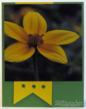
This flower is a False Sunflower.  It is a gorgeous bloom in any garden.

I chose Garden Green card stock for the card base. Considering that most of the flowers are taken in gardens makes sense. I may need to source out some more of this color.

I aligned the banner with it's green eyelets along the focal point of the 4x4 inch flower photo.

These were both adhered to the card front.

I added an A2 envelope and a quarter sheet insert.

Super pleased with these cards.

I will pair them in sets of two - one flower and the other a nature one.

Thursday, July 6, 2023

Cards - July Birthdays

 This is a birthday card for my sister who celebrates a birthday this month.

I chose a piece of watercolor paper I colored up a while back with playing with my Stampin Up Watercolor Wonder Crayons.  It was 9x12 inches.  I chose to cut it with the Tim Holtz Vintage Cabinet Card.  I mounted a layer of silk flowers filling in the top half circle of the die cut. I chose a large oen with warm toned ends, then a pink organza one and then a small ivory one all held in place with a gold mini brad.

I added a pink Modern Label punchie topped with a Word Window punchie with the greeting.  This was adhered below the flower on the diecut with 3D foam tape.

The diecut was adhered to the Lucky Limeade green A2 card base.

A white quarter sheet insert was added to the inside.

With the other half of the watercolor sheet I cut a Tim Holtz Cameo Frame. 

I chose to highlight the bit of yellow towards the bottom of the diecut and so cut big H and B with the Stampin Up Typeset Alphebet dies in Crushed Curry.

I traced the rest of the words with a More Mustard marker.

I added 2 gold glitter star brads to the left of the B.  The diecut was then adhered to the Lucky Limeade card front of with 3D foam tape.

A white quarter sheet insert was added.

This is for my nephew whose birthday has already passed but that's okay I was in touch by email.

Monday, July 12, 2021

Cards - Birthday and All Occasion

I chose a piece of Stampin Up Designer Paper from the Tea for Two series and cut it into 6 - 4.00 x 5.25" pieces.

The paper was designed with Island Indigo as the deep blue I don't have that color so I substituted Midnight Muse which works well.  Love the quilting pattern.  This is my Angle Rectangle design where the decorative paper is titled on the card front and adhered. Then it is trimmed to the card edges with scissors. 

I added a length of Lucky Limeade Ruffled Ribbon and knotted it on the front aligning it on the left near the fold.

I punched an Artisan Label from a scrap of the same DSP and turned it over to reveal the Calypso Coral polka dot side. I layered a Modern Label blue greeting over that. It was adhered in the bottom right hand corner with 3D foam tape.

This will be a card for one of my quilting sisters.

For this card I have paired it with a Lucky Limeade card base.

I cut the layer at 3.5" and turned the smaller piece over and taped them back together.  I placed a length of Lucky Limeade Ruffled Ribbon along the join and taped the ends to the back.  The layer was then adhered to the card front.

I created the greeting with a SU Scallop Circle punchie in a coordinating orange card stock with a color printed circle greeting.  The blue and green greeting was punched with the 1 3/8 inch circle punch then adhered to the scallop.  This accent was then adhered to the card front over the ribbon with 3D foam tape.

This card is for a friend who celebrates her birthday in early August.


I made a couple of all occasion cards for my card box.

Here I have paired the reverse side which is the Calypso Coral Polka Dots with a coordinating card base. 

I assembled the flower accent with a couple handmade paper flowers (turquoise and yellow) and a couple silk flowers (white and orange).  All held in place on the designer paper with a tiny blue brad. 

The layer was then adhered to the card front with double sided tape.


I used another Midnight Muse card base with the quilting side of the Tea for Two DSP facing out. I made a slit in the designer paper and folded back the triangles to reveal the orange polka dots.  Like the way it repeats the triangles in the paper.

I wrapped a length of narrow organza ribbon in the Lucky Limeade color around the narrowest point of the front layer and tied a bow.  Trimmed the ribbon ends.

The layer was then adhered to the card front.

I added some three warm white Sugar Dots in the triangle space across from the ribbon bow.

Each of these has a white blank insert and has been paired with an white envelope.


Sunday, December 20, 2020

Christmas Card Order - JOY Nativity

I received a request for a large order of Christmas Cards late in November.  I prepared 3 samples within a price range which fit their budget. They made their selection quickly and I got started.  I proposed 4 different colors of card stock to provide some variety in the cards. I did not have enough card stock in any one particular color either. I used Stampin Up card stock for the project.  Very good quality card in 8.5 x 11 size and I planned to use the coordinating ink in the spatter final touch.  

The holy family die cut was cut in heavy black card stock with the Penny Black Manger die. It was adhered to a white card stock layer where the J and Y were printed in black and the die cut was the O.  The die cut was held in place with a mini star brad.  The JOY layer was adhered to the card front with double side tape. The quarter insert was glued in with glue stick.

There was pressing when the card was folded then again when the JOY layer was adhered.  The spattering was the final step and then they were dried overnight.

The card stock is Lucky Limeade.

The spatter was mixed from other reinkers as I did not have that particular ink.  I had to experiment a bit. In the final color I used 4 drops of Old Olive to 2 drops of Kiwi Kiss.

This card stock is Lovely Lilac. When I checked the package which had been opened I discovered 4 sheets of textured card.  Another bit of variety to the overall project.

With out the exact reinker color more experimenting was needed.  The final color was 3 drops of Orchid Opulence to 1 of Brilliant Blue.


The card stock for this card is Buckaroo Blue.

It's interesting to see the weight of the card stock change over time.  It has become quite a bit thinner over the years.

I had to mix this ink for this one as well.  After some experimenting the final was 1 drop of Brocade Blue to 1 drop of Baja Breeze.

I was very happy to be able to create the colors I needed and it went pretty well.


The card base for this is Regal Rose. 

I had the exact reinker for this color so that was a breeze and it was a good thing as it was the last set.

I am sure the cards will be a blessing to those who receive them.  I expect some folks are just not doing Christmas at all this year which includes no Christmas cards.  

With no craft sales to attend this year, sales were way down so I really appreciate this order.