Showing posts with label stampin up. Show all posts

Wednesday, April 30, 2025

Cards - Butterflies - Charity

Another few cards for I Win charity.

These are the last of the clear butterfly stickers I bought yesterday.

I chose Stampin Up Glorious Grape cardbase in A2 size and added a layer of watercolor background cardstock.  Not sure when I created this but it works well.

Added a strip of gold non shed glitter card stock across the top third.  Mounted the sticker onto the glitter.

I added a SU Small Oval greeting in coordinating colors and added a bit of purple around the edge to tone down the white.  Mounted with 3D foam tape.

Blank white quarter sheet insert.

I used the left over scrap of the watercolor background card stock on this Glorious Grape card base set in the wide or landscape orientation.

I added a non shed gold glitter corner on the right hand side of the watercolor layer adhered with double sided tape.

I mounted the butterfly sticker in the opposite corner.

The banner greeting was perfect for the space left by the shorter background layer.  It is mounted with 3D foam tape.

A white quarter sheet insert was added.

The final butterflies were warm toned so I turned to my favorite Stampin Up color - Summer Sun.

I dug in the origami paper envelope and found a burnt orange piece, cut it to size and mounted it to the card front.

I chose a scrap of paste paper in blue and cut to 2.5 inch square and mounted the butterfly to it. I added a strip of gold glitter to the bottom.

A SU Modern Label punchie in the same blue paste paper with a Word Window greeting in orange glued to the front.

A white quarter sheet insert was added.

I chose Summer Sun card base again with a bit brighter orange origami paper for this card.

I added a Pacific Point strip of card stock then mounted the butterfly onto it.  I like that the tips of the wings show off their bright colors.

I added a bit of non shed gold glitter card stock on the blue strip.

The greeting is the same blue card stock punched with the SU Modern Label punchie  with an orange Word Window greeting.  Mounted with 3D foam tape.

A white quarter sheet insert.

Another 4 cards for this charity.

Tuesday, April 29, 2025

Cards - Charity - Butterflies

 More cards for the IWin Charity.

I chose the Crate Paper Designer paper which made the cut when I de-cluttered a while back because it had Stampin Up colors. Pear Pizzaz, So Saffron and Brave Burgundy.

For this card I have an A2 card base in Pear Pizzaz with a layer of DSP and a coordinating strip placed vertically. 

The greeting is a SU Decorative greeting punchie which has been warmed with the Laurentian pencil crayon - Arizona Topaz 80. Great match for So Saffron. Also I punched a green one and cut it in half and glued the halves offset at the back of the greeting.

The Martha Stewart butterfly punchie with black marker additions was adhered with a Bling Zot. White quarter sheet insert.

The other Pear Pizzaz card with a layer of DSP and a horizontal strip across the top third. 

A So Saffron Martha Stewart Butterfly punchie with black marker enhancements adhered with Bling Zot.

The greeting is a SU Small Oval punchie with a similar punchie cut in half and attached offset at the back.  The accent was then adhered with 3D foam tape.

A white blank quarter sheet insert added to the inside.
This set has So Saffron card bases in the A2 size.

This is a portrait (tall) orientation with a layer of DSP on the front then a strip of Bravo Burgundy mounted horizontally across the top third.

A yellow Martha Stewart butterfly with black marker embellishments held in place with a Bling Zot.

The greeting is a SU Modern Label punchie with a Word Window punchie embellished with the pencil crayon to warm up the white card stock.

A white quarter sheet insert added.


A So Saffron card base in the A2 size set in the wide or landscape orientation.

A strip of Pear Pizzaz card stock mounted vertically on the left hand side. 

The yellow Martha Stewart Butterfly with it's black marker embellishments attached with a Bling Zot.

The Modern Label punchie greeting this time in green with a similarly enhanced Word Window greeting with the Arizona Topaz pencil crayon.

A white quarter sheet insert.


These cards feature a Bravo Burgundy A2 card base with a layer of the designer paper adhered to the front.

A narrow strip of the deep red card stock mounted on the left hand side with a circle of So Saffron with the MS Butterfly punchie mounted onto it.  Black marker used to add the body and antennae.

The greeting is the Stampin Up Modern Label punchie topped with a Word Window greeting warmed up with a pencil crayon.  It adhered to card front with 3D foam tape.

A white quarter sheet insert.


This card is the same Bravo Burgundy card base with the designer card stock layer.

A narrow strip mounted vertically with a 1.75 inch circle punchie and a butterfly stick I found at the ReUse center the other day. Very blingy.

A Modern Label punchie with a Word Window greeting warmed up with a yellow pencil crayon which matched perfectly.

A white quarter sheet insert.

Hopefully my car will be ready to come home today after it's over night compression test.

Friday, February 7, 2025

Thank You Cards and Gifts - Renovation

I managed to get my small gifts and thank you cards for folks who were involved with the renovation project at my house that started back in September and finished up a couple of weeks ago.

I am still unpacking and will be for the next few weeks.  

I had some great people working and helping during this stressful time of my life and I wanted to let them know how much I appreciated it.

I was up early this morning in my kitchen and I made some caramel popcorn.  I did not get the opportunity to do that this Christmas as I was living in temporary accommodations.  

I check off the things I needed.

  1. Recipe
  2. Margarine
  3. Nuts
  4. Popcorn
  5. Corn Syrup
  6. Brown Sugar
  7. Stainless Steel sauce pan
  8. Large yellow bowls
  9. Popcorn maker and Ultra21
  10. Measuring Cups
  11. Stirring spoon
  12. Brown Sugar
Where's the brown sugar.  After checking my packing list most of my food Tupperware had not been unpacked.  After unloading 3 boxes I found the brown sugar.  I am good to go.

I made 3 bags of caramel popcorn and 6 cards.

It was great to be back in my kitchen doing what I have done for years at Christmas time.  Well, this year there was a 6 week delay but I enjoyed do it.  I expect the recipients will enjoy the popcorn.


Next the thank you cards. 

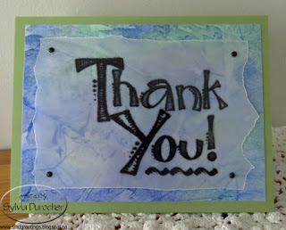
I decided to use watercolor paper I made a long while ago with a clear embossed black greetings.

The greeting is printed on vellum then heat embossed with clear powder.

I downloaded some free graphics from online.

The card stock is coordinated with the piece of watercolor paper then the vellum is trimmed and held in place with brads

The card stock is Pear Pizzaz in the A2 size.

The card stock is Brilliant Blue with the watercolor paper trimmed to leave a small border.

The greeting is cut to 3.5 inches square and aligned along the right hand side.  Held in place with pink mini brads.

The cards are for the tradesmen that worked on the project, the managers that were involved, the staff at the temporary accommodation, and my insurance agent.

The gifts were delivered and were graciously received.

The card stock is Stampin Up Island Indigo.

The greeting is placed along the bottom edge to soften the pink in the watercolor paper.

Held in place with silver tiny brads.
The card stock is SU Soft Suede.

The greeting was just designed with fonts on my computer.

Ripped the top and bottom edge of the vellum.

Held in place with brown mini brads.
The card stock is SU True Thyme.

The greeting was aligned with the bottom edge and held in place with tiny black brads.
The card stock is SU Elegant Eggplant.

The greeting was aligned with the top edge and held in place with deep purple mini brads. 


Tuesday, June 25, 2024

Cards - Christmas - Snowflake

I need to make more Christmas cards.

I browse my designer paper and chose this 1 sheet from the Season of Cheer DSP set by Stampin Up. I believe this is mistletoe.

The color in this set is Mossy Meadow but I had Always Artichoke instead, also Soft Sky as card bases in the A2 size. 

 I added a length of Mellow Moss seam binding topped with Cool Caribbean narrow rick rack with all ends taped the the back of the designer paper. It was then adhered to the card front.

For the snowflake I punched a MS Snowflake and a Stampin Up one and layered them. I added a large white sequin in the center all held in place with a tiny blue brad.  This was adhered to the card front with a medium Zot.

I added 3 white sequins adhered with Bling Zots. A seasonal insert with a white envelope completes it.

The next card is a DSP Split where I cut the one piece at 3.5 inches and flipped the small piece over and tape them back together.  I taped it to the front of a Soft Sky card base.

I then punched a border with the Stampin Up Dotted Scallop Ribbon border punch in the same Soft Sky card stock.  It was adhered over the join in the DSP.

I found a large oval greeting with a color to match and adhered it over the border punch with 3D tape.


For this card I adhered the designer paper cut to 4.00 x 5.25 inches to the front of an Always Artichoke card base.

I added a strip of light blue across the card and trimmed the ends.

I added a snowflake accent make with the Martha Stewart large snowflake punch in 2 colors - white and blue.  All held with a tiny silver star brad with a silver sequin.

I added a greeting with a Word Window greeting in a similar blue color and mounted to a Modern Label punch in a similar green color.


This card is the opposite coloring to number 2.

Always Artichoke card base with a DSP Split piece of designer paper from the Season of Cheer set.

I used a border punchie in green this time to match with the card base.

I again chose a large oval greeting held in place with 3D foam tape.

A seasonal sentiment on a white insert and a white envelope.


A mirror copy of number 3 card with the alternate combination of colors.

This is Soft Sky card base with the same snowflake accent.

The greeting again is the same with the colors swapped.

A seasonal insert and white envelope.

Press overnight to ensure the tape sticks well

Great to have a few more cards in the box.


Wednesday, April 17, 2024

Sewing Project - Wine Bottle Bag - Beau Chateau

This fabric was designed and sold through Stampin Up years ago.  This design is called Beau Chateau and the colors are Very Vanilla and Marina Mist.

This time I decided my accent ahead of time. I dug through my Stampin Up card making supplies and found some scallop edge ribbon in Maria Mist.  The wide grosgrain ribbon is ivory and was in my stash.

I laid the narrow blue ribbon on top of the ivory and ran a line of wavy decorative stitching across the width of the fabric with ivory thread.  This was my first line of stitching to quilt the flannel to the outer fabric. Then added 2 more lines of the same stitch above the ribbon running width wise.  I then ran 4 lines of the same stitching vertically going from the ivory ribbon to the base of the fabric. With that I had quilted the outer fabric.

I chose a thin ivory polyester fabric for the lining of this bag. Had to take it easy with the hot iron.

While the slit was still open in the lining I added the white button.  I tried to find a blue one that would match with no luck.


For information on "My Bag" line:

Friday, November 24, 2023

Christmas Cards - Watercolor Ornaments - Process

I decided I wanted to make some special cards for my family.  I wanted to use watercolor and ink. What to make? I considered using die cuts so that I would have a framework to work within.  I did get rid of quite a few so I had to investigate what I had left.

Gingerbread - nice size but not enough artistic options

Snowman - too big and limited artistic options

I have quite a few ornament dies.  

Some too big.  These don't leave any room for a branch or other thing to have the ornament hang.


Others too small.  Not enough to stand alone, then I could make 3 three but that is 3 times the painting and design.  Are they all the same color and design? 

This one is one of the Stampin Up Keepsakes Ornaments as are the 2 small ones above. 

I could have used the three different ones but again a lot of decisions to make and designs to come up with.  

It was very cute.

I decided to use a permanent marker instead of the dip pen because I had watercolor containers, several brushes and several palettes out so I could have easily dip the wrong tool into the wrong liquid.


This is the Sizzix Ornament #2 die which was the right size. It had a nice hanger. 

It had this bump below the round part and here was my first attempt.  I did not like to highlight it by tracing it with the marker. Then it should be shaded to make it look nice.


I could cut the bump off as you can see in this photo.  Yes, that was better.  I was inclined to create the main part of the ornament as a circle which would limit my options.


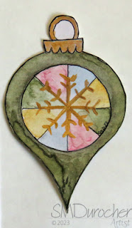
Then, I remembered that I had designed a digital ornament quite a few years ago. You can see it in this post.   I decided to pursue this option.      Pros: Using my own design was a great idea.  It meant I could size it exactly the height I wanted. It had a hanger. Cons: I would have to cut them out myself.  I decided that would add to the handmade original feel.
I traced the shape onto my nice mixed media paper with a pencil.  I then cut them out and then added the black line with the marker. Eventually, I learned it was better to do the line first then erase the pencil lines and then cut out the shape.  Here is one of my rejects.  I was not happy with the green watercolor on the outside, the circle limited my designs, then I used acrylic gold to try and save this one and I was not happy to mix mediums.
After a lot of trial and error I finally found a process that worked for me. I wanted to put these ornaments on a green watercolor background then onto a card base.   I had problems with the green watercolor layer as well.  I used salt to create texture but it must not have been wet enough so I got very little of it. This is one of my cards.  I'm not sure about just having it stuck there.  It should have a connection but I don't what it will be. Should it be a bow? a ribbon?  Would have been better to think of that before I adhered it.  We shall see what I come up with. 

Friday, November 3, 2023

Simple Sentiments - Photo - Set 2

Another set of photo cards. 

I chose a different presentation for this set.

I chose Stampin Up Soft Suede as the A2 card base, scored in half and folded.

The accent layer is Really Rust cardstock cut to a quarter sheet and cut with the SU Top Note die.  Once cut I then cut it in half cross wise with the paper cutter and then trimmed the center points off with scissors.

I trimmed the photo to 3.5 inches wide to perfectly align with the widest spot on the half Top Note.  This was adhered with tape on the back then process repeated for the bottom half.

I chose a green-brown grosgrain ribbon to lay over the join of the photo and the die cut.  It was pull to the back and taped down with tape.  This layer was then adhered to the front of the card.

A white insert and envelope finished off the card.

This card features a Jacob's Ladder blossom taken at the Botanic Park.

I chose SU Elegant Eggplant for the card base and Lavendar Lace for the Top Note layer.

I ran a piercing tool over the photo to mirror the stitched edge on the Top Note layer. 

The grosgrain ribbon is Certainly Celery.


This flower is called a Late Tulip.  I don't remember where to found it.

The cardbase is Daffodil Delight which is half a sheet, scored in half and folded.

The Top Note layer card stock is Old Olive.  Same process to trim sides.

I found some nicely matching grosgrain ribbon in my stash to put over the joins.

A quarter sheet insert and white envelope. 


This card features a Copper Skipper which is a butterfly that comes out in early spring.  Usually the first one I see on my walks.

The card base is Mellow Moss and the Top Note layer is Really Rust

I found some Stitched grosgrain ribbon to match the tones of this card.  It is a chocolate brown.

There are a couple of the cards in this set that came from the Nature Photo Calendars so they are more masculine and tones and colors. Works out to balance the set of cards.


This makes a nice set of cards. 


Saturday, September 30, 2023

Exchange Cards - September - Yellow Flowers

My Exchange Cards for September feature autumn colored flowers.

This first one is a sunflower.  The 4x4 inch photograph is from one of my annual photo calendars.  Trimmed the numbers off and it was ready to go.

I chose a Stampin Up Summer Sun card base.  I cut a 2" strip of black card stock which I punched with the SU Banner Triple Punch.  

It is very versatile as it easily centers the V on several widths of banners. Allow allows you to make any length.

Once that was adhered I installed 3 golden yellow caplets by making holes with the Crop-a-dile and then inserting the caps and choosing the right settings to press these into place.

A full half sheet white insert make this a card which can be used for any fall occasion.

This card features the same Summer Sun card base. This time I chose a Chocolate Chip piece of card stock which I aligned closer to the top of the landscape oriented card.

I adhered the 4x4 inch photo of a dahlia aligned on the left.  

Then, I chose a metal postage stamp brad in a golden yellow color.  I marked the spot for the prongs on the back and used a push pin to create a hole for them.  Press the prongs apart on the inside.

A full half sheet insert and this card is ready to be mailed on Monday.

Tuesday, January 24, 2023

Thank You Cards

I made some Thank You cards for the folks who gave me Christmas Gifts.

I was blessed with many less formal things this year such as tourtiere making with my aunt, a wonderful Christmas dinner with family, a Facetime session with Mom when she was in hospital.  Tea with my friends which gave us a chance to catch up.

I used a 9x12 inch sheet of water color paper from the pad I received from my sister. I taped it to a stiff plastic and used my Stampin Up Wonder Watercolor crayons to just smush it with color.  Once it was dried then I cut it into 3 inch squares.  

I selected my card based on the primary colors on that particular piece of watercolor.  In the top card I chose Perfect Plum as the base and printed some flag greetings to match.  I fussy cut the greeting. I adhered the piece of watercolor to the card, added the stitching and trees with a small brush, adhered the greeting with 3D foam tape then spattered the whole card with some of the watercolor I had used.

This card is has the same parts as the one above but I chose Really Rust as the card base, I use a marker to add a flower on the watercolor square, and the square was adhered on a diagonal. 

It's great to put together one large sheet of water color and get a bunch of different colored and oriented cards from it.

These could also have been placed in the tall or portrait orientation. 

Maybe the next set.

Tuesday, November 1, 2022

Christmas Card Challenge - Watercolor - Doves

I created watercolor backgrounds with the intention of using these dove brads for this set of cards. The watercolor has a bit of salt technique.

The doves come in right and left facing styles. I used a Sakura GellyRoll Stardust - Clear Star gel marker for the olive branch.

The circle behind the dove is a 13/8 inch circle punchie.

The greeting is a color printed double flag end banner I designed.

This card is Stampin Up Elegant Eggplant which is a deep rich purple color.  This card is in the landscape orientation.

On this card I used Stampin Up Primose Petal for the card base as I did not have any Rose Red card stock.

The circle is Rose Red.

The greeting is also Rose Red and I chose Peace on Earth in various fonts.

You can see the Sakura Gelly Roll Stardust - Clear Star gel marker on the image on the right. 

It just adds mostly sparkle with little colors so it works well in many situations.


These watercolor backgrounds were created with the Stampin Up Watercolor Wonder Crayons which makes it easy to match to the card stock.  

This card had lots of salt action on the color.

The card base, the circle punchie and greeting are all Marina Mist on the left and Always Artichoke on the right.

Monday, October 31, 2022

Card Exchange - Oct - Blue and Orange

I put together some cards for my exchange partners.

The paper sure looks like SU but it was not marked so I guess not.

It matches Groovy Guava, Baja Breeze and Early Espresso.

I cut the designer paper to leave a small border of card color.  

Then I taped a length of Early Espresso Taffeta Ribbon and taped the ends to the back of the designer paper layer.

This layer was then adhered to the card front.  The card above is orange in Groovy Guava card base in wide orientation.

I then put together an accent with a SU Scallop circle of Early Espresso with a white silk flower layered on top followed by a large copper sequin which is all held together with an orange mini brad.

The flower accent is adhered to the card front with a piece of 3D foam tape.  A quarter sheet white insert was glued to the inside.

The second card is blue with Baja Breeze card base and has a tall orientation. 

These will be off to my partners shortly.

Saturday, October 1, 2022

Christmas Card Challenge - Watercolor - Ornaments

Another set of watercolor Christmas Cards. 

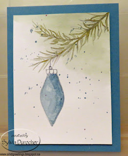
I wanted a branch with an ornament.  I put a wash of Old Olive green in the top right hand corner blended softly to the center and left hand side to suggested more tree.  

Once that was completely dry I drew my line for the branch with a pencil.  I worked with Always Artichoke, Old Olive and More Mustard. It was really hard to be loose and let the needles go willy nilly but it worked. 

Then, when the branch was dry I drew the ornament by hand with a pencil. I filled the ornament with Tempting Turquoise and Night of Navy. Card is Marina Mist. I added another layer of wash on the right hand side to suggest light from the left. 

I did the hanger with a very thin brush and Payne's Gray also lining the outside of the ornament.

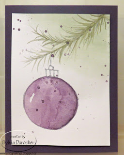
On this card I used Elegant Eggplant purple color on the ornament with the same general steps for the branch.

I ended up with a harder high light spot on the left hand side which works better.  The darker side on the right hand side does not seem to be as dark as I intended.  Watercolor is sometimes hard to judge as it dries lighter.

I have used the color of the ornament to add spatter to the layer.

The card stock used for these ornaments is the back side of the Foil Joy cards I did last month.  It was a textured linen card stock.  I think it worked with the watercolor pretty well.


On this card I used Rich Razzleberry pinky purple for the ornament.

The pieces of card stock were trimmed to 3.75 x 5 inches before I started painting. They warped a little so needed to be steamed and pressed to flatten.

The ornament layer was adhered to the card front with 3D foam tape in the corners and a bit in the center.

I did add my signature on the original art after I photographed them for blogging.

Seasonal inserts and white envelopes have been added to the mix and they are sitting in the box for December 1st.

The color is Stampin Up Watercolor Wonder crayons and coordinating SU card stock.