Showing posts with label CST. Show all posts

Saturday, September 30, 2023

Exchange Cards - September - Yellow Flowers

My Exchange Cards for September feature autumn colored flowers.

This first one is a sunflower.  The 4x4 inch photograph is from one of my annual photo calendars.  Trimmed the numbers off and it was ready to go.

I chose a Stampin Up Summer Sun card base.  I cut a 2" strip of black card stock which I punched with the SU Banner Triple Punch.  

It is very versatile as it easily centers the V on several widths of banners. Allow allows you to make any length.

Once that was adhered I installed 3 golden yellow caplets by making holes with the Crop-a-dile and then inserting the caps and choosing the right settings to press these into place.

A full half sheet white insert make this a card which can be used for any fall occasion.

This card features the same Summer Sun card base. This time I chose a Chocolate Chip piece of card stock which I aligned closer to the top of the landscape oriented card.

I adhered the 4x4 inch photo of a dahlia aligned on the left.  

Then, I chose a metal postage stamp brad in a golden yellow color.  I marked the spot for the prongs on the back and used a push pin to create a hole for them.  Press the prongs apart on the inside.

A full half sheet insert and this card is ready to be mailed on Monday.

Friday, August 4, 2023

Cards - Exchange

My August exchange cards are ready!

Again, I am using 4x4 inch photos from my 4x6 photo calendars.

I believe this is a strawberry flower with morning dew.  I would have taken it at the Community Garden.

I chose a Handsome Hunter card base.  

I cut a Stampin Up Lattice die in white.  I adhered it behind the flower photo allowing only a portion of it to show on the bottom.  

I added small yellow handmade paper flowers, white flower sequins and black tiny brads on the intersections of the die cut.

I then adhered this layer to the front of the card base, added a quarter sheet insert on the right hand panel and a white envelope.

Excellent.


My next card features a Queen Anne Lace flower which I would have taken in Ontario when visiting my sister.

The colors on this one were warmer so I chose a white card base.

I cut the SU Lattice die from a warm green textured card stock.  I split the diecut in two and placed one half on top and bottom of the photo.  The diecut was taped to the back of the photo then the layer was adhered to the card front.

The photo needed a bit of something so I used my fine black marker and added a dash frame all the way around the photo.

The photo has been trimmed to about 3.5 inches square.

I added a white quarter sheet insert and a white envelope and it is ready!

Tuesday, July 18, 2023

Exchange Cards - Purple Flowers

My cards for my exchange group are ready.

This month I chose purple/blue flowers for the cards.

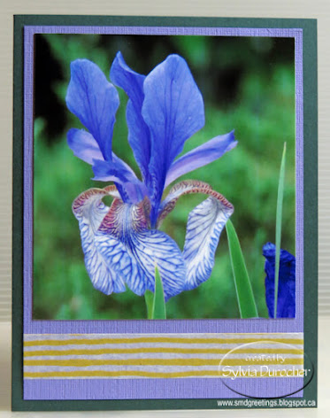
The first card is a photo of a blue iris.

I trimmed the photo to make it skinnier and  mounted it onto a piece of Lovely Lilac textured card stock. 

I added a length of yellow striped SU designer Washi Tape below the photo.

This layer was adhered to the front of a SU Handsome Hunter A2 card base in the portrait orientation.

A white quarter sheet insert was added to the inside of the card.


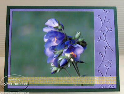
The second card features a photo of Jacob's Ladder taken at the Botanic Park.

The 4x4 photo was trimmed at the top to fit the Lovely Lilac layer.  The lilac layer is textured card stock from Stampin Up and was embossed with a border folder.

I chose a yellow SU Washi Tape with a plaid pattern to place below the flower.  I had to trim it in half so it would not interfere with the flower.

White quarter sheet insert.

Wednesday, March 1, 2023

Card Exchange - March - Five Petal Flowers

I used the Stampin Up Five Petal Flower punch for my March exchange cards.

I started with a Soft Suede card base A2 in portrait mode.  I cut a layer of this gorgeous screen printed handmade paper.  

I wrapped a length of Early Espresso Taffeta Ribbon on the left hand side and tape the end to the back of the decorative paper. 

The decorative paper was then adhered to the card front with double sided tape.

I created the flower accent with a pearl white flower stacked with a Cherry Cobbler one then the same flower in a smaller size punched in pearl white all held together with a red mini brad.  

The accent was then adhered to the card front with a piece of 3D foam tape.

This card is in the landscape orientation. The card base is Very Vanilla. 

I adhered a strip of the decorative paper along the left hand edge.

Then added a piece of non shed gold glitter card stock and taped that over the edge of the decorative paper and trimmed the top and bottom to the card edge. 

The accent is a square of Cherry Cobbler then a piece of decorative paper leaving a small border. 

Again the five petal flower accent was adhered on the square with 3D foam tape.

These will be off to my partners shortly.

Wednesday, February 1, 2023

Card Exchange - Feb - Red Raffia

Used this beautiful screen printed designer paper on this set of cards.

I used a Cherry Cobbler card base for card number 1. 

Cut the DSP to 4.00 x 5.25 inches and adhered to card front.

I chose 2 pieces of left over card stock in greens and used the SU Eyelet Border Punch on the bottom edge of both of them. 

Layered them together and punched 2 one eight inch holes evenly spaced from the center.

I pulled the Cherry Cobbler Raffia through and knotted it on the front.  This layer was adhered to the card front about 1.5 inches down from the top edge. 

It was adhered with 3D foam tape. I unraveled the raffia to have the ties spread out.


For this card I used a Chocolate Chip brown card base.

I added a decorative paper layer leaving a small border. 

I used the light green card stock and punched both edges with the Eyelet Border punch.  

I wrapped a length of Early Espresson Taffeta Ribbon across the front and taped the ends to the back. 

Place 2 one eight inch holes evenly spaced from the center, pulled the raffia through and knotted it to the front.   This layer was adhered to the card front with 3D foam tape.  White blank inserts and white A2 envelopes. 

Sunday, January 1, 2023

Card Exchange - Jan - Silver Snowflakes

Some snow flake cards for January exchange.

I started with Not Quite Navy card base.

I added a blue snowflake designer paper which coordinated well but I purchased from Michaels years ago.  Cut it down to 4.00 x 5.25 inches.

I pulled out some old Satin Stitched Ribbon in the color Midnight Muse which was an in color at the time.  Works well with the warm dark blue. Wrapped around the designer paper and taped the ends to the back.

I created the accent with a silver fabric snowflake from the dollar store, then a white plastic snowflake sequin held together with a warm navy star tiny brad. Pushed through the DSP.  

The whole layer was adhered to the card front with double sided tape.

The card is in the tall or portrait orientation and the next is in the wide or landscape orientation.

This card is identical to the first one except the orientation is changed.

I added a quarter sheet white insert to the inside and a white A2 card.

These will be out to my partners very soon.


Thursday, December 1, 2022

Card Exchange - Dec - Triangle Trees

These are my December exchange cards.  I used the beautiful screen printed decorative paper again because the colors where Christmasy.

I selected a beige card base.

I cut some triangle trees from solid card stock. For this card it was a warm green then I cut the decorative paper a bit smaller leaving a border all the way around.

I used pencil crayons in browns and greens to create a soft background and for the tree trunk at the bottom. I then adhered the Christmas Tree over top.

I added a red star sequin at the top of the tree and gold ones around the rest of the card.  These are adhered with Bling Zot glue dots.


For this card on the right a very similar layout to the top one.  This time I used a Very Vanilla card base.

Same warm green solid card stock for the tree.  

Again, a color pencil background and tree trunk.  A red star sequin at the top of the tree.

The small stars were punched from gold card stock with my Creative Memories star border punch. This is the largest of the one in the border.  I adhered them with Scotch Quick Dry liquid glue as it has a very fine point on the bottle.

I used the green pencil crayons to add some rays to the stars.

A seasonal insert was added as well as a white envelope and they are ready to go.

Thursday, November 24, 2022

Card Exchange - Nov - Screen Printed Paper

This sheet of beautiful screen printed paper stayed with me when many of the other 12x12 sheets left last week. 

It had so many Stampin Up colors in it. Early Espresso, Kraft, Very Vanilla, Cherry Cobbler, Soft Suede, Chocolate Chip and Melon Mambo.

On this card I cut the decorative paper to 5.25x4.00 then placed on a Very Vanilla card base. I cut the paper following the floral design from left to right. I then cut a piece of Melon Mambo to finish the rectangle along the cards bottom edge.  This was adhered first then the decorative paper over top of that leaving a small border all the way around. I added rhinestones in the center of the flowers with Bling Zots glue dots.

On this second card, I but a piece of designer paper for the top of the cards and a piece of Melon Mambo for the bottom and chose a Soft Suede card base.  

I ran my piercing wheel tool to make some wavy lines in the solid card stock on the bottom to provide texture.  I adhered that below the piece of designer paper on the top.  

I added a piece of Very Vanilla card stock across the join of these above mentioned papers and adhered it with double sided tape.

I then punched a SU Five Petal Punch flower in the pink and then the ivory card stock.  I layered these and added a small yellow flower in the center. This accent is held together with a deep pink mini brad.  The flower was adhered on the strip of paper with 3D foam tape.

These are off to my exchange partners this week.

Monday, October 31, 2022

Card Exchange - Oct - Blue and Orange

I put together some cards for my exchange partners.

The paper sure looks like SU but it was not marked so I guess not.

It matches Groovy Guava, Baja Breeze and Early Espresso.

I cut the designer paper to leave a small border of card color.  

Then I taped a length of Early Espresso Taffeta Ribbon and taped the ends to the back of the designer paper layer.

This layer was then adhered to the card front.  The card above is orange in Groovy Guava card base in wide orientation.

I then put together an accent with a SU Scallop circle of Early Espresso with a white silk flower layered on top followed by a large copper sequin which is all held together with an orange mini brad.

The flower accent is adhered to the card front with a piece of 3D foam tape.  A quarter sheet white insert was glued to the inside.

The second card is blue with Baja Breeze card base and has a tall orientation. 

These will be off to my partners shortly.

Wednesday, June 1, 2022

Exchange Cards - June

This months exchange card feature gold non shed glitter paper and plastic daisy accents.

I chose a Real Red card base and mounted black and white designer paper to the front. I placed a black daisy plastic flower onto a gold glitter scallop circle held together with a red mini brad and attached it to the designer paper. 

I ran a length of black thread from the flower to the edge of the designer paper and taped it to the back.  I adhered this layer to the card front.   

I added a narrow strip of gold glitter paper towards the top of the card.  I mounted a Stampin Up Modern Label Punchie greeting on the left hand side over the gold strip.

For this card I swapped the colors of the plastic daisy flower to red with a black mini brad.  

I changed the orientation to portrait (tall).

The strip of gold glitter paper is wider and adhered across the bottom of the card.

I wrapped the black thread over the glitter strip.

I created the greeting with a 2 inch oval punchie layered with a solid red one which was cut in half and offset on the right and left sides.

The greetings are adhered with 3D foam tape.

I added a white insert and envelope.

Sunday, May 1, 2022

Exchange Card - May

These cards are for my card exchange partners. 

I started with the aqua handmade paper flowers then chose the Stampin Up Fresh Prints designer paper then the pink card base.  

This card has a Stampin Up Pretty in Pink card base with a designer paper layer featuring the color of Coastal Cabana which matches super well.

I layered a white flower sequin, a yellow handmade paper flower by Prima, then a white silk flower, the large handmade paper flower and lastly a large white card stock daisy punchie onto a white tiny brad.  Once aligned I pressed it into the DSP and press the prongs apart on the back.

The card base was scored at 1.5 inches then 5.75 inches and folded to the front to create an offset fold.  

The flower accent layer was adhered to the card front with double sided tape just on the left hand side so the Coastal Cabana DSP would overlap the small flap.

The card on the right has the same accent layer of die cut flowers and DSP in Coastal Cabana as the one above.

The card base for this one is Pink Passion which is a deeper version of the one above.

These are headed off to my card exchange buddies.

I added a white quarter sheet insert and a white envelope.


Sunday, April 17, 2022

Exchange Cards - April

We are starting a new session of card exchange.  I've decided to get my cards ready ahead of time so I will not disappoint folks when I am busy moving.

I had these silver chrome metal earrings in my stash so I off the hanger and mounted them with brads.

I chose Striped designer paper by SU in Rose Red and cut it to about 4x3 inches. I adhered it to a piece of sold Rose Red card stock measuring 4.75 x 3.5 inches. I placed pink and silver brads into the holes in the larger flowers in the metal accent.  

I strung a piece of silver cord through one of the flowers and wrapped around this layer and knotted it on the right. This layer was then adhered to the front of a Pretty in Pink card with 3D foam tape.  I added the round greeting in the bottom right hand side again with 3D foam tape.

On this card it the same layout with different colors.  The card base is Chocolate Chip.  The designer paper seems to have pink and brown lines so I chose those colors for the brads in the metal accent.

I cut the designer paper larger this time to 4.00 x 5.5 inches.  Attached the silver cord in the same way.

The greeting is punched with the Modern Label Punch in color printed in Chocolate Chip with an offset of solid card stock same as the card base. It was adhered with 3D foam tape.

Saturday, January 29, 2022

Card Exchange - January - Watercolor Birds


I have been busy so my Card Exchange cards are almost late.  I decided to use the small bird image I used for the thank you project I did in December.  This time I wanted to actually paint the birds.   I prepared my pieces of watercolor paper with different background colors.  The paper is 3.5 inches wide and I just applied a wash down the sheet changing the colors as I went. It was taped down and allowed to dry completely.

I trimmed the pieces of watercolor paper to squares roughly having a different color in each square.  I traced the bird onto the center of the square by placing the line drawing below my watercolor onto my light table. I used a permanent black fine Sharpie marker to trace the image.  I then used the colors I had mixed for the backgrounds to color the bird accordingly.

Then I matched the card base to the bird color.  The one on the left is Close to Cocoa and the right is Bashful Blue.  I added a length of Soft Suede grosgrain ribbon across the card and taped the ends under the focal element.  The birds are attached with 3D foam tape.  I spattered the cards with a bit of brown watercolor.

These are off to my partners.

Thursday, December 9, 2021

Card Exchange - Nov 2021

I am getting caught up on my exchange cards.

These are late for November.

I used the Sizzix Bigz Die -Assembly Snowman by Tim Holtz and cut all the pieces for this snowman.  The hat and eyes from black, the nose from orange, the hat band and scarf from red velvet paper, the arms from textured brown cardstock and the snowballs from white card stock.

I embossed the falling snow background with the Sizzix - Tim Holtz - Alterations Collection - Christmas - Texture Fades - Snowfall and Speckles in blue card stock.

I adhered the snowman with quick dry adhesive then mounted him on the card with 3D foam tape.  I added a prism snowflake attached with bling Zot and a SU Artisan Label greeting in the bottom right hand corner.

Wednesday, August 26, 2020

Exchange Cards - Warm Spattered Paper

I made a couple more cards with the spattered paper I created on this day.

  This paper featured some simple brown geometric repeated squares pattern on an ivory background.  It is by Creative Imaginations - Art Warehouse - Danielle Johnson. It needed some sprucing up so I chose some brown and red acrylic color and spattered it. I did add a bit of black which looks charcoal here.

I chose a terra cotta colored card base for this card.  I created a floral accent from yellow, red and orange flowers and a black sequin.  The large handmade paper was colored with the same red color from the spattered paper. Matches well.  The accent is held together with a yellow tiny brad. 

I ripped the piece of spattered paper which left a space for the card color to show through. I tied a piece of black thread around the top piece before adhering it to the card front.

The floral accent was adhered to the card front with 3D foam tape.


This card features a deep red card base.

I created another floral accent with silk flowers and small black sequin. 

I taped the ends of the black sequin string to the back of the spattered paper with tape. I then positioned the floral accent to the left of center. The paper was then adhered to the card front.  I added 3 black sequins on the right hand side. 

These are in the mail tomorrow morning.


Friday, August 14, 2020

Exchange Cards - Spatter Cardstock

I made a couple of cards with the the great spattered card stock I made a while ago.  I loved how I was able to get ink splotches!  The original 12x12 card stock is by Teresa Collins - Giving Thanks.

I started with card bases in Stampin Up Bermuda Bay. 

I used Nick Bantock's Cerlean Blue and Chrome Yellow liquid acrylic as well as white pearl Gleams acrylic paint on this card stock. 

I found some large die cut flowers in aqua.They needed a bit of a texture so I used the same colors again on the large handmade paper flowers.  Then I added a pearl white flower die cut made with the Stampin Up Flower Fair thin-let set.  I layered a deep teal flower then a smaller deep yellow one held in place a deep teal mini brad.  This was assembled into an accent.

I cut the spattered card stock to 4.00 x 5.25 inches and adhered it to the card front.  I added  a ripped strip of silver metallic card stock.  I then adhered the flower accent with 3D foam tape. I added a quarter sheet insert.


This card as very similar pieces. 

The ripped strip is pearl white cardstock. It was adhered to the card from then trimmed it to the card edges.

The flower accent has a deep yellow mini brad in its' center.

I love the swirls of grey in this card stock.   I chose their layout to determine where I was going to place the flowers.

These are headed out to the mail box.


Tuesday, August 4, 2020

Exchange Cards - June

I am really late on these cards. 

I started with the Dandelion paper I made a while ago which features navy, ultramarine, and turquoise with white pearl as colors on a yellow base.

I ripped the right hand side. 

Wrapped a piece of white seam binding around it on the left hand side and tied a knot.

I added pearly sequins to the center with Bling Zots. 

It's great that the paper can be used tall or wide. 

For this card since it mostly has one flower I added the seam binding to the left hand side to fill in the space.

Pearly sequins for the center of the flower again held in place with Bling Zots repeats the white pearl in the paper.

For both cards I used the navy card base but I had selected a turquoise and medium blue as well.

Quarter sheet inserts work for both of these.

These are off in the mail today.

Wednesday, April 15, 2020

Exchange Cards - Paper Strips

I have tons of strips of paper cut off from 12x12 designer paper.  I was looking for a way to use these so onto the internet to find solutions.

This is a technique I found.

I cut the designer paper strips to half inch and sorted them into similar colors schemes.  Selecting designer card stock that I am not inspired by I cut it into 4.25 x 5.5 pieces.

I applied glue stick to the quarter sheet and laid my first long strip.  I then applied the other piece perpendicular to the first one.  I continued till I had covered the whole piece of ugly card stock.

I trimmed the strips close to the card edge and pressed them under books to let the wet glue to set up and dry.   After several hours I trimmed this background to 4.00 x 5.25 inches.

I then chose a warm dark blue card base onto which I adhered my paper strip background.
Then I added a piece of white rick rack wrapped around the card front.   I taped the ends under the accent.  The accent is a scallop punchie, a 1 3/8 inch circle then a white color printed greeting.  These were adhered into an embellishment.  It was adhered over the join of the rick rack with 3D foam tape.

In the tiny gaps between strips I applied chalk to lessen their impact. I chalked the edges as well.

The pink background was adhered to a bright pink card base.  It also received a scallop greeting.

These are headed to my card exchange partners.

Wednesday, March 18, 2020

Exchange Cards

I decided on hexagons for this month's exchange cards.

They are cut with the Spellbinder Nestabilities set.   I chose a true blue card base in the landscape orientation.

I added a length of red grosgrain ribbon wrapped toward the top of the card.

I added 3 blue hexagons adhered along the ribbon.  I chose one red hexagon and a greeting.  The greeting is color printed and punched with the Stampin Up Modern Label.

I chose a kraft gate fold card base and included an ivory insert.


I used the Stampin Up Wonder Watercolor crayons to add some texture to the card front.  I used Riding Hood Red, Always Artichoke and More Mustard.  The color was applied with a natural sea sponge.

I mounted 3 hexagons with the adhesive on the left hand side so the card will still open.  They were cut from warm tones card stock.

These are off to my card exchange partners.

Saturday, February 29, 2020

Exchange Cards

I created a piece of watercolor paper using Stampin Up Watercolor Wonder Crayons and white heavy textured card stock.  I used Always Artichoke, Garden Green, Cajun Craze and More Mustard with a #4 brush.

Once dry, I cut it into leaves with the Spell Binder Foliage thinlet set.

I chose a pea green textured card base with a piece of designer paper with red accents. The paper is by Fancy Pants - Christmas Magic - Mince Pie.   I did add a bit of Cajun Craze to the die cut to connect with the dots.

The die cuts were adhered to the card front with Scotch Quick Dry adhesive.

The greeting is a Stampin Up Decorative Label punch in ivory with printed words. I water colored it as well.  It was mounted to the card front with 3D foam tape.
The same pea green textured card base for the card on the right.

On this card I used a different designer paper for which I have no credits.  I ripped the bottom right hand corner then adhered it to the card base.

The large leaf and a couple of small leaves were used in these cards.

The greeting is a Stampin Up Decorative Label punch in ivory with printed words. I water colored it as well.  It was mounted to the card front with 3D foam tape.

These are off to my card exchange buddies.