 I worked on more watercolor cards this week.
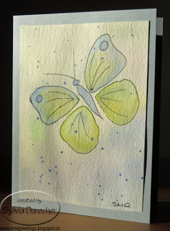
I needed a sympathy card and I have found that butterflies are a great symbol for that occasion.
I drew a basic butterfly outline that I will be able to use then adjust the shapes of the wings as I choose.
I again cut a long strip of 140lb water color paper and taped it to my desk. I applied a light coat of color across the whole piece and let it dry.
Once dry, I cut it to 4" wide pieces then added my elements.
Here I have put the butterfly on the right and filled the wings with mostly lines. I used a blue, yellow & green color scheme. I added some color below the butterfly to make the bottom a bit darker which helps to ground the composition.
Once, dry I spattered a bit of blue and let that dry again. Trim the piece to it's final size and adhered it to a card base of Bordering Blue.

I created this butterfly with just lines in the wings put down with a Faber-Castell Ecco Pigment Black pen in size.4.
Painted with some pink, purples and blues.
Again, I added some additional color in the bottom left hand corner to ground the composition.
A bit of purple spatter.
I believe the card base is Brilliant Blue.
Really loving the subtle colors in these cards.
I used my Lowe-Cornell watercolor palette.
The blue one will be mailed out today for a friend who lost her husband last week. They have been married for over 70 years.
On this bulrush card I just lightly drew a rough composition with a pencil. Started with my horizon line, added the sun, then the bulrushes.
I have a brown in this palette so I did not have to mix it but just darken it a bit.
I mixed a warm green for the bulrush leaves.
A warm golden yellow for the sun and some blue for the water.
I had to make decision about whether the bulrush stems were in front or behind the leaves.
Once dry I added a bit of yellow above and below the sun to have the sun glow. This worked out very well this time.
Once trimmed I mounted it on a card base of Crushed Curry.
Each will get a blank quarter sheet insert and a white envelope.

 I made this card for my real estate agent who helped my purchase my next home.


