Showing posts with label SMDWC. Show all posts

Thursday, June 2, 2022

Christmas Card Challenge - Watercolor

Worked on Christmas cards again.   

Using 140lb rough watercolor paper trimmed to approximately 4.00 x 5.25 inches.

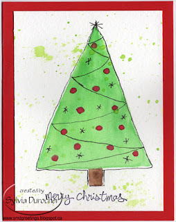
I wet the triangle and just dropped color inside and let it blend together.  Added a trunk and let dry.

The red dots were added after the tree was dry.

I used a Micron Fine Permanent black marker to add the lines, the star and outlines around the dots.  Spattered the background by covering the tree with scrap paper.   This was mounted onto dark green card base with a seasonal insert.

The colors are different on this one and I chose another pattern for my lines.  This are quite not traditional colors and I am okay with that.

Stars replaced the cots.

This one was mounted on a medium olive green card base with a seasonal insert and white envelopes.

A few more cards for the box! 


Sunday, May 8, 2022

Mom's Day Card

I painted a blue daisy flower for my Mom's mother's day card.

Her favorite color is blue.

I used a piece of 140lb rough water color paper measuring approximately 4.25 x 5.5 inches.  I sketched it lightly with a pencil and then painted it with my Stampin Up Wonder Watercolor  Crayons.  Using Marina Mist as the main color with some Night of Navy and some Not Quite Navy.   The leaf colors were Always Artichoke and More Mustard.  The center is More Mustard.

Once completely dry I traced around the flower and leaves with a black permanent marker. 

I mounted the flower onto a half sheet card of Marina Mist card stock.   I added white and medium blue seam binding below the flower by punching a slit in the fold then wrapping them around the card front and knotting in the front.

A white insert was added to the inside.


Friday, April 1, 2022

Christmas Card Challenge - Watercolor - Dot Wreath

I chose to use my Stampin Up Watercolor Wonder Crayons for this month's Christmas Cards as that is the card stock that has not been packed.

I used Arches Watercolor Cold Press Paper.

I started with a light pencil circle mark.  I sprayed my crayons. I mixed Always Artichoke and Garden Green for the green dots, Cherry Cobbler and Real Red for the red ones and Not Quite Navy and Night of Navy for the blue ones.  I applied the dots with the end of a cotton swab which I wet then dabbed into the colors. 

I drew a bow towards the bottom of the wreath with a Micron black permanent marker then filled it in with a bit of the red paint.

The greeting was traced with the black marker using the window as a light box.  I just printed several greetings on a quarter sheet of white paper.


I added a few stars with the black marker to balance out the shape.

The piece was then spattered with colors used in the card front but somewhat diluted.

I chose a Not Quite Navy card base.  I adhered the wreath watercolor to the card with double sided tape, added a quarter sheet insert and pressed them to ensure all the pieces stick together.

I am taking advantage of some down time now to get ahead  with this project so when the move comes I don't have to worry as these will be scheduled to arrive on time.

Thursday, March 17, 2022

Card Exchange - Spring Watercolors


I am trying to get caught up on things.  

I decided to make some spring watercolors for my March exchange cards since the spring solstice is on Sunday.   I tried some wreaths yesterday which did not go well so I turned the paper over and tried again.

Some purple and pink blossoms on sprigs of greenery.  I used my Loew Cornell palette for these pretties.

A bit of spattering with the flower color and the leaf color and let it dry.

Fortunately, I still had 8.5 x 11 card stock which was not packed but it was white.  I did not like the idea of white watercolor paper on white card stock so I painted the edges of the card base with black watercolor.  Love the shades in the border when I adhered my watercolors to the card front.  With the photo studio also packed away I had to come up with alternate photo location. 

These are pressing and will be off to my card partners this afternoon.

Thursday, February 3, 2022

Christmas Card Challenge - Watercolor - Christmas Chickadees


Here are my cards for the February Christmas Card Challenge.  I chose to make Christmas Chickadees.  Using the bird line drawing I have used a few times, I changed it up a bit and added a evergreen bough instead.  I studied the coloring of these birds then started.  I laid the outline of the bird onto the 140lb cold press watercolor paper which measures 3.5 inches by 4.5 inches.  I applied clear water around the outline and dropped blue at the top and green on the bottom for a light background.  I let this dry completely.  I painted the black head, throat and beak of the bird leaving a bit of white in the eye and let dry.  Next, I applied a puddle of clear water on the breast area and dropped a bit of yellow into it and let it dry. I added the brown branch and the green foliage next.  I then added a bit of light grey to the wing and tail.  Once dry, I traced the outline with a black permanent marker.  Love these!

I steamed them and pressed them between books to flatten them.  I chose a warm green card base, added an aqua grosgrain ribbon with the join under the accent.  The chickadee watercolor is mounted with 3D foam tape.  I printed some greeting with the Teeny Tiny Wishes digital stamp set by Stampin Up. I punched them out with the Small Oval punch.  I lightly brushed a blue wash over the black letters. These where mounted with slightly thicker tape to have it higher than the chickadee layer.  Super happy with these cards. 

Saturday, January 29, 2022

Card Exchange - January - Watercolor Birds


I have been busy so my Card Exchange cards are almost late.  I decided to use the small bird image I used for the thank you project I did in December.  This time I wanted to actually paint the birds.   I prepared my pieces of watercolor paper with different background colors.  The paper is 3.5 inches wide and I just applied a wash down the sheet changing the colors as I went. It was taped down and allowed to dry completely.

I trimmed the pieces of watercolor paper to squares roughly having a different color in each square.  I traced the bird onto the center of the square by placing the line drawing below my watercolor onto my light table. I used a permanent black fine Sharpie marker to trace the image.  I then used the colors I had mixed for the backgrounds to color the bird accordingly.

Then I matched the card base to the bird color.  The one on the left is Close to Cocoa and the right is Bashful Blue.  I added a length of Soft Suede grosgrain ribbon across the card and taped the ends under the focal element.  The birds are attached with 3D foam tape.  I spattered the cards with a bit of brown watercolor.

These are off to my partners.

Thursday, January 13, 2022

Christmas Card Challenge - Watercolor - January


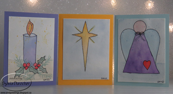
I made these three watercolor cards for my Christmas Card Challenge - Watercolor for January.  I chose 140lb cold press watercolor paper.  I cut a piece of paper and taped to a piece of glass.  I drew my images by hand then painted them.  I traced the images with a black permanent marker after they were dry.  I them spattered them with watercolor.  I trimmed the images and I had cut it too short so on some of them you can see the line from the tape.  Live and learn.

The first is a candle and I used a gradient wash from blue to purple on the body of the candle. I added holly leaves and berries then added some different foliage. I added yellow, orange and red to the flame.  I left the foliage not touched by the black marker. I added a background to the bottom and the top.

The  middle is just a Bethlehem Star.  I tried to add spatter with bleach thinking it would remove the color but it did not.  Maybe I should have added yellow. 

The angel is a design I create years ago for a custom ornament.  A background was added to this one also with a spatter of blue.  I think I made the bow too small.  Still happy with it.

Tuesday, November 30, 2021

Four Season Art Show - My Submissions

The theme for our end of the year member show this year is "Four Seasons".

I chose to do a smaller version of the large sunrise I painted for the stained glass piece. You can check out the Sunrise Stained Glass project. 

Title: Summer Sunrise

Size: 14 x 14 inches

Watercolor

Mats: White Double Archival

Frame: Black Wood medium profile

Print: 8x8 inches

I used my Loew&Cornell watercolor palette to paint this piece.  The black lines are done with a Micron Archival marker. 

Back to my regular art of photography.  This was taken a couple of years ago.  Love the crystal looking frost on this pine branch.

Title: Winter Frost

Size: 16 x 12 inches

Signed Photography Print

Mats: White Single Archival

Frame: Black Wood medium profile

Print: 8x10 inches

I chose to do a mixed media piece as well.

Title: Four Seasons

Size: 13 x 11 inches

Mixed Media

Mats: Wood

Frame: Black Wood medium profile

Print: 5 (4x6) openings


This is a wooden frame with 5 openings for 4x6 photos.  I chose the first pussy willows for spring, bees buzzing for summer, a beautiful orange horse chestnut leaf for fall, and a small evergreen tree in a snow covered landscape for winter.

I watercolored a background onto which I printed words I created which describe the transition from winter to fall. 

Saturday, November 20, 2021

2021 Photo Card

I try to make at least one Christmas photo card every year.

I was given this dove ornament a couple of years ago by one of my sisters.  I decided this year to use it for my photo card.

I wanted Peace on Earth so I needed to create myself an earth. I set the dove up in my photo studio so assess what size the earth should be.  I determined it needed to be about 8 inches in diameter.

I found a dish in the kitchen and traced that onto a piece of bristol vellum card stock.  I found a tutorial on line on how to draw an earth.  Using the instructions I drew an earth in pencil so I could erase until I had it right. I then painted it in watercolor ensuring that I had enough texture in the land and water.  I then added the borders in black Sharpie marker. 

Once it was dry, I installed it in the studio adhered to a blue material background I have for the studio.  I used several Zots to hold where I wanted it.

Then I found many shots with different lighting and angles.   I reviewed my shots and took some more and repeated the process one more time.

I was finally happy with one of the shots.  

I added the greeting and the olive branch in post processing.  I printed the card at 4x6 inches.  Once those were back from the developer, I got ready to create the cards.  I was glad that I had used black borders and black shadow on the greeting which worked really well with a black 110lb card base.  I adhered the photos to the card front of a 5x7 (A7) card base.  I printed a sentiment in keeping with Peace on Earth on letter paper and trimmed those to fit inside.  I adhered those with glue stick. 

Just like that I have 15 photo cards to add to my stash.  Very happy with these.  The ornament is headed to my other sisters house for Christmas because she loved it.  I am sure the earth will come in handy in the photo studio again.  Win Win!

Wednesday, October 27, 2021

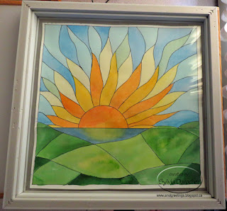
Stained Glass - Sunrise

I've always wanted a stained glass piece for my window and thought it would be a nice retirement gift but it did not happen.  So I decided that I would pursue the idea and see where it led.  In my mind I see a colorful image casting beautiful colors on the wall and ceiling, almost sparkly.

First, I had to decide what image did I want?  Sunflowers are a favorite but I chose a sunrise as it represents a new beginning, hope, and a look to the future.

Second, research as to what a piece would cost, which window would work best, and would it do what I wanted.

Third, a trial run - how? I found a site that provided a video on how to create a piece of faux stained glass art and a few steps with easily found supplies. At Art Emporium the Faux Stained Glass video used basic school glue and acrylic color to make an art piece.  

Frame-  I found a white frame in my stash that did not have a mat and was quite large measuring  16.5 inches square so it likely would not be used in my photography.  It also had words on the glass that I removed with a razor blade.  Cleaned the glass thoroughly.

I needed some original art now so I browsed online sites with stained glass sunrise projects and after looking at hundreds I started to have an idea what mine would look like.  I did not want the pieces to be too bulky or too simple.  Remember I want lots of color.  


I drew the first sketch - sun off center, water and hills in the foreground.  I did not want straight lines like in the little one drawn below the sketch. 

This one was drawn at 7 inches square.


I traced it onto not the best watercolor paper and used my Stampin Up Watercolor  Wonder Crayons to color it.  I loved the colors but I stumbled with getting a variety of shades of green in the hills.  Of course, a real stained glass piece will not be a shaded as this one.

I asked a few folks for some feedback. 

I recognized that I had a hard time drawing the secondary rays on the left hand side.  Someone suggested that I copy the image and put then flip it so I could roughly follow what I did on the right on the left.

The hills were too similar and did not have enough pieces.

Ok, I can work with that.


So with that feedback I started on the second sketch.  This one was also at 7 inches.  

I now had light yellow pieces on the left hand side as well and more pieces in the hills.

I marked out the which rays would be Orange, Yellow and Light Yellow.  I wanted green blue and blue in the sky pieces.

Happy with that so lets move on.


Now it had to be enlarged to fit the frame I described above.  The glass could not be removed from the frame so I would have to be painted and leaded in place.  Because of that I chose to keep the design from going all the way to the frame.  That meant I did not have to touch the frame with the leading.

I enlarged it to 14 inches square and decided to put a frame around the edge which would leave about 1/2 inch between the wood frame and the lead frame on the glass.  Excellent.

Another suggestion was made that I paint it in the colors I was planning on using in the final piece just to be sure I was happy with it and still had a chance to adjust if needed.

So I traced the 14" piece onto some Bristol Vellum heavy card stock which was leftover from an art class I took years ago.  It had to be pieced together just like the sketch was earlier, to be large enough.

I sampled the liquid acrylic colors I had and made some selections.

The colors chosen are listed below:

Nick Bantock - Chrome Yellow, Deep Turquoise, Prussian Blue, Sap Moss Green, Chartreuse

Daler-Rowney FW Acrylic Inks - Flame Orange, Rowney Blue


Here's the Bristol Vellum piece all colored in. The yellows in the first row of rays are not all the same color.  I was just enjoying the process.  

I will be able to mix colors in the final product as well.

Of course, it will be more watercolor in tone than a glass piece will be.

I am happy with the hills this time in shape and color.

I used a Sharpie black marker with a fine tip to do the black leading on this piece.


Now I can get ready to transfer the image to the glass in the frame.

I placed the frame over the painted piece of Bristol Vellum and taped it carefully in place.  I will be putting the black leading on the glass surface on the inside of the frame. 


I chose Pure Black by Folk Art for the acrylic paint.

I reused at glitter paint bottle with a fine tip.  The black leading is mixed 1 part black acrylic paint and 4 parts white glue.  Test it to be sure it flows nicely so you can easily draw your lines.

I traced the black lines on the glass following the  drawing above.


You will see from the photo on the left that I put the art on my light table so that I kept the composition in the same direction as the original so when I flipped the frame back to the front it would be same as the original art.

Once the black leading was applied it needs to dry completely before you paint your color.  The video recommended overnight.  I painted my lines in the early morning and by the late afternoon they were dry and I could move on to the color.  The fun part was beginning.


I used some condiment cups to mix up my clear glue and acrylic color.  A cup for each color.

I applied the glue with a small wide craft brush and made sure I rinsed thoroughly before moving to the next color.

Then I followed my color chart from earlier and painted the sun and up then from the horizon line down to keep my hand and fingers away from my finished work.  

I let that dry over night.   


I discovered that I missed the top right most space when I was painting.  I did paint that several days after it was hung.


The next morning all was dry so I put the eye screws in the top middle of the width of the frame.  I chose wire to ensure it could carry the weight.  I have a second curtain rail so I slid a hanger onto the rail and screwed it tight. I then placed a carabiner between the wire and the hanger.  

I hung it in the window and waited for the sun to shine.  It took 3 days to have the sun shine and for the colors to be on the walls of the living room.

I was not anticipating it being so random as to when I would see the colors sparkling.

Of course, looking out it looks really nice but when the sun shines it is great. 


Another down side is that the sunshine only shines for a limited time through the window and the stained glass.  So I have to be around and paying attention to see the sparkle for the 10 minutes it is on the wall before it moves off the the book case.

In this photo the image is half on the wall and half on the side of the book case.

It took over a month from start to finish.  

The costs in materials was minimal. School glue on sale in early September. Liquid acrylic I already had. And my time.

Thanks to the artists who provided feedback and support during the process.

This was a great learning experience. Drawing, mixing colors, and sticking with it.   The biggest thing I learned is that I want sparkle all the time or when I need it not just when the sun shines in the window.  I am so glad I did not invest hundreds of dollars to learn this lesson.  I will enjoy it when the sun shines.

So, I have started another project to get the sparkle all the time or at least when I want it!  More to come on that project in days to come.

I Love You Card

I made a card for my Dad who is in hospital and not doing well.

He is too sick to have the surgery he needs to fix his arm which was broken in a fall very early morning Friday.

I just wanted to let him know that I love him and whatever happens all will be well.

We have started the process of him moving from the apartment to a place with more care.

He is in his early 90s and has survived many health issues.

I pray that God blesses him today and that he knows how much we all love him.

I watercolored the heart, ran a line of gold metallic ink around it and spattered it with the 3 colors I used - Nick Bantock - Vermilion, Rose Madder and Plum.  Added a gold ribbon wrapped around the card front and tape to the inside. Mounted the heart to a brown card A7 base with 3D foam tape. 

Wednesday, August 18, 2021

Watercolor on Handmade Paper

More reusing supplies from old card kits.  I just loved these small white handmade paper sheets and could not just give them away.  I have painted daisies on these in the past but I wanted to create new art on these.

I am using my Stampin Up Watercolor Wonder crayons in rich regals and brights color families.

This one is an abstract flower in the blue green color family.

I had to trim the handmade paper because the other flowers were not great.  This required an additional layer so i chose some Old Olive on some Not Quite Navy card base.

I always adhere handmade paper to cards with hot glue.  It works the best but you have to be fast before it cools.

This card features a multitude of pinky orange abstract flowers again.  Regal Rose and Old Olive are the colors used.

I did try to put a background of subtle color which did not really work great.

Mounted on a Regal Rose card base.

Each card gets a white blank insert on the inside.

I signed each one as well.


I started with abstract shapes on this piece of handmade paper.  

The colors used are Tango Tangerine and Marina Mist.

I dug through my bling box and found these butterfly confetti sequins which were the right blue color.  I then added them to the handmade paper sheet with orange tiny brads.

I like the fact that there are 2 different designs of butterfly.

Makes me think Santa Fe coloring.

Mounted to the a Marina Mist card base.


This card features Bravo Burgundy as the color in several shades for the flowers.  I was thinking of roses when I painted but I am not sure I succeeded.

Always Artichoke for the stem and leaves with a bit of mixed brown thrown in for good measure.

A bit of spattering in the main colors to lessen the white background.

Mounted to a Bravo Burgundy card base and a white insert.


I tried following the design of the small deep teal handmade paper flowers I had selected as inspiration.  

I had to remind myself - Stick to the 5 petals and make them rounder than usual.  Always Artichoke for the stem and long open leaves.

I mounted the small pale yellow flower then the bit larger teal one onto the watercolored on with a tiny white brad.

Mounted to a deep teal card base of textured card stock.

A bit of spattering to tone down the white background.


I painted the flower with More Mustard and a bit of Daffodil Delight with a lot of long slender petals. I think I should have overlapped some of them.

I really needed Summer Sun to match the card base but I did not get the yellow mix quite as good as I hoped.

A mix of greens and blues for the closed long leaves.

I mounted a small yellow handmade paepr flower in the center of the watercolored one, held in place with a tiny white brad.

These no greeting cards could go into the cards for seniors box but I am not sure yet.

Love the painting.

Monday, August 16, 2021

Miniature Watercolors into Cards

I was inspired by a photography challenge to produce some art and I chose watercolor.  

I opened a pad of water color paper bought at a scrapbook store. There is no indication of the weight of the paper so I was not getting my hopes up.  

I cut down a sheet about letter sized into 4 smaller pieces.  Some square and others not.  I pulled out my Stampin Up Watercolor Wonder Crayons so I can match it will card stock later.

This one is a bit of a landscape with a tree, flowers, the sun and a few birds flying in the sky.  The paper worked really well in this small size.

I paired it with a piece of Bashful Blue leaving a tiny border and ripped the bottom edge.  I mounted that onto a piece of Passion Pink card base.  Stamped a greeting with Old Olive with a set of small clear stamps. I spattered the card once it was finished.

This next card features just a little watercolor using the wet in wet technique.  I sprayed the entire paper with clean water.  I then dropped spots of color - Rich Razzleberry, Regal Rose, Marina Mist and Old Olive. You can see where the colors mixed in place to produce a purple.  

I was going to define the pinks as flowers but I was happy with the composition so chose to stop.  I dried it with my heat gun and signed the bottom.  It was spattered with a bit of green.

I cut a banner of Bashful Blue and mounted it across an Elegant Eggplant card base.  Stamped the greeting again in the Old Olive color.  The watercolor was adhered to the card front with 3D foam tape.

I started the composition with flowers in mind. I dropped the Regal Rose pink with a bit of Daffodil Yellow and the soft green of Old Olive in the background.  It was dried with the heat gun.

I then used a black Micron Permanent Black Marker and drew my flower petals and leaves.  I chose to add a bit more color to the leaves and petals.

I mounted it to a piece of Regal Rose and ripped the left hand edge.  I stamped a several butterflies on the left hand side.

This layer was adhered to a Garden Green card base.
Each card has a white quarter sheet insert on the inside.


Sunflowers are in full bloom around here these days.  I love them. 

This is my attempt on a sunflower against a pale blue sky.  I used some More Mustard and Daffodil Delight in the flower and Always Artichoke with Old Olive in the leaves. I mixed the brown for the center.

It was spattered with much watered down Old Olive once it has been dried with the heat gun.

Again layered on a piece of Bashful Blue ripped on the right hand side. Stamped the greeting in Old Olive. 

The thank you ones will be donated to Compassion House and the others will be added to my card box. 

It was a lot of fun!

Sunday, July 18, 2021

Balloon Cards

I painted some balloons with watercolor.  I chose my Watercolor Wonder Crayons from Stampin Up to match the card stock I am using. 

I did draw a slight image to follow in pencil on heavy white card stock.  

I chose Always Artichoke green, More Mustard yellow and Bravo Burgundy with Cherry Cobbler red for the balloons.  

I added strings with a black permanent marker once the piece was completely dry and pressed flat.  I signed the art as well. 

I added a length of Bravo Burgundy grosgrain ribbon across the bottom o the card with ends taped to the back.  

I added a Modern Label punchie color printed greeting with a More Mustard offset to match the card base in the same color.  This was adhered with 3D foam tape.


Another balloon card.  I chose Old Olive, More Mustard, Not Quite Navy and Real Red card stock for the balloons.  

I cut them out of scraps of cardstock with my Create Cricut electronic cutting machine using the Create a Critter cartridge.   I cut them at 3", 2.75" and 2.5" inches.  I tied black thread onto them for strings.  I added white highlight spots on each of them with a white opaque marker.

Added a piece of sky designer paper which I warmed up with some warm yellow chalk pastel applied with a stipple brush and adhered to the front of an Old Olive 5x7 card base.  I then assembled the balloon bouquet with the ones farther back adhered to the sky paper, then the next ones with 1 layer of 3D foam tape then the small red one in front with 2 layers of 3D foam tape.   This adds depth to the composition.

I taped all the string to a central spot.

I added a ripped color printed greeting over the strings with 3D foam tape.

Friday, February 26, 2021

Christmas Card Challenge - Feb - Watercolor Cards 2

Here are the next 4 cards in this watercolor challenge.

I lightly drew the shapes with watercolor pencils. I then used red watercolor to paint this trio of elliptical ornaments.  The 140lb watercolor paper was taped down to a piece of glass and allowed to dry taped down.

Once dry, I added the black lines with a thin permanent marker.  

I then added spatter with gold liquid acrylic color. 

I mounted this on a dark card base.

This card is a round  ornament in fuchsia color.

I added a string where it hangs and a tiny bow. I added some pearl liquid acrylic to the sections of the shape.  Spattered with fuchsia color.

The greeting is from the Stampin Up Good Greetings set in permanent black ink.

I really loved the snowbanks I created in this composition. 

I added a twig tree with the black marker.

Stamped the greeting on the lower right hand quadrant.

This wreath was created with light and dark leaves. Remember to keep them in the same direction.

I added black outlines on the leaves and a bow at the bottom of the wreath.   

Stamped greeting above the wreath. 

Spattered with red watercolor.

Wednesday, February 24, 2021

Christmas Card Challenge - Feb - Watercolor Cards

I decided to try watercolor cards for my February challenge.

I watched several Youtube videos from Maremi Small Art.

She has several at the beginner level.  It seemed pretty easy so I gave it a try.  I chose to tape down my Cotman 140lb Watercolor paper to a piece of glass before I started.  I painted my color then allowed them to dry still taped down.

I cut them down into individual art pieces measuring 3.75 x 5.00 inches and added the black lines with a permanent fine tip marker. I stamped the Christmas Greeting from the Stampin Up Good Greetings set.

I adhered the watercolor piece with double sided tape to a coordinating colored card base.

I chose various color to spatter the small pieces of art. 

For the first one I chose a lavender card base with black spatter.

I did draw a rough outline with watercolor pencils before I started applying watercolor with a brush.  I picked up this tip from another video I watched and it was a great idea.

For the card on the right I chose a ultramarine blue card base for the yellow star watercolor image. 

On the tree card I used gouache (opaque watercolor) for the red balls because mixing red with green watercolor would have yielded brown ornaments.  

I used the same green for the spatter then a nice red card base. 

On this next card I painted a round ball which I turned into an ornament.  

I added the hanger and string with the black marker. Then patterns onto the ornament itself.

I added copper accents to the patterns I had drawn with the marker.

I added quarter sheet inserts with a seasonal sentiment.

I have made another set of four but they have not been turned into cards yet.

This was a lot of fun but harder than the videos make it look.