Showing posts with label mini brad. Show all posts

Sunday, March 30, 2025

Cards - A7 - Die Cuts

Another few cards today.  Again, A7 (5.25x7.25 inch) envelopes.

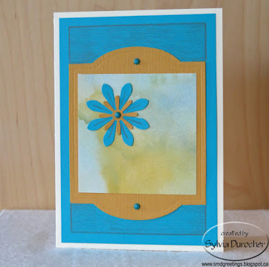
I started with an ivory card base.  I cut a piece of textured turquoise card stock to leave a small border.  

I cut a Tim Holtz Cameo Frame die cut from left over Stampin Up More Mustard card stock from yesterday's session. Trimmed a piece of watercolor designer paper to fit the middle of the die cut. 

The floral accent is a large daisy punchie in turquoise, topped with a small More Mustard one held in place with a turquoise mini brad. 

The cabinet die cut was then adhered to the turquoise layer with 2 more blue mini brads top and bottom.

I added the finishing border with a warm grey colored pencil and also added lines on the large daisy die cut.  A white insert and an ivory envelope to finish it off.

For this card the base is SU Tempting Turquoise card stock in 12x12. 

I used the negative piece from the Cameo Frame die cut to layer onto the card front leaving a tiny border. 

I placed a piece of the watercolor designer paper behind the More Mustard layer. 

I cut a Sizzix Leaf Stem die cut from warm green card stock then embellished it would pencil crayons. I cut a couple more leaves and added them below the opening.

I added a pencil crayon line along the inside of the die cut in a warm grey.

A white insert and an ivory envelope were added.

For this card, I chose a warm green card base. 

I ripped left over card stock in the More Mustard and the Tempting Turquoise and layered them with a piece of the watercolor designer paper.

I cut a flower with the Sizzix Flower Daisy #4 die from turquoise card stock.  I glued it to the front of the card with Scotch Quick Dry adhesive.

I added some texture to the flower with colored pencils. 

I mounted a tiny button in the center of the flower with a Bling Zot.

A white insert and an ivory envelope completes the card.

Saturday, March 29, 2025

Cards - A7 - Florals

I needed a distraction today so I put my hands to making some cards for my stash.

I found some A7 (5.25 x 7.25 inches) envelopes which were free when received so nice to destash.

The floral designer paper I chose is by Anna Griffin in this grey brown color cut to about 4 inches. 

The dark layer is some Early Espresso in Co-ordinations style which means it has a colored core and folding the card stock reveals that color so I used it for the layer and band instead.

The script paper at the bottom designed by Blue Fern Studios - Paisley & Vine - Bohemian. 

The card base is Stampin Up Sahara Sand.  A white sheet insert and ivory envelope.

This card has the same components.

I cut the floral paper to leave a large board all the way around then cut a Early Espresso layer leaving a narrower border.

SU Sahara Sand is the A7 card base used in the landscape orientation.

I cut a band of the dark brown card stock and flagged the end. Using 3 ivory mini brads I adhered it to the 2 other layers.

This full layer was then adhered to the card base with double sided tape.

A white insert and an ivory envelope.

For this card I chose a Stampin Up More Mustard card base to fit in an A7 envelope.

I cut the floral designer paper by Anna Griffin in the mustard color to leave a wide border all the way around.

I layered a piece of Early Espresso card stock behind leave a narrow strip on the left and right sides. These were adhered to each other with double sided tape.

I cut a strip of the dark brown card stock and then added 2 Stampin Up Five Petal punchies in the dark brown and the More Mustard colors with a tiny flower punch in the center all adhered to the layers with a More Mustard mini brad. 

A white insert with an ivory envelope.

A Stampin Up More Mustard base to fit in an A7 envelope.

The Early Espresso but to leave a small border all the way around and the mustard floral by Anna Griffin cut a bit smaller to provide an even brown border on all sides.

I added a band running top to bottom on the left hand side of the floral piece.

I punched a Martha Stewart butterfly punchie in More Mustard and adhered it to the 2 previous layers with a yellow mini brad.

This was all adhered to the card front in the landscape orientation.  White insert and an ivory envelope. 

Tuesday, June 25, 2024

Cards - All Occasion - Block Print Paper

I found this Indian Block Print Handmade Paper at the ReUse Center recently and loved it.  I knew that it would work with Stampin Up cardstock colors wonderfully.  The piece was about 9x12 inches so just a few cards.

I chose Baja Breeze and Ruby Red for the card bases in the A2 quarter sheet size.

I cut the decorative paper to leave just a small border.  

I chose a strip of matching card stock to go across the card and then a white scallop circle, with a grey coordinating smooth circle, a bird accent made with the Stampin Up Bird Builder Punch. I added a bit of black which helps to ground the design. A bit stitching around the circle with a fine black marker.

Quarter sheet insert and a white envelope and it is ready to go.

The next layout I used a daisy flower punch which I did one in each color. Then a smaller one in black.  A large white sequin and a coordinating mini brad to hold things together.

I added a strip of white card stock across the landscape card and glued it to the decorative paper leaving the ends hang over. 

I used a push pin to create a hole in each of the layers and mounted the flower accent through to the decorative paper.  Then adhered the whole layer to the card front.

I added black stitching to the white strip with a fine tip marker.

Added a quarter sheet insert and a white envelope.

This card has a Ruby Red card base with a layer of decorative paper adhered with double sided tape.

I created the bird accent with the above mentioned punch in the 3 colors.

With a marker I added the eye and lines to the beak and the stitching around the grey circle.

The accent was then adhered to the card front with double sided tape. 

A white quarter sheet insert and white envelope to finish things off.


Another flower accent card with the alternate color combo from the first one.

The daisy punch accent was assembled the same way with a coordinating warm red mini brad.

A fine black marker for the stitching and the flower adhered to the decorative paper.

This entire layer was then adhered to the landscape card front.

White insert and envelope.  These are now pressing under books overnight to allowing the glue to take a good hold.

I am almost ready to liquidate my designer paper as I very rarely use it and I could use the space for something else. 
Tuesday, June 18, 2024

Cards - All Occasion

I wanted to finish a few more cards before cleaning up my space for company as well as use up the rest of this gold speckled paper. 

An Island Indigo card base with a piece of the gold decorative paper adhered with ds tape and glue stick.  

I added a gold fabric ribbon along the left hand edge knotted to the top of the card.

A flower element with leftover flowers from the earlier set. Cut with the Tim Holtz Tattered Flowers die.

Rust, golden yellow and blue to match the card all held in place with a copper mini brad.

White quarter sheet insert and envelope.

A masculine themed card with Not Quite Navy card base with a piece of the gold speckled decorative paper. 

A length of gold fabric ribbon tied along the top edge and knotted.

I cut a Tim Holtz mover and shaper Jalopy truck from same card stock as card and adhered with 3D tape.

A white quarter sheet insert with a white envelope.


For this card I used a SU Handsome Hunter A2 card base.

Adhered a piece of gold speckled decorative paper and trimmed the left hand side to the card edge with scissors.

Added a length of gold fabric ribbon along the fold edge of the card and knotted.

There was a star shaped hole where I had cut a shape earlier.  I cut a yellow star with the same cutter (SU Star Thinlits). It was adhered over the hold with 3D foam tape.

A white quarter sheet insert and white envelope and it is ready to give.


A bit of change of pace in color for this card.

The star was a leftover from earlier cardmaking so I mounted it to a piece of Tempting Turquoise card stock trimmed to leave a border.

I chose a bright green card base - Glorious Green I think.

I tacked the large star in Summer Sun then the small star in the same color as the blue layer. 

Made a hole in these layers and added a yellow star brad.

This layer was then adhered to the green card front.

White quarter sheet insert and envelope.

Saturday, June 1, 2024

Card - Happy Birthday - Night of Navy

A card for my brother who is celebrating a birthday this week.

I chose a beige card base with navy and red accents.

The red layer was embossed with a recent thrift store purchase.  See below.

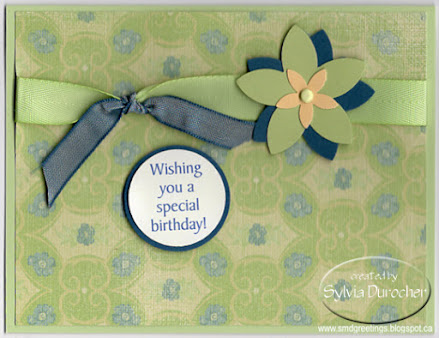
I punched a navy 1.75" circle and added a 1 3/8 circle greeting on beige cardstock.

I trimmed the embossed layer to place the circle off center, then ran a length of Night of Navy seam binding along the left hand side.

I attached the 2 circles over the embossed circle and held them in place with a navy mini brad.

A quarter sheet insert and an envelope and it is ready to deliver. 

No company branding on these but considering that the price was 2 for $1 and I have all the Stamping Up circle punches and Nestabilities dies which will cut circles I decided that it was a good investment.

One is masculine and the other would work for feminine cards it was a great combo.

There is some room in the embossing folder storage box which is priority as well.

Wednesday, November 8, 2023

Christmas Cards - Joyeux Noel - Purple

I made some French cards for my aunts and uncles who are still with us.  Joyeux Noel means Merry Christmas.

I started with the purple paste paper my sister and I made many years ago.  It has been paper that I though too special to use just willy nilly and so it has not been used.  I have to get out of the scarcity mentality and use stuff I think beautiful knowing that more will come when it needs to.

I cut the paste paper to 3.5 inches wide and about 4.75 inches tall.  The die is a thinlit by Memory Box.  I used my magnetic spacer to keep the die in place while cutting.  I cut the paste paper then pulled it off the paper. This requires gentleness because those letters up top are very delicate. I did mark the die with an up this way arrow this time because I did lay it upside down and of course had the greeting the wrong way.

I chose Stampin Up Lavender Lace for the card bases for these cards.  I added a layer of Whisper White cut to leave a small border all the way around. I used double sided tape on the bottom and side and Scotch Quick Dry Adhesive around the noel letters. The bottle has a very fine tip so it was easy to put just where I wanted it.  

Once that was adhered to the white layer, I added my accent pieces. The tree is by Hampton Art and cut from Elegant Eggplant. I added decorations with my white opaque marker. I added silver star and sequin on the top of the J. The snowflake is a large Martha Stewart punch. I adhered to the layer with a dusty purple mini brad and a silver sequin and a tiny sequin on the J. 


Wednesday, July 12, 2023

Belated Birthday

I made this card for a friend whose birthday was in April but I just lost track of it.  

She is here visiting so I will give it to her at supper tonight.

Card base is A2 in Rich Razzleberry with a top fold.

I cut another piece from my larger watercolor paper piece and chose this blue purple section. I cut a Stampin Up Top Note die.

I added a length of Elegant Eggplant grosgrain ribbon wrapped top to bottom on Top Note die and held it in place with a crystal large brad.

I cut large flower in Elegant Eggplant and smaller one in Not Quite Navy and added a small silk all held with a silver mini brad.  The flowers are Tim Holtz - Tattered Flowers.

White insert quarter sheet on the inside.

Saturday, April 1, 2023

Card Kits - Flowers

I volunteered to help my sister prepare card kits for my other sister`s daycare.

I first assembled the flower main accents.  Onto the yellow brad I placed a white flower sequin, then a yellow small silk flower, then a medium white one, then a pink bit larger one then a blue large silk flower.  I pressed the prongs of the brad apart on the back. I added a large Zot glue dot still on it`s release paper.

I selected the card stock to match the color of the flower accent.  Here, I choose navy blue.  The various kits feature red, green, turquoise, pink, and peach. The card base measured 11 inches wide and 8.25 inches tall. I scored it at 5.5 inches and folded in half.

I selected green plaid glitter paper to suggest the greenery for the flower.  I cut the plaid paper to 3.25 inches wide and 7 7/8 inches tall which allowed a full 9 scallops.  

The scallops were punched with a Martha Stewart border punch on both side of the strip of glitter paper.

I included a white insert measuring 5 x 8 inches and yellow envelope.

With the card already folded, the green glitter band is adhered onto the card front, the release paper is removed from the back of the flower accent and it is adhered onto the green plaid strip. The white insert is glued to the right hand side of the fold on the inside of the card.  I made 23 kits and provided 1 actual card sample and instructions for the staff. 

All put together, ready to deliver on the Easter weekend.


Wednesday, March 1, 2023

Card Exchange - March - Five Petal Flowers

I used the Stampin Up Five Petal Flower punch for my March exchange cards.

I started with a Soft Suede card base A2 in portrait mode.  I cut a layer of this gorgeous screen printed handmade paper.  

I wrapped a length of Early Espresso Taffeta Ribbon on the left hand side and tape the end to the back of the decorative paper. 

The decorative paper was then adhered to the card front with double sided tape.

I created the flower accent with a pearl white flower stacked with a Cherry Cobbler one then the same flower in a smaller size punched in pearl white all held together with a red mini brad.  

The accent was then adhered to the card front with a piece of 3D foam tape.

This card is in the landscape orientation. The card base is Very Vanilla. 

I adhered a strip of the decorative paper along the left hand edge.

Then added a piece of non shed gold glitter card stock and taped that over the edge of the decorative paper and trimmed the top and bottom to the card edge. 

The accent is a square of Cherry Cobbler then a piece of decorative paper leaving a small border. 

Again the five petal flower accent was adhered on the square with 3D foam tape.

These will be off to my partners shortly.

Thursday, November 24, 2022

Card Exchange - Nov - Screen Printed Paper

This sheet of beautiful screen printed paper stayed with me when many of the other 12x12 sheets left last week. 

It had so many Stampin Up colors in it. Early Espresso, Kraft, Very Vanilla, Cherry Cobbler, Soft Suede, Chocolate Chip and Melon Mambo.

On this card I cut the decorative paper to 5.25x4.00 then placed on a Very Vanilla card base. I cut the paper following the floral design from left to right. I then cut a piece of Melon Mambo to finish the rectangle along the cards bottom edge.  This was adhered first then the decorative paper over top of that leaving a small border all the way around. I added rhinestones in the center of the flowers with Bling Zots glue dots.

On this second card, I but a piece of designer paper for the top of the cards and a piece of Melon Mambo for the bottom and chose a Soft Suede card base.  

I ran my piercing wheel tool to make some wavy lines in the solid card stock on the bottom to provide texture.  I adhered that below the piece of designer paper on the top.  

I added a piece of Very Vanilla card stock across the join of these above mentioned papers and adhered it with double sided tape.

I then punched a SU Five Petal Punch flower in the pink and then the ivory card stock.  I layered these and added a small yellow flower in the center. This accent is held together with a deep pink mini brad.  The flower was adhered on the strip of paper with 3D foam tape.

These are off to my exchange partners this week.

Monday, October 31, 2022

Card Exchange - Oct - Blue and Orange

I put together some cards for my exchange partners.

The paper sure looks like SU but it was not marked so I guess not.

It matches Groovy Guava, Baja Breeze and Early Espresso.

I cut the designer paper to leave a small border of card color.  

Then I taped a length of Early Espresso Taffeta Ribbon and taped the ends to the back of the designer paper layer.

This layer was then adhered to the card front.  The card above is orange in Groovy Guava card base in wide orientation.

I then put together an accent with a SU Scallop circle of Early Espresso with a white silk flower layered on top followed by a large copper sequin which is all held together with an orange mini brad.

The flower accent is adhered to the card front with a piece of 3D foam tape.  A quarter sheet white insert was glued to the inside.

The second card is blue with Baja Breeze card base and has a tall orientation. 

These will be off to my partners shortly.

Wednesday, June 1, 2022

Exchange Cards - June

This months exchange card feature gold non shed glitter paper and plastic daisy accents.

I chose a Real Red card base and mounted black and white designer paper to the front. I placed a black daisy plastic flower onto a gold glitter scallop circle held together with a red mini brad and attached it to the designer paper. 

I ran a length of black thread from the flower to the edge of the designer paper and taped it to the back.  I adhered this layer to the card front.   

I added a narrow strip of gold glitter paper towards the top of the card.  I mounted a Stampin Up Modern Label Punchie greeting on the left hand side over the gold strip.

For this card I swapped the colors of the plastic daisy flower to red with a black mini brad.  

I changed the orientation to portrait (tall).

The strip of gold glitter paper is wider and adhered across the bottom of the card.

I wrapped the black thread over the glitter strip.

I created the greeting with a 2 inch oval punchie layered with a solid red one which was cut in half and offset on the right and left sides.

The greetings are adhered with 3D foam tape.

I added a white insert and envelope.

Friday, July 2, 2021

Cards - Exchange - July

A blue and yellow theme for my July exchange cards.

I chose a golden yellow card stock and ran it through the Big Shot with the Cuttlebug Script Texture folder.

I adhered it to the a white card base.

I wrapped and knotted the blue organza ribbon around the card front and placed it along the fold on the left.

I added a focal element created from punchie flowers made with the Stampin Up Five Petal punchie from yellow and blue card stock.  I managed to find scraps of blue that matched the ribbon really well.  I added a half inch circle and a yellow mini brad in the center to hold these all together. 

The accent was adhered to the card front with 3D foam tape.


For this card all the same elements but switched orientation to a wide card.  

On hind sight maybe I should have selected a different folder for this one because the script is sideways.  It's mostly texture so I think its still works.

For the focal element I used a white flower brad for the center which brings in the white of the card base.

These will be off to my exchange partners shortly.


Wednesday, June 16, 2021

Special Birthday Card

My first card made with Stampin Up supplies since the major clear out of card making supplies in my craft space.

The card stock is Certainly Celery topped with a piece of Porcelain Prints DSP. 

I added twill ribbon in the same shade.  I added a short piece of Not Quite Navy tied in a knot.

I punched a couple of Five Petals punchies in those 2 colors. I added a small So Saffron flower in the center all held in place with a mini brad.  I adhered the flower to card front with 3D foam tape.  

The greeting is a color printed circle punchie with a NQN backer.

Wednesday, March 24, 2021

Card - Japanese Tea

I made this card for the Coffee Loving Cardmakers Spring and Summer Blog Hop.

I started with the Japanese Tea Set graphic in gorgeous grey and deep red colors.

I trimmed it to 3.75" x 5".   I found a deep red A2 card base and a coordinating grey layer to go with the tea image.

I adhered the grey layer to the card front.

I added 3 red mini brads in the upper left hand corner and the kanji for TEA in the right hand upper corner.

This layer was adhered to the card front with 3D foam tape.

I am happy with this card.

This was a prize winner in the blog hop! #794
 

Sunday, March 21, 2021

Card - Coffee Time

I made this card for the 2021 Spring and Summer Coffee Loving Card Makers Blog Hop.

I started with a digi of a hand drawn pastel image of a beautiful coffee pot and cup.

I just love the soft muted tones of this image.

 I printed the image on a quarter sheet of white card stock and trimmed it to 3.75 x 5 inches.

I added a warm caramel piece of card stock layered behind it and adhered these layers to the front of a pea green card base.

I added a greeting above the image with a ripped layer of the same caramel card stock and the greeting printed on a taupe card stock.

I added 3 mini brads to the left of the greeting.

This greeting layer was adhered with 3D foam tape. 


Friday, August 14, 2020

Exchange Cards - Spatter Cardstock

I made a couple of cards with the the great spattered card stock I made a while ago.  I loved how I was able to get ink splotches!  The original 12x12 card stock is by Teresa Collins - Giving Thanks.

I started with card bases in Stampin Up Bermuda Bay. 

I used Nick Bantock's Cerlean Blue and Chrome Yellow liquid acrylic as well as white pearl Gleams acrylic paint on this card stock. 

I found some large die cut flowers in aqua.They needed a bit of a texture so I used the same colors again on the large handmade paper flowers.  Then I added a pearl white flower die cut made with the Stampin Up Flower Fair thin-let set.  I layered a deep teal flower then a smaller deep yellow one held in place a deep teal mini brad.  This was assembled into an accent.

I cut the spattered card stock to 4.00 x 5.25 inches and adhered it to the card front.  I added  a ripped strip of silver metallic card stock.  I then adhered the flower accent with 3D foam tape. I added a quarter sheet insert.


This card as very similar pieces. 

The ripped strip is pearl white cardstock. It was adhered to the card from then trimmed it to the card edges.

The flower accent has a deep yellow mini brad in its' center.

I love the swirls of grey in this card stock.   I chose their layout to determine where I was going to place the flowers.

These are headed out to the mail box.


Tuesday, March 19, 2019

Ready2Go AO Stack Kits - DSP Split - Artisan & Apothecary Labels

These kits are based on the DSP Split layout where the designer paper layer is cut to 5.25x4 inches then cut again at 3.5 inches. One of the pieces is turned over and the pieces are taped together on the back.  A ribbon is laid across the join and the ends are taped to the back of the DSP layer.  This layer is then adhered to the card front.  This is a versatile layout as you can see it can work tall or wide with the narrow piece on the left or right. With alternating the combo on the double sided paper each card can be different.

The Stampin Up Artisan Label was used on this set.  The greeting was printed on white card with Kiwi Kiss and Early Espresso and punched with the coordinating punch.

The designer paper used on the card shown is by BoBunny - Little Miss - Little Miss Dorothy.  The other I selected is Basic Grey - True Love - Giddy.

The grosgrain ribbon is pink.

The greeting is adhered over the ribbon with 3D foam tape.

I chose this set of cards to have no greeting which allows it to be used for any occasion.  The designer paper for this set is by Simple Stories - Snap Color Vibe - Dot/Stripe in Green and Yellow.

The ribbon is white grosgrain ribbon.

The textured card bases coordinate with the color of the DSP in green and mustard.

It label was cut with one of the Stampin Up Apothecary Framelits.

The accent has a white silk flower in the center held in place with a coordinating mini brad.  The 2 white buttons on either side are held in place with Bling Zots.

 It is adhered to the card front over the ribbon with 3D foam tape pieces.

Friday, November 16, 2018

R2Go Christmas Stack - Prism Snowflakes & Trees

I started with a navy card base.

I tacked a 4" square of vellum leaving even borders top and bottom.

I added the silver metallic ribbon wrapped around the card front and taped to the front over the vellum where the accent will cover it.

The snowflake element starts with a small white sequin then a silver fiber one, then the prism one and finally the Stampin Up Snow Flurry white one cut from card stock.  Make holes as needed in each of the snowflakes. These are held together with a navy mini brad where the prongs are spread apart on the back.

Adhere the snowflake element with the 3D foam tape.

Glue the quarter sheet insert.


I started with a warm green card base.

I assembled my trees by cutting the black strip into 3 pieces then adding one to each tree with a tiny brad. The trees are adhered to the card front with double sided tape.

Remove the star & Zot from release paper and adhere to card front at the top of the tree one at a time.

Rip the white paper to create your snowbank.  Trim it to the card edge if necessary. 

Layer the white circle greeting onto the black larger circle. Add the 3D foam tape to the back and adhere to card front as shown.  Glue the quarter sheet insert to the inside.

Tuesday, November 6, 2018

Cardmaking - CH - Class 3

Style 3 - I started with this decorative card stock featuring a colorful tree of peacock feathers with birds.  The dark areas are gold foil. It was cut to 3 3/8 inches with a Sizzix square thin-lit.

I chose a turquoise layer of card stock cut to 3 5/8 inches to highlight some of the colors in the tree.

The next layer is a gold moire texture decorative paper which has been cut to 5.25 x 4 inches. 

I chose a purple card base to coordinate with another color in the tree.

The greeting is a Stampin Up Decorative Label in the same color as the card base.  I added a SU Word Window punchie in warm white card stock with coordinating color.   These are adhered together then it is adhered to the card front with 3D foam tape.


Style 7 - I started with designer paper from the My Mind`s Eye - Holiday Avenue - Sweet Dreams Glittered Holiday Paper pad. It was cut to 5.25 x 4 inches with the embossing placed on the left hand side. 

The star element was created with a star die cut and a gold star circle. The die cut was cut from ivory pearl card stock with the Sizzix Star original die.  The gold star circle was attached to the star with 2 tiny gold brads.  The element was adhered to the card front with ds tape.

Style 2 - I started with clear embossed double sided designer paper from Imaginisce.

I cut the designer paper at a logical line to ensure I did not cut through a strip of the design.  I turned the top over to reveal the green polka dot pattern. These were taped back together.

I added gold foil ribbon across the join and the ends were taped to the back. 

I added an accent of silk flowers.  White and red poinsettias were layered together with a gold sequin onto a gold mini brad.  Using a push pin I created a hole in the designer layer. I pushed the prongs through and spread them apart on the back holding the poinsettia accent in place.

I then adhered the layer to the front of a cranberry card base.